Download
1 / 5
50 likes | 352 Views
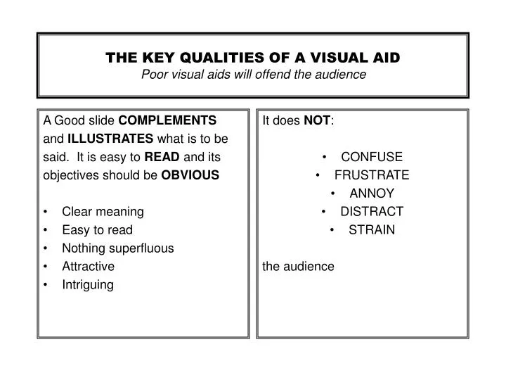
A Good slide COMPLEMENTS and ILLUSTRATES what is to be said. It is easy to READ and its objectives should be OBVIOUS Clear meaning Easy to read Nothing superfluous Attractive Intriguing. It does NOT : CONFUSE FRUSTRATE ANNOY DISTRACT STRAIN the audience.

E N D
A Good slide COMPLEMENTS and ILLUSTRATES what is to be said. It is easy to READ and its objectives should be OBVIOUS Clear meaning Easy to read Nothing superfluous Attractive Intriguing It does NOT: CONFUSE FRUSTRATE ANNOY DISTRACT STRAIN the audience THE KEY QUALITIES OF A VISUAL AIDPoor visual aids will offend the audience
GUIDE TO THE PREPARATION OF VISUAL AIDS FOR CONFERENCE PRESENTATIONS Produced by: IOM Communications Ltd and The Institute of Materials
If an image is clear at 1.5m, the equivalent slide will be clear in a reasonably designed theatre. A slide is normally an accompaniment to the spoken word and does NOT NEED to be totally self-explanatory. Most slides are on display for 1-2 minutes, during which the speaker will use 90 - 150 words. 10-20 CLEAR words on the screen is ALL the audience can absorb whilst LISTENING to the speaker. Use SIMPLE, SHORT words and avoid detail. Include nothing unnecessary - except perhaps a title which viewers expect. DO NOT REPRODUCE REPORT diagrams, tables, graphs or computer prints. NEVER copy machine diagrams. ALL these sources must be EDITED and REDRAWN. VISIBILITY, SHAPE & SIZE, INFORMATION & CLARITY
Slides should be designed on A3 or A4 paper. The following is based on using A4 paper. The thinnest line EVER acceptable is 0.5mm, but for simple graphs and diagrams, 3 or even 4mm is a good size. LETTERS must not be hand-drawn; use dry transfers in a heavy rounded font. The smallest letters MUST NOT be less than 3.5mm high. Most lower case text should be a 5-6mm and upper case at 7-9mm. A bold RED line on a RED background is INVISIBLE. First choose your BACKGROUND and then ensure that all the colour combinations used have HIGH CONTRAST. WHITE on a BLACK background is clear but looks old fashioned and uninteresting. Black on white GLARES. The BACKGROUND colour should be pleasing to the eye; SKY BLUE is commonly used. LINES & LETTERSTYLESCOLOURS & CONTRASTS
Overhead transparencies are easy to make and useful for relatively INFORMAL presentations in ROOMS up to 10m LONG. They are EXCELLENT for overlays and for live illustrations or annotation while speaking. Often they are used in conferences because the author has not given enough time or effort to make proper slides! THIS IS NOT THEIR ROLE In general, the same production rules apply to overheads but: The format is square; 17cm x 17cm, instead of A4 Modern computers will print straight onto acetate sheets Freehand production is tempting but always looks poor Overhead projector images are relatively poor, often distorted and cannot be greater than 2m x 2m Coloured lines can be drawn easily, but coloured areas need special preparation OVERHEAD TRANSPARENCIES