Download

1 / 15
160 likes | 362 Views
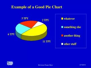
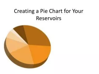
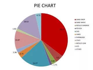
Why do we create a pie Chart. A special chart that uses "pie slices" to show relative sizes of data . [part to whole] It is a really good way to show relative sizes: it is easy to see which movie types are most liked, and which are least liked, at a glance .

E N D
Why do we create a pie Chart A special chart that uses "pie slices" to show relative sizes of data. [part to whole] It is a really good way to show relative sizes: it is easy to see which movie types are most liked, and which are least liked, at a glance. To open all hyperlinks: right click and click on open hyperlink.
Acute: an angle that measures less than 90°. • Obtuse: an angle that measures greater than 90°. • Right: an angle that measures 90°. • Straight: an angle that measure 180°. http://youtu.be/vB9Fax-9nAs Angles
Converting Fractions, Decimals, and Percents To change A fraction to a decimal: Divide the denominator (the bottom part) into the numerator (the top part): 1/4 = 1 ÷ 4.00 = 0.25 A fraction to a percent: Multiply the fraction by 100 and reduce it. Then, attach a percent sign. 1/4 x 100/1 = 100/4 = 25/1 = 25% A decimal to a fraction: Starting from the decimal point, count the decimal places. If there is one decimal place, put the number over 10 and reduce. If there are two places, put the number over 100 and reduce. If there are three places, put it over 1000 and reduce, and so on. 0.25 = 25/100 = 1/4 A decimal to a percent: Move the decimal point two places to the right. Then, attach a percent sign. 0.25 = 25% A percent to a decimal: Move the decimal point two places to the left. Then, drop the percent sign. 25% = 0.25 A percent to a fraction: Put the number over 100 and reduce. Then, drop the percent sign. 25% = 25/100 = 1/4
If needed watch the following video: • The following video will give further instruction on how to change a fraction to a decimal and finally to a percent. • http://youtu.be/vibnwMBYsCA Fraction decimal percent
How to use a protractor Watch the following video: https://www.khanacademy.org/math/geometry/parallel-and-perpendicular-lines/Angle_basics/v/using-a-protractor
Click on the link below to interact with the protractor along with measuring. This website is interactive….practice. • http://www.mathsisfun.com/geometry/protractor-using.html Extra practice if needed: Interactive: Practice
How to create a circle graph • Place your protractor on top of your piece of paper and use it to draw a complete circle. Do so by tracing 180 degrees along the outside edge of the curved portion of the protractor, then flipping the instrument upside-down and tracing the curve again. • Draw a dot in the exact center of your circle, which will be the midpoint of the outside edge of the straight portion of the protract • Write down the percentages you are working with. For instance, imagine that you are making a circle graph to represent a student body that is 28 percent freshmen, 27 percent sophomores, 25 percent juniors, and 20 percent seniors. • 4. Calculate the number of degrees that should represent each group in your circle graph by multiplying each percentage, in decimal form, by 360--the total number of degrees in the circle. In our student body example: • Freshmen = 0.28 x 360 = 101 degreesSophomores = 0.27 x 360 = 97 degreesJuniors = 0.25 x 360 = 90 degreesSeniors = 0.20 x 360 = 72 degrees • The entire circle--360 degrees--represents the whole student body, and it can be divided into sections of 101, 97, 90, and 72 degrees, to represent the subgroups within the student body. • 5. Line up the center dot of your circle with the midpoint of the straight edge of the protractor. Make a mark at 0 degrees on the curved edge of the protractor, which should be lined up with the edge of the circle. Then trace the circle in a clockwise direction until you reach the correct measurement for the first percentage in your graph. In our example, we would stop at 101 degrees and make another mark there.
6.Use the straight edge of your protractor to draw lines connecting the center of the circle to the first two marks you made on the outer edge of the circle. This "pie slice" represents the first part of the graph. In the case of our example, it represents the 28 percent of the student body that are freshmen. • 7. Align the center of the protractor with the center of the circle, and rotate the instrument until the straight edge matches the line you drew to the second mark you made on the circle (the 101 degree mark in our example). This now becomes 0 degrees. Trace the outer edge of the protractor clockwise until you measure out the second portion of your graph. In our example, we would make the next mark at the 97 degree point. Once again, draw a line from the center to the new mark and label this next "pie slice" accordingly. In our example, the second "slice" represents the 27 percent that are sophomores. • 8.Repeat the process of creating measured "pie slices" until you have completed the entire graph and represented all the groups.
http://youtu.be/S3yRRP6F-mo • for extra help if needed • http://youtu.be/Pz3N1fIKdoI Creating a Circle graph with given data
ExtraVideo to further help explain how to create a circle graph. • http://youtu.be/vibnwMBYsCA Let’s continue to create a circle graph
Practice problems on the next 4 slides Complete-show all work!
1. In 2008 approximately what percent of the world's population lived in Asia? A 50% B 60% C 75% D 90% 2. In 2008 approximately what percent of the world's population lived in Africa?(Hint: the angle is about 52°) A 10% B 14% C 20% D 52%
3. The bar graph shows the scores obtained when a die was rolled a number of times.If this information were displayed instead as a pie chart, what would be the angle of the sector of the pie chart representing the score of 2? A 18° B 54° C 90° D 108°
4. The bar graph shows the usual method of transport to school for the students in a class.If this information were displayed instead as a pie chart, what would be the angle of the sector of the pie chart for the students who walk to school?Give your answer to the nearest degree. A 23° B 82° C 86° D 98°
5. If there were 800 children in the school, how many said their favorite pet was Fish? A 4 B 9 C 14 D 32