Download
1 / 24
240 likes | 343 Views
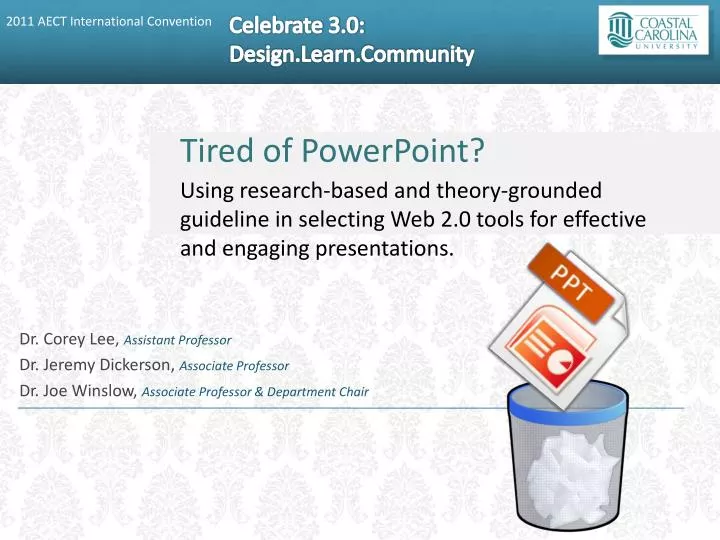
Tired of PowerPoint? Using research-based and theory-grounded guideline in selecting Web 2.0 tools for effective and engaging presentations. Dr. Corey Lee, Assistant Professor Dr. Jeremy Dickerson, Associate Professor Dr. Joe Winslow, Associate Professor & Department Chair. Outline.

E N D
Tired of PowerPoint? • Using research-based and theory-grounded guideline in selecting Web 2.0 tools for effective and engaging presentations. • Dr. Corey Lee, Assistant Professor • Dr. Jeremy Dickerson, Associate Professor Dr. Joe Winslow, Associate Professor & Department Chair
Outline What is Multimedia Learning? Graphic Design What are the effective Web 2.0 presentation tools? Why? Strategies for technology integration
Multimedia Learning 1. Use words and graphics
Multimedia Learning 2. Don’t decorate, communicate! Don’t use pictures which aren’t conceptually relevant
Multimedia Learning 3. Present words as audio rather than onscreen text
Multimedia Learning 4. Avoid cognitive overload
Alignment • Key idea: Nothing should be placed on the page arbitrarily. Every item should have a visual connection with something else on the page. • Strong alignment helps guide the user's eye, making the page easier to browse and drawing the eye to the most important parts of the page. • According to Williams: • center alignment tends to look formal and can sometimes look dull or "mushy" • strong left or strong right alignment looks more professional and clean
Contrast Contrast makes a page more interesting and readable Key idea: • If two items are not exactly the same, make them different, really different. • Shape, font face, size, weight, texture, line, spacing, color, etc.
Contrast Example Less effective More effective
Contrast Example LESS effective MORE effective
Proximity • Key idea: Group related items together. • Proximity helps the user identify which items go together • Close proximity implies a relationship • Use placement, size, and color to group items that go together • Don’t be afraid of empty space! – Less is MORE
Repetition • Key idea: REPEAT some aspect of the design throughout the entire piece. • Repetition of visual elements throughout the design unifies and strengthens it by tying together otherwise separate parts.
Effective Web 2.0 Presentation Tools 14 presentation tools were reviewed http://vandelaydesign.com/blog/tools/online-presentation-tools/
Strategies for Technology Integration For online course presentations To share with students and colleagues To engage students Students as the authors/designers/developers