Download
1 / 12
120 likes | 128 Views
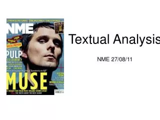
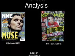
Textual Analysis - Country Weekly. Lucy Richardson. Colour - Front Cover.

E N D
Textual Analysis -Country Weekly • Lucy Richardson
Colour - Front Cover There are many different colours used on this front page. The title is a light blue with a contrasted red strapline. Other colours include white and yellow. The variety of colours seems odd but it actually works. However, it gives a look of a gossip magazine instead of a country magazine. This magazine seems more professional but I would rather do mine with a calmer cover as this one is too busy. It doesn’t seem that the colours represent anything, I feel as if they’ve used them because they think it looks good. I think the use of blue on the title is really good as it stands out and you would be able to see it on a shelf. It also seems a more feminine colour which links with the picture as it appeals more to females; especially when looking at the coverlines such as ‘The loves of my life’. However, they have also used the same colour on the text at the bottom of the magazine which I find quite difficult to read. I wouldn’t use this kind of colour on a smaller text. The use of yellow on the other coverlines is really good as it stands out against the image behind it.
Colour - Contents Page Much like in the other magazine, the colour scheme isn’t constant. It went from about four different brightly coloured fonts to a soft, calm, white/peach colour scheme when will confuse and disorientate the reader. I like the colour scheme of this contents page compared to ‘Country’ magazine as it is more fitting and relevant. However, the writing which has been laid on top of the image seems too small to read without difficulty and it could be made a brighter colour to stand out more.
Colour - Double Page Spread I love the colour scheme on the double page spread. The use of the green background is really effective behind the black shirt/guitar. The connotation of green is mainly money, especially as it is the colour of US Dollars which could symbolise that this magazine - Country Weekly - is an American magazine compared to the other which is British. It also represents envy or jealousy which could be what the readers feel when looking at the model or reading about his celebrity life. However, it also represents life and nature. This links in with what the magazine is trying to give off and how people want it to be viewed. There is a larger image to text ratio which draws the reader in as they can see who this article is going to be about. I like how they have used large white font on top of the dark background which makes it bold and stand out. Although, the light green text used seems too similar to the background on the left page which could block some viewers from reading it.
Layout and Design - Front Cover The layout and design of the front cover seems more like a gossip magazine rather than focusing on the music. It looks quite professional however, it seems quite busy as if too many distractions on the page. It gives the reader quite a lot to think about when passing it which could either be a positive thing as they feel there is a a lot the magazine can offer or they get confused and don’t choose it. I want to do an in-between cover with not as much on it such as ‘country’s sexiest man’ but still have it bright and bold to stand out on the shelf. The coverlines are used to draw in fans and admirers as it focuses on love, regret and mistakes of the stars. It also has a ‘Free!’ image which is easily read to add extra appeal into buying it. I like use of a notepad in which the text about school is laid upon as it is relevant and fun. The rule of thirds is used here to make the readers eye automatically go to certain points on the page. The strapline has been put at the top in bolder colours and a bigger size as it is one of the first things the readers will see. In newsagents etc, the magazines are laid out on top of each other but the top of it sticks out the end which would conveniently be the strapline. Also, the price has been reduced which adds more persuasiveness into actually buying it.
Layout and Design - Contents page The layout of the contents page looks too busy as if the text has just been crammed in. As the image is so large, the text has had to fit in around it at a smaller size which isn’t what the reader wants. You would got o the contents page to find out information such as page numbers but not necessarily to look at pictures as you can do that further into the magazine. The main, important text that has been added on top of the image is too light in colour and to small to be able to read efficiently. In my magazine, I want to make sure the information given is easily accessible/readable whilst being attractive and spaced.
Layout and Design - Double Page spread Much like the other magazine, the main focus of this double page would be the image. It looks better just being on one page (left) instead of dragged over both. It gives space for the text on the right hand page which has been spaced in a strange way. It has been put into little text boxes instead of one big chunk of writing which could be a good thing. There is also another smaller image worked around the text which is really effective and looks professional. The use of font on the title is really good. They have used two different fonts which are relevant to what they actually say. The word ‘barred’ is bigger, thicker and has marks on it which stands out and draws the audience in. It uses the rule of thirds within the two pages as the readers eye will automatically go to the models face, guitar, the smaller image or the title. I will definitely use this technique in my magazine as it is a simple and easy way to get the audience to look at what the creator wants them too.
Images Front Cover - The image of Trace Adkins represents who the readers will be looking to read about. The use of celebrities add to the magazines appeal and will increase sales. There is also relevance as he is a country music star which is what the magazine is all about. The Male Gaze theory could be used here suggested by Laura Mulvey or more so ‘The Female gaze’. The use of an attractive man could make male readers aspire to be like the person or make women more inclined into reading it as there is an famous man on the cover. Although it is stereotypical to only have an attractive person as the model, it just increases sales and readership which is better for the magazine. Contents page - The contents page also uses the male gaze theory as women could see a beautiful women in an image and think that if they read this magazine, they could be more like her. This image seems really random as it doesn’t go along with what the front cover is trying to represent. However, it does say in the corner what page to look at if you want to read about her. I believe the image should have been smaller as the text is more important whilst the large image will be used on her actual page. Double-page spread - The image used on these pages is fantastic. The angle he is sitting in and the page it has been placed on looks really professional and the photography itself is of a high standard. I also like the smaller image used on the next page however, it does resemble that of a gossip magazine which isn’t what I would want to represent within my magazine.
Pose, Style, Hair and Make-up Front cover - The pose used by ‘Trace Atkins’ on the front cover is very relaxed. His outfit and style is also very relaxed with a pair of jeans and a cowboy hat. It gives off the style and vibe of the magazine itself. This could be linked to the representation and stereotypes theory presented by Branston and Stafford. When you think of country and Tennessee for example, you would think of cowboys, hats and boots. It involves imagining certain groups of people in certain ways. However, we have to remember that this is an American magazine and this wouldn’t be strange to many people as it is the normal fashion there compared to Britain. Contents page - This image is also quite similar in the view of being relaxed and simple. Her makeup isn’y over the top, her hair is down which could be seen as ‘free’ and simple. Double-page spread - Again, the pose in the image is relaxed and is relevant to country as they have included the cowboy hat and acoustic guitar. The makeup in this image is limited or there is none at all, as the image is of a man. All in all, simple things such as a relaxed pose in an image gives off the style of a magazine and what it is trying to represent.
Composition and Framing Front Cover - The image is a mid long shot which seems rare for a magazine. Most will use close ups or mid shots with more emphasis on the face rather than body. They have also made his head/hat layer over the title which is used for nearly every magazine. This shows professionalism. When you first look at the front cover, the first thing I see is the hat which I think has been done on purpose. Using this composition/framing has allowed them to add in more coverlines in a larger size. Contents page - They have used a mid close up on the contents page which could be used to show emotion and expression on her face rather than the body and clothes etc. The image is the top 2/3 of the page whilst the text for the information is on top of the image or below it in the extra 1/3 at the bottom. Double-page spread - The image takes up the entire left page with the text on the right. A mid shot has been used on the main image and a long-mid shot for the smaller image on the right. This again, could be used to show expression on his face. the first thing I see when I look at the two pages is the rule of thirds points (hat, title, guitar, smaller image).
Written codes and Language Front cover - The title shows the audience what the magazine is going to be about - ‘Country Weekly’. Most of the audience of this magazine will be a specific reader who are interested in country music etc. The heading is easily readable as it is bright blue and a decent size. The language used is quite simple so it is easier to read on a shelf or walking past for example. The straplines are designed to draw the readers in much like a gossip magazine and also to involve the reader. For example, ‘you vote!’ allows the reader to voice their opinion and maybe get in the magazine. Contents page - The language used on the contents page is also very simple. This is because the information given is simple in itself such as page numbers and what will be on that page. On the right hand side is some information about the magazine that you would also expect to get in a media pack such as how many readers etc. Double-page spread - The language is quite formal and is easy to read which suits the audience. Although it is formal, it isn’t the most intelligent read which actually appeals to the reader as they are most likely to be working class. They have used light colours such as white and green for the main body text as it is on a dark background. However, where the background itself gets lighter, the writing becomes more difficult to read. Overall, the look and the writing within the double page spread look very professional and well done.
Overall Impression My overall impression of Country Weekly is quite good. I prefer this magazine, compared to Country as it seems more professional and more thought has gone into it. However, I don’t like the front cover of this one as it looks too much like a gossip magazine. Looking at this magazine has allowed me to decide what kind of things I want to include in my own design. The colour scheme of the contents page is in keeping with the theme, however, they could have laid it out more effectively to make it easier to read and to look spaced instead of cramped, as if they crammed too much information in. The image is far too large for the page as the information is the key aspect of a contents page. Looking at the colour schemes, images and styles of writing shows that it is trying to give a sense of happiness, freedom and the general country feeling. The house style helps make the right atmosphere or ‘vibe’ for the magazine which then, overall, gets more readers/sales. I will take inspiration and ideas from this to encourage the design of my own.