Download
1 / 10
100 likes | 213 Views
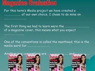
Hazeley School Magazine Evaluation. By Ibby. Front cover (What went well). The front cover came out ok but gradually Better over time. First of all the background was Just going to be plain blue with the title in a box And just writing on the page. I done that and

E N D
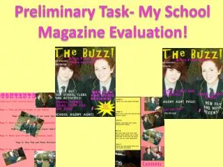
Front cover (What went well) The front cover came out ok but gradually Better over time. First of all the background was Just going to be plain blue with the title in a box And just writing on the page. I done that and Realised that it looked to plain to be a magazine. So I first decided to change the background to Something better (Clouds) using multiple replicated Images of it. But that looked too computerized So I just used the one image and stretched it across The page which turned out fairly well, I then added An image of a matured student with a smile to make It look more naturalistic, I removed the box around The title making it look more natural and also added The hazeley logo as it fundamental to represent Hazeley!
Front cover (What could improve) I believe my magazine front cover is good but there are several features that can be improved such as the layout. The layout could look more flashy and appealing and it could also look more colourful with extra added features such as advertisements and more images. There could be more information added such as other news/ updates to do with the hazeley school.
Front cover (colour & font) The colours ive used for my magazine are mainly blue and white, I did this so it can make the magazine cover look brighter and also more peaceful. The blue colours represent happiness, fun and aspirations which is what the h factor is all about. I used a childish/funky font to make the magazine look more fun and relaxed instead of using a more smart and sophisticated font which would make it look more serious and formal.
Front cover (Image) The only images ive used were the sky background and the girl in front. I used the sky as a background to give the viewer/ reader a feel of relaxation and sophistication. The smiling girl I put in front was used to make the viewer/ reader feel welcome, she was also used as an example of what you or your child could feel like if they joined hazeley or participated in the ‘h factor’, at last but not least I added the hazeley logo as that is what represents the school.
Front cover (language) The language for my front cover was inspirational and persuasive, I did this to make the reader more Interested and intrigued, making them want to take part. I also used bullet points to make it easier to read.
Contents page (What went well/ Could improve) The contents page got better as I went along and turned out well at the end. The background was initially just going to be a plane in the sky, but that looked to plain so after I added information about the h factor, I added images also relating to h factor in the background faintly which came out quite good. I also made the information mainly white so it can stand out from all the background images. However it could be improved a lot In terms of the layout and presentation, i.e. it could look more colourful and flashy, there could be more information and maybe some use of advertisments.
Contents page (Colour & Font) The colour on my contents page was ok but a bit plain, however I mainly used blue so it relates to the front cover and also so it can give the reader a feel of peace and relaxation. I used the same font as the front cover so it has the same theme, which was a childish/funky font to make the magazine look more fun and relaxed instead of using a more smart and sophisticated font which would make it look more serious and formal.
Contents page (Image) I used several images for my contents page but made it faint, so it would look more appealing but not be too distracting. The different images represent the features of this weeks main issue, the ‘h factor’ i.e. playing instruments, magic, singing and dance. The plane also stands out the most to represent that ‘h factor’ is like a first class plane where it feels like your flying.
Contents page (Language) For the contents page I could have put more information but I just put the main contents of h factor and what’s going to be in the magazine so the reader knows what’s in the magazine before they carry on reading.