Download
1 / 27
270 likes | 413 Views
The Effect of Slightly Dirty Data on Analysis What effect does missing or clearly wrong data Have on your statistics and analysis? What should you do about it? Some Real World Examples Paul W. Eykamp, Ph.D. University of California, Office of the President. Overview

E N D
The Effect of Slightly Dirty Data on Analysis What effect does missing or clearly wrong data Have on your statistics and analysis? What should you do about it? Some Real World Examples Paul W. Eykamp, Ph.D. University of California, Office of the President
Overview • Ways Data can be “dirty” • The effect of even slightly “dirty” data on your reports • Thinking about cleaning the data • Generating Guidelines • Cleaning the data before it becomes official • What should you do about “official” data that is wrong?
Some General Thoughts • Just because its “official” does not necessarily mean that it is correct. • Reporting skewed summary statistics is worse than editing the “official data”. • You may not be able to go “back in time” but at least you can be correct moving forward. • Data cleaning does not have to be a complicated process, sometimes simple things like a scatter plot make a big difference. • The effects of outliers and bad data are magnified if you are using small samples (e.g., looking for small effects of policy on small student sub-groups).
A Tale of Three Datasets • Data Set One: • Original data from the mainframe • Missing data often set to 0, some data out of bounds. • Data Set Two: • Missing data set to missing instead of “0” • The only cleaning done was to set values that were clearly missing at “0” to “.” (missing) • Data Set Three: • Obviously wrong data set to missing • In addition to setting “0” values to missing, values that were clearly wrong • HS GPA less than minimum to enroll or > 5.0, • SAT I scores less than 300 or greater than 800, • College GPA of less than 1.5 (at year 4) or greater than 4 all set to missing.
Four variables: Fourth Year University Grades Mean Median Mode 1% 5% 2.93 3.09 0.00 0 1.49 3.08 3.12 3.00 1.94 2.26 3.09 3.12 3.00 1.97 2.27 SAT I Math Mean Median Mode 1% 5% 608 630 630 0 440 622 630 630 410 470 622 630 630 410 370 Note that there was substantial change in 4th year university grades from fixing the missing set to zero and a smaller change from removing obviously bad data. SAT information was cleaner and benefited only from setting zero values to missing.
SAT information was cleaner and benefited only from setting zero values to missing. SAT II 3rd Subject Test Mean Median Mode 1% 5% 598 610 800 0 420 612 610 800 380 440 612 610 800 380 440 High School GPA Mean Median Mode 1% 5% 3.84 3.88 4.00 2.84 3.13 3.84 3.88 4.00 2.84 3.13 3.85 3.88 4.00 2.95 3.16
To recap, the SAT 3rd Subject test data was skewed by zero, but not out of bounds data, while high school GPA had few problems with missing data, but some out of bounds data which altered the results.
Effects of Fairly Small Number of Errors on Other Types of Analysis Simple Regression Regression model: 4th Year GPA = SAT I Math + SAT II 3rd Subj. + HS GPA (5 pt scale) Original Data: R2 = 0.078 Zeros to Missing: R2 = 0.094 Obviously Wrong Fixed R2 = 0.168 From this we see that while summary statistics are affected by incorrectly coded missing values, and to a lesser extent by out of bounds values, other analytical tools are even more affected by outliers.
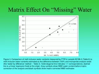
Regression Visually Taking a quick look at a raw scatter plot, we see that there are a bunch of zero values along the bottom Data with missing equal to zero R2 = 0.089
(4th year GPA x HS GPA) With the zero and out of bounds values removed, the regression line more accurately shows what is going on with the data.
Some Important Considerations • What constitutes cleaning vs. removing inconvenient data? • (in rough order of clarity) • o Missing data should not be zero. • o Data that can not be (is bigger or smaller than set of possible values). • o Single data points that seem unlikely and that distort the general trend (more important in small data sets). • o Data that looks systematically wrong. • o Data that does not match other data. • E.g., YTD GPA that is too low for student to have been allowed to continue. • o Any outlier when doing regression analysis or averages. If you think it is real information, set it to the highest non-outlier value.
Bad PA data (another data field showed GPA to be one point higher) Data looks funny (low SAT scores but can’t find a reason why they are wrong so they stay) SAS allows you to click on the dots and see the record. SPSS has a similar feature.
More Advanced Cleaning Worrying about Normality Regressions assume normal data – not all of our data is normal and you should check for both normality and linearity before doing regression analysis. Since most data is normal, or at least all the examples we saw when were were learning statistics were normal, we sometimes forget to do the checking.
Because of the combination of missing and non-normality – it’s hard to see if there is a relationship between income and honors courses. Also, we need to think about what we expect to measure – is $150,000 a year really expected to be different than $400,000 a year? (note data are real, but not complete and the analysis is not robust)
Regressing Non-Normal variables An illustration of the importance of normality Most statistical procedures assume normal data. If it is not normal, you get sub-optimal results. For the very simple model of family income to SAT I combined score you get quite different results if you normalize the income data Model: family income = SAT I combined For un-normalized income R2 = .0925 For normalized income R2 = .1446 Since the statistical procedure assumes normality, the first value is wrong and understates the effect.
Various transformations are used to correct skew: (If you don’t have the fancy software….) • 1. Square roots, logarithmic, and inverse (1/x) transforms "pull in" outliers and normalize right (positive) skew. Inverse (reciprocal) transforms are stronger than logarithmic, which are stronger than roots. • 2. To correct left (negative) skew, first subtract all values from the highest value plus 1, then apply square root, inverse, or logarithmic transforms. • 3. Logs vs. roots: logarithmic transformations are appropriate to achieve symmetry in the central distribution when symmetry of the tails is not important; square root transformations are used when symmetry in the tails is important; when both are important, a fourth root transform may work.
4. Percentages may be normalized by an arcsine transformation, which is recommended when percentages are outside the range 30% - 70%. he usual arcsine transformation is p' = arcsin(SQRT(p)), where p is the percentage or proportion. • 5. Box-Cox procedure: is to (1) Divide the independent variable into 10 or so regions; (2). Calculate the mean and s.d. for each region; (3). Plot log(s.d.) vs. log(mean) for the set of regions; (4). If the plot is a straight line, note its slope, b, then transform the variable by raising the dependent variable to the power (1 - b), and if b = 1, then take the log of the dependent variable; and (5) if there are multiple independents, repeat steps 1 - 4 for each independent variable and pick a b which is the range of b's you get.
Which is why you want to come to our talk on Thursday 10 AM Sheraton 5, Level 4 to hear about Data Mining Tools Compared SAS, SPSS, and MARS (Multivariate Regression Splines) Shameless Plug
A really good discussion of how to normalize data can be found at http://www2.chass.ncsu.edu/garson/pa765/assumpt.htm Or more easily at http://www.paul.eykamp.net/reference.html
Slides at: paul.eykamp.net Piled Higher and Deeper at www.phdcomics.com