Download
1 / 8
80 likes | 128 Views
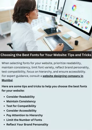
This PPT will help you to choose the right font,whole font concept is the purpose of communicating with audience and information about you, and your business, services, products. So it should not seem to be difficult to the reader.

E N D
Convincing images, with beautiful color combination and attractive UI/UX design is the main key that makes successful website on digital era. The fonts you select tell you convey the clear story about website. • Fonts act as the important role in your content; the good selection of the font can make your site more reader friendly. • So selection of the font must be a good and readable for which suitaleble for the website. Hope this article help yours and makes an easy way in selecting right font for your website content.
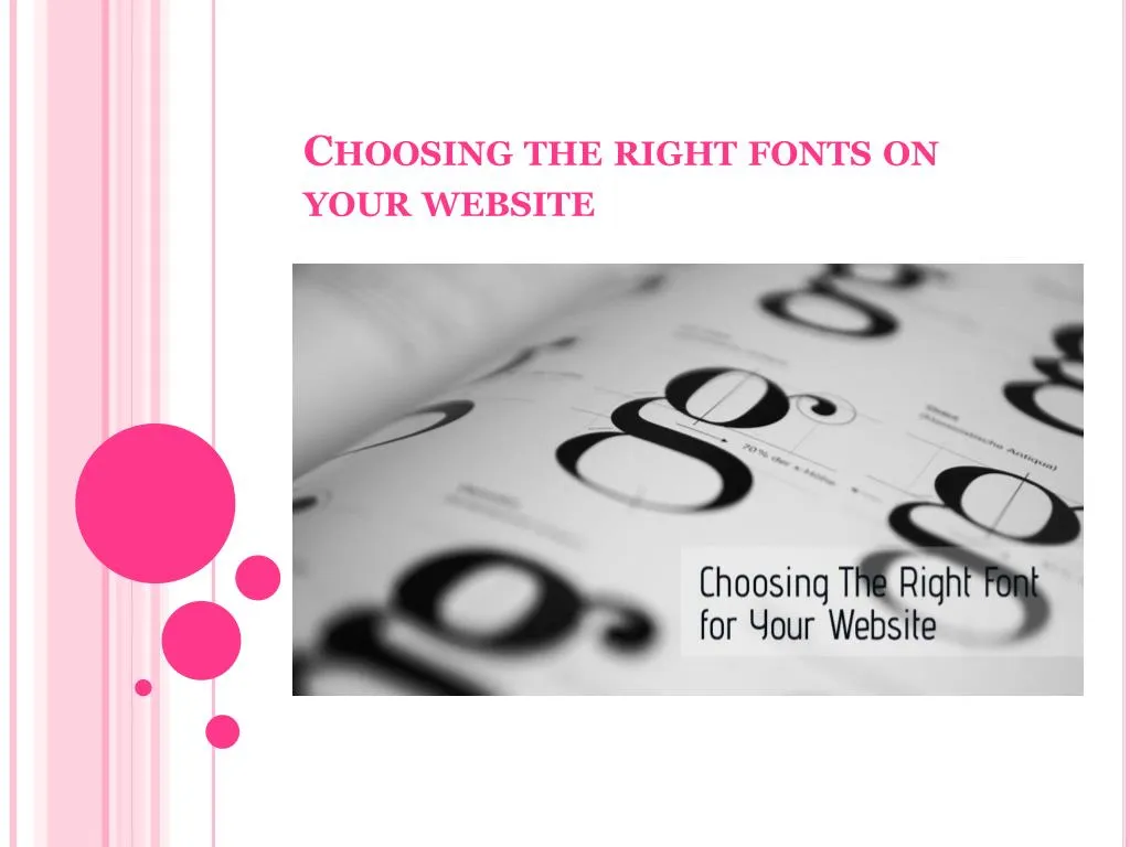
What’s the best typeface? So we know what type of font appears most excellent on screen–but what about the best typeface for readability? Personally, I doubt there is any one typeface to rule them all. There are typefaces more suitable to screen, body text, readability than others.
Font-ology Website font should be readable and easy to understand, if your site visitors may not dedicate profusion of time to read your content on website. If the font is difficult to understand they may bounce your site. Now I will tell you most useable fonts for the headings, Serif, Georgia and Verdana these styles are the most popular screen fonts and looks good on site and easy to understand
Serif: Consider a serif font for your website if you wish to express one of these behavior: warm, individual, imaginative, splendid, customary, conformist or academic. Serif fonts are effective as headings, for main body text and for documents that is intended to download and printed. • Georgia: It is a delightful, pleasant typeface that is unassuming, easy to read, and web-safe. It doesn’t struggle for attention with the title, and it keeps readers moving along the page. • Verdana: Verdana is an extremely easy-to-read: sans serif font that's included with the Internet Explorer.
Website font Website content also need specific font, but font should found in majority of the computers. Most widely used website fonts are the Courier New , Georgia, Arial, Arial black, Cosmic Sans, Impact, Lucida Console, Times new Roman and Verdana These are the fonts which are originate in almost all the computer.
Dynamic flash Obviously, you can download the number of font styles using the flash tool, it gives the dynamic look for your font, but search engines will not read the flash generated text.
Conclusion The whole font concept is the purpose of communicating with audience and information about you, and your business, services, products. So it should not seem to be difficult to the reader. PPT BY SHRUTI Digital marketing executive at ULTIMEZ Technology Contact us for more details Email: ultimezshruti@gmail.com Call: 8095715366 Skype: ULTIMEZ THANK YOU FOR WATCHING