Download
1 / 18
180 likes | 187 Views
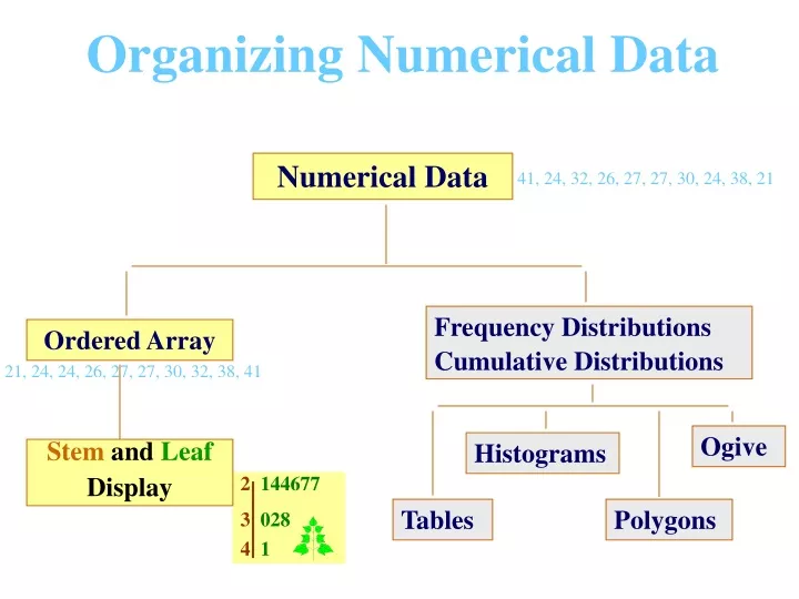
Organizing Numerical Data. Numerical Data. 41, 24, 32, 26, 27, 27, 30, 24, 38, 21. Frequency Distributions Cumulative Distributions. Ordered Array. 21, 24, 24, 26, 27, 27, 30, 32, 38, 41. Ogive. Histograms. Stem and Leaf Display. 2 144677 3 028 4 1. Tables. Polygons.

E N D
Organizing Numerical Data Numerical Data 41, 24, 32, 26, 27, 27, 30, 24, 38, 21 Frequency Distributions Cumulative Distributions Ordered Array 21, 24, 24, 26, 27, 27, 30, 32, 38, 41 Ogive Histograms Stemand Leaf Display 2144677 3 028 41 Tables Polygons
Organizing Numerical Data: • Data in Raw form (as collected): • 24, 26, 24, 21, 27, 27, 30, 41, 32, 38 • Date Ordered from Smallest to Largest: • 21, 24, 24, 26, 27, 27, 30, 32, 38, 41 • Stemand Leafdisplay: 2 1 4 4 6 7 7 3 0 2 8 4 1
Tabulating Numerical Data: • Sort Raw Data in Ascending Order: • 12, 13, 17, 21, 24, 24, 26, 27, 27, 30, 32, 35, 37, 38, 41, 43, 44, 46, 53, 58 • Find Range: 58 - 12 = 46 • Select Number of Classes: 5(usually between 5 and 15) • Compute Class Interval (width): 10 (46/5 then round up) • Determine Class Boundaries (limits): 10, 20, 30, 40, 50 • Compute Class Midpoints: 15, 25, 35, 45, 55 • Count Observations & Assign to Classes
Tabulating Numerical Data: Frequency Distributions Data in ordered array: 12, 13, 17, 21, 24, 24, 26, 27, 27, 30, 32, 35, 37, 38, 41, 43, 44, 46, 53, 58 Relative Frequency Percentage Class Frequency 10 but under 20 3 .15 15 20 but under 30 6 .30 30 30 but under 40 5 .25 25 40 but under 50 4 .20 20 50 but under 60 2 .10 10 Total 20 1 100
Graphing Numerical Data: The Histogram Data in ordered array: 12, 13, 17, 21, 24, 24, 26, 27, 27, 30, 32, 35, 37, 38, 41, 43, 44, 46, 53, 58 No Gaps Between Bars Class Midpoints
Graphing Numerical Data: The Frequency Polygon Data in ordered array: 12, 13, 17, 21, 24, 24, 26, 27, 27, 30, 32, 35, 37, 38, 41, 43, 44, 46, 53, 58 Class Midpoints
Tabulating Numerical Data: Cumulative Frequency Data in ordered array: 12, 13, 17, 21, 24, 24, 26, 27, 27, 30, 32, 35, 37, 38, 41, 43, 44, 46, 53, 58 Cumulative Cumulative Class Frequency % Frequency 10 but under 20 3 15 20 but under 30 9 45 30 but under 40 14 70 40 but under 50 18 90 50 but under 60 20 100
Graphing Numerical Data: The Ogive (Cumulative % Polygon) Data in ordered array: 12, 13, 17, 21, 24, 24, 26, 27, 27, 30, 32, 35, 37, 38, 41, 43, 44, 46, 53, 58 Class Boundaries
Organizing Categorical Data Univariate Data: Categorical Data Graphing Data Tabulating Data The Summary Table Pie Charts Pareto Diagram Bar Charts
Summary Table (for an investor’s portfolio) Investment CategoryAmountPercentage (in thousands $) Stocks 46.5 42.27 Bonds 32 29.09 CD 15.5 14.09 Savings 16 14.55 Total 110 100 Variables are Categorical.
Bar Chart (for an investor’s portfolio)
Pie Chart (for an investor’s portfolio) Amount Invested in K$ Savings 15% Stocks 42% CD 14% Percentages are rounded to the nearest percent. Bonds 29%
Pareto Diagram Axis for bar chart shows % invested in each category. Axis for line graph shows cumulative % invested.
Organizing Categorical Data Bivariate Data: Contingency Table: Investment in Thousands of Dollars Investment Investor A Investor B Investor C Total Category Stocks 46.5 55 27.5 129 Bonds 32 44 19 95 CD 15.5 20 13.5 49 Savings 16 28 7 51 Total 110 147 67 324
Organizing Categorical Data Bivariate Data: Side by Side Chart
No Relative Basis ü Bad Presentation Good Presentation A’s received by students. A’s received by students. Freq. % 30% 300 200 20% 100 10% 0 0% FR SO JR SR FR SO JR SR FR = Freshmen, SO = Sophomore, JR = Junior, SR = Senior
Compressing Vertical Axis ü Bad Presentation Good Presentation Quarterly Sales Quarterly Sales $ $ 50 200 25 100 0 0 Q1 Q2 Q4 Q3 Q4 Q1 Q2 Q3
No Zero Point on Vertical Axis ü Bad Presentation GoodPresentation Monthly Sales $ Monthly Sales $ 45 45 42 42 39 39 36 36 J F M A M J 0 J M A M J F Graphing the first six months of sales.