Download
1 / 2
20 likes | 134 Views
The Responsive and the adaptive website designs help in preparing the website for the mobile use, however in two different ways. Which method suits you the best, to your budget and goals? What would be the advantages of each, you need to read below.<br>Learning about the Responsive Web Design (RWD)<br>The RWD is described as an approach aimed at crafting of sites for providing a useful and optimal experience regarding the navigation and reading with a minimum of panning, resizing and scrolling across the wide range of devices. It doesn’t matter how much you resize the screen, the same layout would automatically respond to that particular size.<br>The responsive sites work really well for the content heavy sites as they don’t have a lot of difference in the user intent between the desktop users and the mobile users. Furthermore, they offer a really simple functionality.<br>The great advantage of using the responsive website design is the writing of a single codebase for a site serving both the desktop and the mobile users. This means that instead of having 2 separate site versions, you just have to have a single responsive site for accommodating all the mobile and desktop users without any worries.<br>From the developers’ viewpoint, responsive site reduces the workload, as there is just one site that has to be taken care of. Same goes for the marketing point of view, as it unifies the work analytics, deployment, and strategy. There is only one set of analytics for examining the strategy that has to be put in place.<br>For more facts and benefits, check out the infographic published below.<br>

E N D
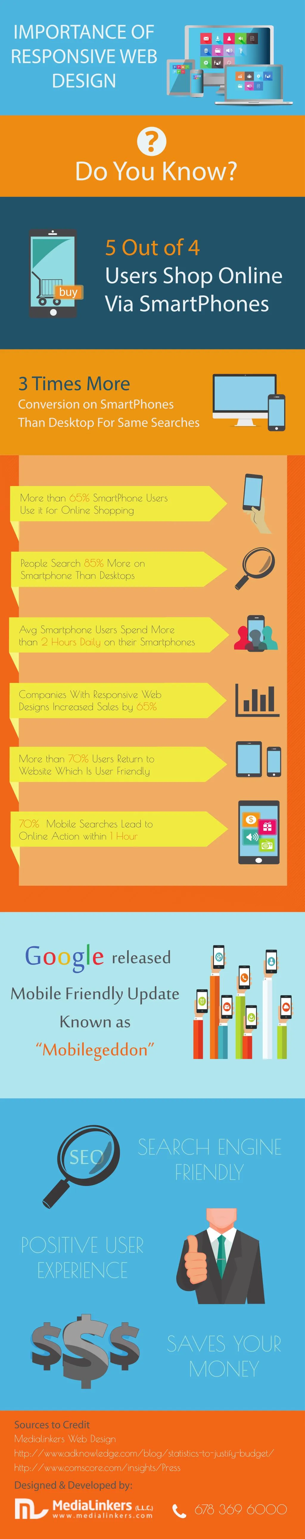
IMPORTANCE OF RESPONSIVE WEB DESIGN Do You Know? 5 Out of 4 Users Shop Online Via SmartPhones 3 Times More Conversion on SmartPhones Than Desktop For Same Searches More than 65% SmartPhone Users Use it for Online Shopping People Search 85% More on Smartphone Than Desktops Avg Smartphone Users Spend More than 2 Hours Daily on their Smartphones | Companies With Responsive Web Designs Increased Sales by 65% More than 70% Users Return to Website Which Is User Friendly 70% Mobile Searches Lead to Online Action within 1 Hour Google Mobile Friendly Update Known as “Mobilegeddon” released SEARCH ENGINE FRIENDLY SEO POSITIVE USER EXPERIENCE SAVES YOUR MONEY Sources to Credit Medialinkers Web Design http://www.adknowledge.com/blog/statistics-to-justify-budget/ http://www.comscore.com/insights/Press Designed & Developed by: 678 369 6000 ?