Download
1 / 3
30 likes | 34 Views
The experts at any top website design company suggest to include site search function and call-to-action buttons while optimizing a site for mobile devices.

E N D
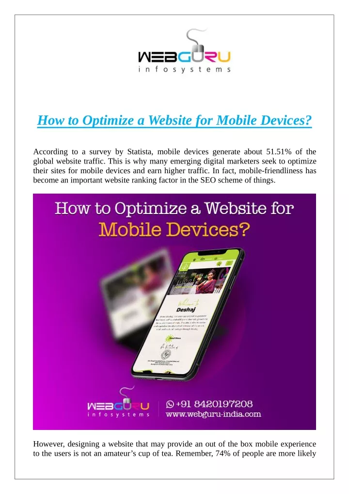
How to Optimize a Website for Mobile Devices? According to a survey by Statista, mobile devices generate about 51.51% of the global website traffic. This is why many emerging digital marketers seek to optimize their sites for mobile devices and earn higher traffic. In fact, mobile-friendliness has become an important website ranking factor in the SEO scheme of things. However, designing a website that may provide an out of the box mobile experience to the users is not an amateur’s cup of tea. Remember, 74% of people are more likely
to return to a website that is optimized for mobile (source: DesignAdvisor). Therefore, from careful planning to proper execution - every step needs to be thoroughly supervised by the experts of any professional website design company. In this blog, we will explore a few unconventional yet highly effective strategies that you should follow in order to make the website mobile-friendly. So, let’s dive in. 1. Site search function plays a crucial role, especially in an e-commerce site. When the users visit the mobile website, they receive an option to search for a particular category or product. To enhance user experience, you may equip the search bar with an autofill feature that can guess what the user is looking for. Thus the efficient site search functionality will enable the users to refine the search and browse several products. 1. Site Search Function 2. This is the thumb rule preached by the professionals at any top website development company. While designing a mobile-friendly website, make sure to keep it simple. Since the mobile screen is smaller than the laptop or desktop screen, you need to convey all the information to the users in a more compact way. Haphazard and unorganized content and pictures, a clumsy mixture of numerous colours, and asymmetrical fonts repel the website traffic and only increase the bounce rate. 2. Simplicity Is Never Outdated Remember, a user spends only 0.05 seconds to determine whether to stay or leave your site (source: Sweor). So, ensure to focus on incorporating minimal design, subtle and complementary colour scheme, and attractive visuals. Instead of using a lot of colours, you may simply use two complementary colours that can appeal to the eyeballs and also create a unique brand identity. 3. Confusing your potential customers with lots of complicated Call-to-Actions (CTA) is not a healthy practice. Instead, use large, convincing, and mobile-friendly CTA buttons so as to take your mobile website experience to an all new level. Help the users with the one-click purchase button or inform them about your services through the direct Call-to-Action buttons. 3. Persuade the Users Through Call-to-Action Button 4. A study by Forrester reveals that a better UX (User Experience) design can boost the conversion rate up to 400%. Leveraging such a wide audience can be extremely beneficial for your business. 4. Enhance User Experience
If you seek to increase the retention rate or drive more conversion, make sure to enhance the user experience. Smart use of colour contrast, ideal typefaces, fast navigability, and minimalistic yet attractive design can readily help you to achieve the desired results. 5. The rapid growth of mobile devices has made it essential for web developers and marketers to pay minute attention to the mobile version of their sites. Follow the above-mentioned strategies to develop a mobile-friendly website and get an edge over your competitors. 5. Conclusion Source: http://webguruinfosystems.mystrikingly.com/blog/how-to-optimize-a- website-for-mobile-devices ---------------------------------- WebGuru Infosystems Email ID: enquiry@webguru-india.com Phone No.: +91-33-40200844 Mobile No.: +91-8420197208 Visit Us: https://www.webguru-india.com Stay Connected Via: https://www.facebook.com/webguruinfosystems https://www.linkedin.com/company/webguru-infosystems-pvt--ltd- https://twitter.com/webgurutweet http://pinterest.com/webguruindia https://instagram.com/webguruinfosystems