1 / 37
370 likes | 376 Views
https://wishingchair.in/ - The Wishing Chair is a women-led homegrown Indian brand creating unique, playfully designed products that celebrate creativity, handcrafted artisanship & Indian craft technique.

E N D
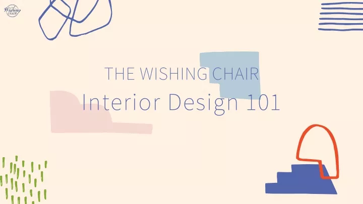
THE WISHING CHAIR Interior Design 101
Let's get started Decorating is not hard It may seem daunting, especially when we scroll through Instagram or Pinterest and see stately, impossibly gorgeous rooms with ethereal light, taunting us as we sit in our not-so-perfect nooks. Well, let’s lay this down first: homes are often beautiful, not because of the expensive artwork or designer upholstery that they possess, but because of the feeling they invoke. This is good news; because it means that with just a few design fundamentals under your belt, and some budget-friendly tweaks, you, you too can create a magazine-worthy space for yourself. Your home is your personality Before we get to the fundamentals, you must figure out what you love. Your home will take on the personality you infuse it with, and for that you need to be clear about what you like: do you want a peaceful sanctuary in one area? An energetic uplifting space after a long hard day in another? A living room that is grand and imposing or friendly and welcoming? Are you a purist, or do you like an eclectic mix of style? Follow the rules & then don't These are personal decisions you need to make, before you use the tools in the next steps. Remember that these are just general design rules and principles, and to be honest, some rules are meant to be broken. If you are new to decorating, follow the rules. As you get more experienced and confident with what works, you may want to get more experimental and bend some of them to yield pleasantly unexpected results.
DESIGN PRINCIPLES understanding the basics Part 1: Scale & Proportion Part 2: Contrast Part 3: Patterns Part 4: Texture Part 5: Balance Part 6: Bling Part 7: Colour Theory Part 8: Interior Styles
Scale Scale tends to refer to how an item relates to the size of the room or to something else – like the humans in it. For example, an exceptionally large dining table crammed into the middle of a living room :that's deemed a wrong scale for the room. Scale vs. Proportion It’s all about how design elements relate to each other Proportion This often refers to the shape of an item and how it relates to other things in the room. For example, if you have a round coffee table and place a large rectangular tray at the centre of it - the tray, by instinct would look “off” – because it’s not in the correct proportion to the table. You would need a trinket with rounded shapes to echo the proportions and lines of the table. Pro Tip Make Pinterest your BFF! From design inspirations to colour palettes and styles - create your personal moodboards using pinterest and you'll be flooded with ideas.
Examples of Scale and Proportion The rectangular frames on the wall echo the shape of the table The large pendant lamp and tree-like plants balance out the high ceilings The oblong shapes of the lamp , frame and table are proportionate
How to create correct Scale and Proportion Furniture Patterns The main anchor piece of furniture in in the room sets the stage for the scale of all the other furnishings. For example, an imposingly large sofa and a tiny, delicate side table may look silly next to each other. Pair a big, poofy sofa, with a large, rounded shaped coffee table and a larger rug to tie them all together, If the room is small, keep patterns to scale: Use smaller prints and fewer of them in a tiny room, or it might look like a block-print factory exploded in there. A larger room can typically handle larger prints as you have the space to allow each pattern to breathe. If you have a small room but you prefer a larger print (say on your wallpaper or your bed-linen), then make sure its base has a lot of white space in it and use it sparingly. Negative space Height Is as important as filled up space. It allows your design to breathe and be contrasted against a minimalism that enhances the filled design to a greater degree. This is the space around and above furniture. A room can seem chaotic, squishy and feel restless when every square inch of it is filled to the brim. The eye needs room to rest in a space, so provide that respite by leaving some surfaces uncovered and some walls alone. The higher the ceiling, the taller and grander the furniture. Low ceilings, (as we tend to have with builder flats with false ceilings built in), need be closer to the ground, or else the effect would be suffocating. Perhaps the one exception to this rule is using low, modern furnishings in a room with tall ceilings to achieve a dramatic effect.
Examples of how to create correct scale Height Furniture Negative space The sofa, table, armchair and plant are similar sized The frames stacked to the top of the ceiling offset the height of the low shelves The clutter at the bottom of the room is offset by the negative space on top
Exercise Take a good long walk through the rooms of your house – if everything seems like it’s in scale and proportion, it sends a unified message: Harmony.
When you achieve harmony, your space feels restful, comfortable, balanced and cohesive.
Basics Contrast is one of our favourite design principles, as it’s visual impact can be dramatically inspiring. Executed well, contrast can create an evocative feeling of vibrancy and joy, infusing the place with a personality that is playful and memorable. Contrast It's all about creating tension between opposites. Practically speaking Let’s dig deeper into what contrast is, and what it can be: • Lighting: Light versus dark colour: opposing ends of the colour wheel, • Surfaces: Bright versus dull • Scale/Proportion: Big versus small • Workmanship: Ornate versus plain • Shapes: Organic versus geometric • Style: Feminine versus masculine / Modern versus Traditional· • Textures: fuzzy versus sharp Pro Tip Start with the focal point of the room, like a large armchair, and think about the next piece in convergence with that? Will it be a little larger scale and lighter in colour, like a painting? And perhaps work with proportions to place an oversized floor lamp next to it, so that the contrast of scale and colour ties them all together.
Examples of Contrast Colour contrast: Bright mustard and chartreuse against a monochromatic background Scale Contrast: Low furniture against high ceilings offset by large globed-pendant lights Colour/Print contrast: Pops of and blue against large white spaces, alongside printed wallpaper and cushions against solid colour Colour contrast: Pops of fuscia with pastel Negative space contrast: White, paired down frames with saturated colour ones
Basics Patterns and pattern mixing when done right can look charismatic and joyful – but when done wrong, can look - oh, so so wrong! Remember when our moms told us never to mix prints? There was a time when people would use matching patterns throughout a room - the curtains would match the sofa which would match the lampshades which would match the pillows and so on. Ugh! Thankfully that look is over (and will hopefully never return). While our moms were right about most things, she definitely wasn’t right about this! Patterns & Pattern-Mixing Rules it’s all about coordinating and complimenting Practically speaking When it comes to using patterns in a room it’s all about coordinating and complimenting. Here are some pointers to start with: Colour Cohesion Pair Patterns with Solids Use distinct patterns and prints Don’t let a pattern get “Lonely” Pattern scale and size variation
Colour Cohesion In a room with many contrasting elements (if you're playing with scale and shape) - colour can bring it all together and make it cohesive. To achieve a well-coordinated effect, you will want to identify a clear colour scheme, limiting your selection to just two or three hues. Use solids to establish your base colours, and then concentrate on choosing patterns that fall into that palette. Use distinct patterns and prints When you ‘re mixing patterns, go all out! Make sure to choose two or three different types of patterns. You might pair stripes with polka dots or polka dots with florals— just make sure that each pattern is distinct. and share the same colours. Multiple patterns of the same type confuse the eye. But varied patterns are instantly distinguishable, creating clear contrast and resulting in fresh and more visually interesting designs. Pair Patterns with Solids It is a good idea to break up your patterns with blocks of solid colour. For example, if you choose a patterned bedspread, pair it with a solid bed skirt in a complementary colour. If you’re using patterned wallpaper, consider a solid curtain fabric. By incorporating solids into your design, you will create clear visual boundaries between patterns, Don’t let a pattern get “Lonely” Patterns are like pack animals - they work together to make something beautiful, but alone, they tend to get lost in the mix. To make sure that each pattern choice makes a coordinated statement, you need to feature it multiple times throughout a space. Aim for at least three or four uses per pattern to create a sense of rhythm, without too much "matching". Let the cushion cover echo the same pattern as a lampshade which may appear on a larger bolster across the room. Pattern scale and size variation Choose patterns that vary in scale. Multiple large-scale prints compete for focus, and can be distracting for the viewer - yet a mix of small and intricate patterns can look too busy. Use both small and large-scale patterns, saving large-scale patterns for larger canvases, like accent walls, curtains or bedding, and smaller patterns for accent items.
Examples of Patterns Don’t let patterns get lonely Use distinct patterns and prints Pattern scale and size variation
Basics Texture is an under-rated element of design, falling way behind colours and patterns as a tool, and yet we feel it’s the most versatile due to its ability to subtly change the mood and impact of a room. In design parlance, texture is, “the sensations caused by the external surface of objects received through the sense of touch.” Basically, how things feel. Think about squishing soft carpet between your toes, running your hand along a rough wooden table top, or sinking down into leather couch cushions. Though you don’t have to physically have contact with the room to feel the power of texture. Texture It's all about how things "feel" Practically speaking Imagine a bedroom with shiny marble floors, shiny satin sheets, glossy lacquer lamps and highly polished furniture? Such a room is evocative of spaces that are cold and sterile – like a hospital room or a fancy office. It definitely will not do for a bedroom: and so texture allows you to play with elements to add warmth, interest and a sense of comfort. Shiny, polished surfaces evoke a sense of hygiene and formality, rough and rugged textures imbue it with warmth and rustic charm, with a touch of masculinity, satiny , velvet finishes denote luxury and playfulness, and a balance of all ends of the spectrum can be tweaked to create the final effect you would like to evoke. Pro Tip You should also consider the placement of textures as you go about designing your room. Putting a smooth texture directly next to a rough one while make the rough object stand out more and seem weightier than if you space them apart.
How to use texture Limit it to Two While you want to create contrast so that important design elements pop, don’t use more than two or three distinct textures in a single space. Choose three when you want people to take in the space as a whole and stick to two when you want to emphasize a prominent focal point. Texture is particularly important if you’re working within a particular colour palette where the shades are very similar. When a monochromatic or analogous colour scheme, make sure you choose items that heavily contrast. When they come together, they will bring a sense of harmony to the space. Ways of adding texture Furniture: Wooden benches, satin reading chairs, and marble table tops all bring a distinct feel to the space. Décor Items: Shadow boxes, knick-knacks ,flowers, plants, carved sculptures. Floor and Wall Coverings: A carefully placed throw rug or even some imaginative wall design will bring more depth to the room. Textiles: Use cloths like slip covers, pillows, blankets and throws to make the room pop. Materials : Glass, wood, cane, fabrics etc, Take it to the next level Whether you choose a throw rug to warm up your bedroom room or a driftwood coffee table to bring rustic charm to your living space, the importance of texture is clear. It completes the room. Texture is the component that helps elevate your interiors to the next level.
Texture in action Limit it to Two Take it to the next level Using wood and fabric to add texture
Basics Our senses yearn for a sense of equilibrium and harmony in a space - and that’s achieved when all the visual weights of the objects in a space are relatively equalized. Balance is created through shape, colour, pattern, and texture. Practically speaking Balance it's all about creating harmony Symmetrical or formal: Traditional or formal spaces call for symmetrical balance where the space is evenly split into two sides that mirror each other. For example, two chairs on either side of a coffee table can be said to be symmetrically balanced. This kind of balance is easy to achieve as design elements are repeated on each side.· Asymmetrical or Informal: The visual weights of lines, colours, forms, and textures are balanced without exact duplication. It is not as ordered as symmetrical balance and can be more complex and interesting. For instance, a sofa can be balanced by placing two chairs on the other side.· Radial balance is achieved when there is a central focal point with other elements radiating from it or around it. An example would be a round dining table, with chairs arranged around it. There is a lot of repetition of form, texture, and colour.
Examples of Balance Asymmetrical Symmetrical Radial
Rhythm As in music, rhythm in design is all about creating patterns of repetition and contrast to create visual interest. You can achieve this by using the same colour or shape at different intervals. Its purpose is to move your eye around the room. For instance, you can establish a rhythm by using a colour in the pillows, picking it up in a painting, and echoing it again in a rug. These repetitions will help carry your eye around the room. Emphasis / Focal point A room where everything gets equal importance will seem either scattered, chaotic or just plain boring. You need an anchor so that the viewer’s eye has something to gaze upon. Architectural spaces often have points of interest such as a fireplace or a window with a beautiful view. You can choose to enhance the built-in focal point by arranging furniture around it to emphasize it. In a room that lacks such a built-in point of interest, you can create one through groupings of furniture or using an unusual or large sculpture, mantel piece, or work of art.
Basics All it takes is a touch of metallics, mirror or glass to add the brightening effect of reflected light to your room. Shiny surfaces also help make a small room look larger. But let’s not play it too fast and loose here – too much bling and gold can look tacky and tasteless- just the right amount looks modern and lustrous. A little Bling shine adds zing to a room Practically speaking Limit yourself to a few of the following shiny elements: A sheer, metallic glaze on the walls Extra mirrors on the walls, above a dresser to create illusion of space. Mirrored doors in dressing room Shiny doorknobs Metallic lamps or ceiling fixtures Shiny electronics Polished glass or metal collectibles Accent pillows with metallic thread, sequins or other glittery trim Pro Tip When it comes to metallics, it’s okay to mix and match bronze, brass, silver and gold elements. The usual room of thumb is not more than 2 different metals in one space.
Basics The way in which each of us views colour is unique. Our vision is complex and sensitive, influenced by many external factors: lighting, adjacent colour, surface texture and our own cultural references to hues. We will stick to very simple colour principles, to help you mix colour across surfaces and objects within a room. A basic understanding of colour theory; understanding natural harmonies and discords between colours, will make the creations of your own colour schemes much easier - and allow you to play with colour with confidence. Color Theory it’s all about deciphering the rainbow Practically speaking So WTF is color theory? Essentially, it’s information that researchers have gathered about the way we see colour and how different colour combinations affect us. Colour theory can be used by artists working with canvas, just as much as it can be used by everyday people looking to paint their walls a new shade. A little knowledge can go a long way, but remember the most important thing: it is you and your family who have to live with and enjoy these colours.
The Colour Wheel Harmonious colours The 4 primary colours are red, blue, green and yellow. When these pure colours are mixed, the secondary colours of purple, turquoise, orange and lime are produced. When primary and secondary are mixed - tertiary colours are produced. Harmonies exist between colours adjacent to each other. For example, a palette of yellow, lemon, marigold and terracotta will always be successful. Complementary colours Colours that sit opposite each other on the colour wheel are called complementary. These are opposing colours that vibrate against each other. Sometimes the clever use of a complementary colour in a room can have a striking effect. For example, a bright turquoise chair against a terracota wall would look beautiful.
Monochromatic This is a colour scheme of only one colour. By using variations of lightness and saturation, you can easily create a cohesive scheme that’s easy on the eye. Beige, grey, greige and blush tones are an elegant choice in this palette. Complementary Colours This is a colour scheme with two colours that are opposite each other on the colour wheel. This colour scheme can be vibrant with high contrast if colours are used in the same saturation. This scheme will naturally include a warm and a cool colour, as they're on opposite sides of the wheel. This one is a difficult one to pull off, but very striking when it does work. Analagous Colours This is a scheme using three colours that are adjacent to each other. An analogous scheme can be very harmonious and relaxing. It benefits from having one dominant colour with the two remaining colours as accents. Analogous schemes work well with accent walls and other large-scale accents because the colours are naturally harmonious together. Pairing two yellows or two greens together with some white or cream tones in between can be simple but game-changing. Triad Colours This is a scheme with three colours that are evenly spaced around the colour wheel. A triad colour scheme could include green, violet, and orange, so care must be taken with the saturation of the colours you choose. This is another scheme that benefits from choosing one colour to dominate, with the other two as accents.
Colour Theory in action Monochromatic scheme Analogous scheme Complementary scheme
Popular Interior Design styles You may be inspired by these styles that dominate the interior-scape at the moment. See what style closest relfects your personality and incorporate its elements to best showcase your taste. Mid-century Modern Scandinavian/ Minimalist Traditional Shabby Chic Bohemian Industrial Art Deco Vintage/Victorian
Traditional What it is From antique furnishings to neutral safe fabrics - traditional style may sometimes get a bad rap as fuddy-duddy. But though it takes inspiration from the past, it's really all about comfort and familiarity. Everything is in it's place like a well-worn shoe. Defining features It promises warmth and welcome, and it delivers. refined furnishings, mannerly textiles, mellow colours and pleasing symmetry - which bring this style a sense of order that makes it beloved amongst many. Look out for rich block-print textiles, old carved furniture in dark wood, fireplaces and mantelpieces, heirloom Kashmir rugs in earthy tones, bric-a-brac comprising life's collections piling up in corners, carved sculptures and oil paintings, and a lot of beige upholstery accented against embroidered cushions. This works for you if... You like familiarity and play safe with colour so as nothing looks out of place or stands out like a sore thumb. You reminisce of your grandparents place with fond memories and want to re-create that nostalgia.
Mid-Century Modern What it is The style grew out of early-20th-century Modernism, including the International and Bauhaus movements. Midcentury really took hold after World War II, thanks to new technologies and materials and a newfound prosperity. The migration to urban areas, and thus smaller living spaces, also influenced the designs of the era. Defining features TThis is a classic, yet of-the-era look, with clean lines and minimal fuss. In the home. functionality is important, as form follows function. Lines are uncluttered and sleek lwith both organic and geometric forms. There is minimal ornamentation. Designers of this form explore different traditional as well as non-traditional materials, and tend to juxtapose contrasting materials and colours. The furniture of this style is iconic and are collector's items if you can get your hands on them. This works for you if... If you like form over function and want each piece to tell a story without too much fuss, if you like your tones muted yet not dull and pieces that are timeless without being old-fashioned.
Minimalist/Scandinavian What it is Like a wooden cabin on the edge of a fjord, containing a few pieces of beautifully designed slim-lined expensive wooden furniture. A minimalistic aesthetic where every piece must be included for good reason - but also a comfortable space. With an innate sense of warmth, but avoidant of clutter. Whilst this design still features the clean lines, calmness and clarity epitomised by traditional 60’s American minimalism, it has a softer Japanese approach of zen-like allure, Defining features Simplicity, purity and calm. Monochromatic punches of colour are interspersed with subtle, pastel tones: Blues, creams and greys help bring the hygge, softening the edges. Large glass windows in clean lines let in etheral light, walls are bare and the furniture is high quality wood (not necessarily IKEA flatpack) and comfortable. This works for you if... You believe in buying less but buying better - for every object must spark joy! You let the objects do the talking whilst staying functional and comfortable.
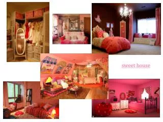
Shabby Chic What it is This style embraces a worn, lived-in look. There’s something comforting yet beautifully curated about shabby chic: throw in soft colors, a mix of vintage and new decor, and feminine accents, sprinkle an array of flea market finds that create an effortless up- cycled second-hand decorating style that is undeniably elegant, yet relaxed. Defining features Defined as : cosy, comfortable, vintage and pretty! Worn, distressed vintage furniture, feminine floral patterns and frills, pastel colours in pink, lavender and blue and antique, charming memorobilia peppered across the space, from chandeliers to bone-china tea- pots. This works for you if... You're not afraid to shout from the rooftops about your love for the romantic, super-feminine aesthetic. If you appreciate soft, breathable fabrics, like to re-purpose old things and have an easy, effortless touch.
Bohemian What it is Overall, bohemian (or boho or bohéme) interiors are casual and anything but minimal. People love bohemian decor because it’s free-wheeling, comfortable and easy on the pocketbook. This look is maximalist, where "more is more". Defining features No Boho space is ever the same, but they're usually warm, cozy and layered. Choose lots of colours in earth and jewel tones, layer textured prints and patterns and textile rugs and batik wall hangings, plush, fluffy furniture mixed with vintage cabinets and stools, lots of accessories from travel and tons of indoor plants, which will partly cover your wall art collected from your travels. This works for you if... Boho decorating is for those who want their homes full of life, culture, and interesting items for all the world to see. For people who embrace the carefree, the relaxed, and the unusual. The style has long been representative of free-spirited, unconventional and artistic types.
Industrial What it is Defined by a raw, unfinished, and almost factory-like sensibility, an industrial interior style showcases utilitarian materials such as wood, metal, and cement in a way that proves that form and function can be one and the same. Defining features Exposed brick, piping, and ceiling beams are just a few industrial giveaways, while stripped floors, visible ducts are a look seen in some lofts and bars, Most homes in this style would pair a wooden table with metal chairs, implement distressed kitchen surfaces, or repurpose old tools and installation fixtures into pendant lamps with edison bulbs. This works for you if... The industrial aesthetic is definitively masculine but poignant, fuss-free but thoughtful, and the mark of someone who understands that the finer things in life aren’t always the most frivolous or flashy.
Art Deco What it is Art Deco was one of the most exciting and influential styles of the 20th Century and one that still influences design today. Contemporary re-imaginings of Art Deco designs are inherently opulent and luxurious style, with bold overtones. Deco is elegant, functional and modern, and though it dates back to the 1920s, it has a Gatsby-esque charm that never goes out of fashion. Defining features Angular, geometric forms, Art Deco motifs have a strong and bold look, with vertical lines and angular details. The sunburst was a classic Deco motif. Zigzags, chevrons and stepped patterns are equally popular: on floors, walls and upholstery. Also use of exotic materials, often with decadent, polished, high-shine finishes. Wood is usually highly polished, or given a luxurious lacquer finish, or finished with metallic touches in brass or chrome against a monochrome pallette. This works for you if... You want a classy, dynamic way to show off your decadent, luxurious lifestyle - where all that bling won't look out of place.
Vintage/Victorian What it is This takes is name after the prolific English queen, who ruled from 1837 to 1901. Britain enjoyed a lengthy period of prosperity during this time, thanks to colonialisation and the Industrial revolution, making way for the middle class to access this royal- bent of design. This is a classic style, otherwise known as 'granny chic'! Defining features A cluttered room was the order of the day, so accessories, soft furnishings, and decorations should be prominently displayed in the Victorian interiors, usually in bursts of varius patterns: chintz, florals, damask, preferably in subdued tones of pink, grey, lavender, sage or teal. Ideally, to copy the Victorian design style, every surface should be covered in framed photographs and pictures, China, flowers in vases and souvenirs, on top of mahogany, oak or walnut hand-carved furniture. This works for you if... You are nostalgic for the good ol' days and want to add some vintage charm and maximalist formality to your home, allowing both you and your guests to feel like Royalty while sipping from Silver teacups.
Your Home What it is Your haven, your sanctuary - a four-walled manifestation of everything that makes you feel safe, secure and with a sense of belonging - with spaces that relfect your personality, calm you down, energize you, and that are sacred, by holding space for your rituals and routine. Defining features The use of colour theory, balance, harmony, scale and proportion, texture and contrast, alongwith your own personal instincts and individual flavour to turn a space into something that reflects YOU! This works for you if... You have the will and spark to take some chances and change things up in your home! Don't take it to seriously and have fun with it! Nothing is permanent, and if you hate it - you can switch things up and store curios away, There are few things a fresh coat of paint can't fix! So go out there and refresh your space!
Email info@wishingchair.in Thank you! For any further questions you can get in touch with us Website www.wishingchair.com Phone +91 9319293140 *All images are from pinterest and the credits & link to original are available here : https://in.pinterest.com/thewishingchair/decorating-like-a-pro/