Download
1 / 20
200 likes | 350 Views
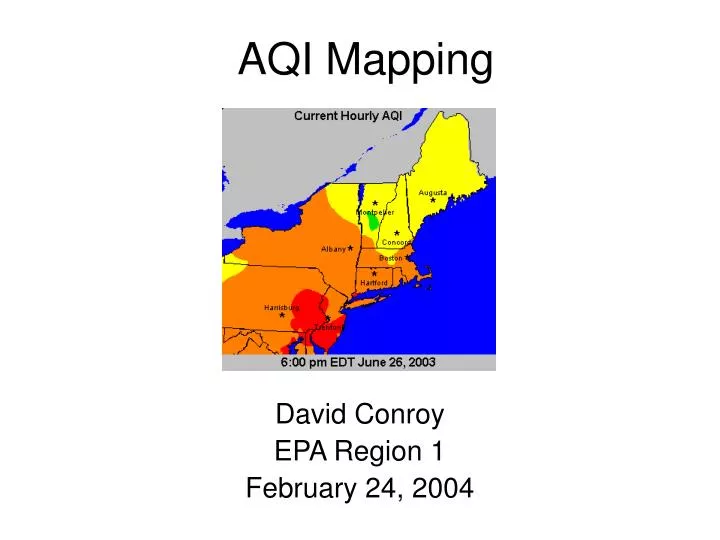
AQI Mapping. David Conroy EPA Region 1 February 24, 2004. Current State of Affairs. During the upcoming ozone season, separate maps will be created each hour for ozone and PM 2.5 . Each of these maps displays the Air Quality Index for the respective pollutant.

E N D
AQI Mapping David Conroy EPA Region 1 February 24, 2004
Current State of Affairs • During the upcoming ozone season, separate maps will be created each hour for ozone and PM2.5. • Each of these maps displays the Air Quality Index for the respective pollutant. • To get a true picture of the air quality in a given area, a person needs to look at and interpret both maps. • Each day there may be times when the controlling AQI flips from one pollutant to another (and maybe back again). • This is especially true on high ozone days, when the AQI for ozone will generally start off low and peak in the late afternoon.
On some days, just looking at the ozone map will be misleading Ozone AQI Map The ozone map indicates good air quality for the NYC metro area at 8 a.m. However, hourly PM2.5 conc. were above 100 ug/m3 during this time.
Does this look like good air quality? Newark, NJ Hazecam on June 27, 2003 8:00 AM EDT
A more accurate tool for the public would be an hourly AQI map Air Quality Index
Can such maps be created? • AIRNOW now collects hourly PM2.5 and ozone data from most states, and produces current hour AQI maps for both pollutants. • In areas with sufficient PM2.5 monitoring densities, contour maps for PM2.5 can be generated. • For domains that have contour maps for both ozone and PM2.5, a combined AQI map could be created. • However, since there is not a PM2.5 monitor at every ozone site, an AQI map cannot be made by simply using the highest value at each monitoring site.
How would such maps be created? • The first step is to produce hourly AQI contour maps for both ozone and PM2.5 for identical domains. • Hourly AQI maps are generated using the appropriate surrogate method for each pollutant.
How would such maps be created? • Next using MapGen, which is used to produce both the ozone and PM2.5 maps, create hourly gridded AQI data for each pollutant.
What the Gridded Data Looks Like • Each grid cell contains an AQI value Example of a 100 x 100 grid
Using Gridded Data to Produce AQI Maps • By maintaining a constant domain for both the ozone and PM2.5 AQI map, matching grids can be created. • With matching grids, a direct comparison of the data in each grid cell can be made. • A simple logical function can be created which keeps the higher AQI value for each grid cell. • The resulting merged gridded data can then be used to produce a “True AQI” map.
Gridded Ozone AQI data and PM2.5 AQI data are compared to determine the higher AQI Gridded Ozone AQI Data Gridded PM2.5 AQI Data Merged Gridded AQI Data
What results is a true AQI map Air Quality Index
Benefits of a True AQI Map • With a true AQI map, the public has a more accurate picture of the current air quality conditions. • Armed with such information, the public can make a more informed decision about behavior modifications they may need to make to protect themselves.
Early in this episode, ozone dominates throughout much of region
Late in episode, different pollutants dominate in different parts of a domain
In this example, PM2.5 dominants in morning when ozone is still low
Later in afternoon, dominant pollutant differs depending on area
Conclusions • True AQI maps can be generated for many of the domains on AIRNOW. • In order to avoid confusing the public with maps for both ozone and PM2.5, we should move as quickly as possible towards AQI maps where they can be accurately produced. • This is especially critical during the summer months when the predominate pollutant can flip back and forth on many days. • During the winter months in most areas, the PM2.5 map is the AQI map. • Areas with high AQI values for other pollutants (e.g., PM10) can be dealt with on a case-by-case basis.