Download
1 / 22
220 likes | 392 Views
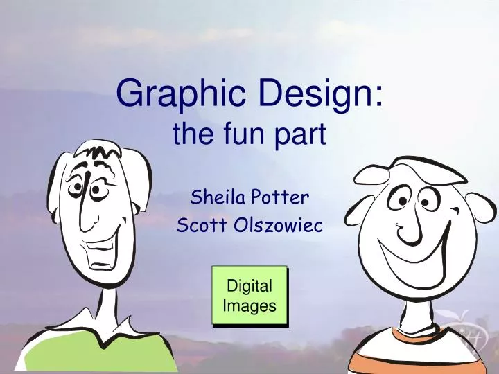
Graphic Design : the fun part. Sheila Potter Scott Olszowiec. Digital Images. The plan:. housekeeping activity design principles (if we have time): web examples activity. P: /AITT/teacher training/Clarica Scholars1/CD/…

E N D
Graphic Design:the fun part Sheila Potter Scott Olszowiec Digital Images
The plan: • housekeeping • activity • design principles • (if we have time): web examples • activity P:/AITT/teacher training/Clarica Scholars1/CD/… /Presentations and Resources/graphic design workshop/graphic_design.htm
Hierarchy: Organize Your Information • a hierarchy is a “visual path” • establishes the relative importance and sequence of information • use various font sizes, colours and weights for contrast • similar “chunks” of information together • separate unrelated items with more white space
Fonts: 2 broad categories • what is a serif? • Times New Roman has serifs • Arial doesn’t
Serif fonts lead the eye horizontally, and may therefore be preferable for large blocks of text, whereas sans-serif fonts are simpler, lead the eye up and down, and are more easily read from a distance. Serif fonts lead the eye horizontally, and may therefore be preferable for large blocks of text, whereas sans-serif fonts are simpler, lead the eye up and down, and more easily read at a distance.
Font-fest • some fonts are fun • some are friendly • some are more serious • some are dignified …others are more artistic than legible
Fonts have personality, and convey an impression which should be consistent with the meaning of the words themselves. Fonts have personality, and convey an impression which should be consistent with the meaning of the words themselves.
What’s your favourite colour? usually, complimenatry colours are a safe bet, but not always
Powerful colour… PREFER BLUE • for example, more people • which therefore has broad appeal, but also tends to be serious, corporate, and cool. • IBM • warmer colours tend to draw the eye, and can overwhelm a design • for example, red used a lot is hard on the eyes, but as a highlight, it can help establish hierarchy
whatever colour you choose, consider leaving lots of white space…
Balance Balance in design is the overall unity and visual weight that is created when all the elements are in place. • whole design will become unified • two basic types of balance: • symmetrical • asymmetrical
Off Balance • In an ‘unbalanced ’ layout, • « …the eye is confused. It shifts from element to element, wanting to move things so that they sit right on the page, as we want to straighten a picture hanging crooked on a wall. » Toward a Dynamic Balance.
Monterey Bay Steinhart Aquarium