Download
1 / 12
120 likes | 262 Views
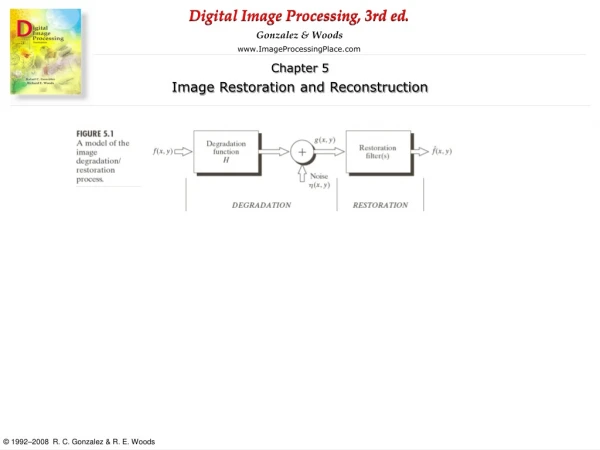
Boosting the Image of Boost Mobile’s ® Website. Ms. Victoria Castro, Web Design Consultant Engl.&235 J. Isern Fall 2013. Introduction Speaker: Victoria Castro, professional web design consultant hired by the marketing director of Boost Mobile ® What We W ill D iscuss T oday

E N D
Boosting the Image of Boost Mobile’s ® Website Ms. Victoria Castro, Web Design Consultant Engl.&235 J. Isern Fall 2013
Introduction • Speaker: Victoria Castro, professional web design consultant hired by the marketing director of Boost Mobile ® • What We Will Discuss Today • Review Visual Web Rhetoric • Discuss possible changes and propositions for the Boost Mobile ® website • Look at and compare two effective and ineffective websites • Use the Straight Talk website as a model of effective visual rhetoric in web design
The Importance of Visual Rhetoric on Wireless Pre-paid Phone Sites • How Effective Visuals Can Benefit Us: • Help us sell more phone products • Provide us with a positive image • Make our business appear professional • Visually appealing to viewers • How Ineffective Visuals Can Affect Us: • Make our business and website look unprofessional • Intimidate viewers • Give us a bad image • Cost us money in phone sales
Concerns with Boost Mobile ® Website • Lack of white space with a solid black background • Inconsistent text and colors • Sizes range from large to small • Orange • Gray • White • Cluttering of images (much of the same ones, which are phones)
White Space… • Allows for central eye focus • Makes a work appear professional • Brings sharp contrast and makes content easier to see • No white space • Causes the viewer to work harder while attempting to read and visualize a work • Too many colors look unprofessional Non-Distracting Title
Less Graphics • Do not overwhelm the viewer • Too many graphics • Overwhelm and intimidate the viewer, drawing them away • Make the work appear unprofessional
Inconsistent Text • Does not allow for a consistent and organized visual • Offends viewers • Consistent text • Helps the viewer feel at ease and allows for easy online navigation • Makes a work look professional
Straight Talk As a Model • Green center is surrounded by white space • Consistent text size (small) and color (black) • No crowded images
According to Our Model, What Changes Should Be Made? • Change Boost Mobile’s ® black background color and add more white space, which will allow central focus on the most important content of the site • Change text size and color in order to even the out the content in a consistent manner • Remove some of the images of phones which clutter the home page
Conclusion Comments, Questions, Concerns? Thank you.