Download
1 / 5
50 likes | 194 Views
In This article, you will focus on how to apply these fonts to web design using CSS and improve your typography the way you use them in your design projects. Let’s get started!

E N D
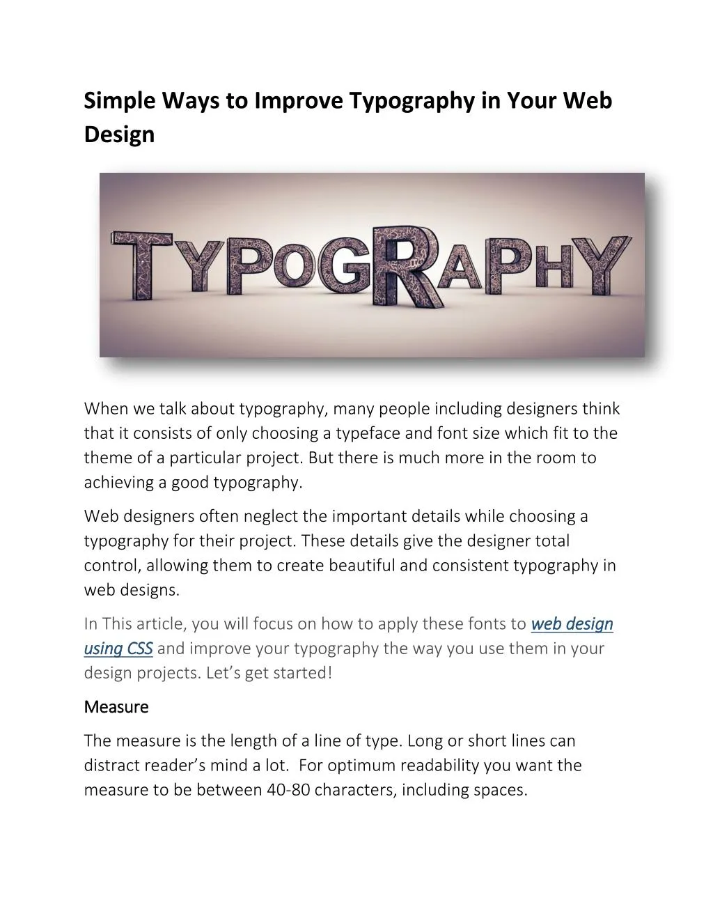
Simple Ways to Improve Typography in Your Web Design When we talk about typography, many people including designers think that it consists of only choosing a typeface and font size which fit to the theme of a particular project. But there is much more in the room to achieving a good typography. Web designers often neglect the important details while choosing a typography for their project. These details give the designer total control, allowing them to create beautiful and consistent typography in web designs. In This article, you will focus on how to apply these fonts to web design using CSS using CSS and improve your typography the way you use them in your design projects. Let’s get started! web design Measure Measure The measure is the length of a line of type. Long or short lines can distract reader’s mind a lot. For optimum readability you want the measure to be between 40-80 characters, including spaces.
A simple way to calculate the measure is to use Robert Bringhurst’s method p { font-size: 10px; max-width: 300px; } Leading Leading Leading is the space between the lines in a body of copy that plays a big role in readability. It improves the overall appearance of the text. A good rule is to set the leading 2 2- -5pt 5pt larger larger than than the the type type size size To get the right spacing body { font-family: Helvetica, sans-serif; font-size: 12px; line-height: 16px; } Hanging Hanging Quotes Quotes Hang quotes in the margin of the body of text. Hanging quotes keeps the left alignment intact and balanced hence improving readability. This can be achieved very easily with CSS using the blockquote element:
blockquote { text-indent: -0.8em; font-size: 12px; } Vertical Rhythm Vertical Rhythm A continuous continuous rhythm consistent grid .To keep a vertical rhythm in CSS, spacing must be equal the size of the baseline baseline grid grid. rhythm in in the the vertical vertical space space which keeps all the text on a body { font-family: Helvetica, sans-serif; font-size: 12px; line-height: 15px; } p { margin-bottom: 15px; } Widows and Orphans Widows and Orphans A widow widow is a short line or single word at the end of a paragraph. It can disturb the reading experience, avoided by adjusting the type size, leading, measure, wordspacing, and letterspacing.
Emphasis Emphasis Emphasize a word without interrupting the reader. Italic is widely considered to be the ideal form of emphasis. Scale Scale A scale establishes establishes a a typographic typographic hierarchy. hierarchy. An example of a typographic scale defined in CSS: h1 { font-size: 48px; } h2 { font-size: 36px; } h3 { font-size: 24px; } h4 { font-size: 21px; } h5 { font-size: 18px;
} h6 { font-size: 16px; } p { font-size: 14px; } We are done here! Hope the article will help you to improve your typography skills and the overall usability of your web design. iMediaDesigns is an toronto web development and Online Marketing agency for B2B and B2C clients in the luxury, fashion, lifestyle and retail industries.