Download
1 / 42
420 likes | 629 Views
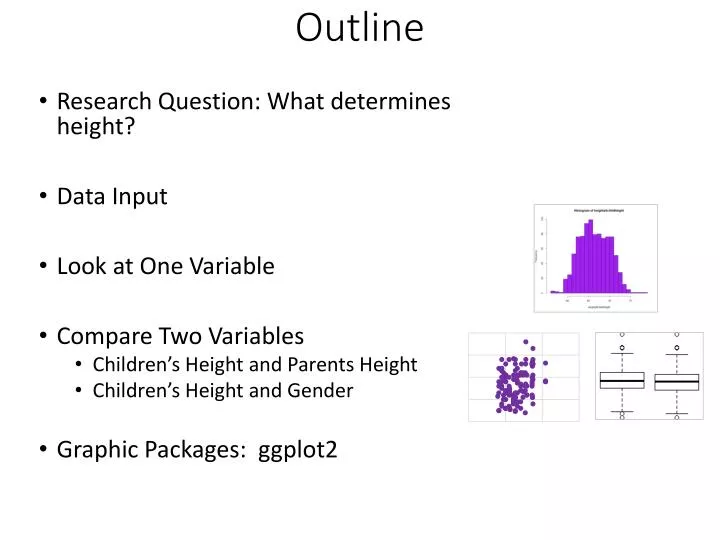
Outline. Research Question: What determines height? Data Input Look at One Variable Compare Two Variables Children’s Height and Parents Height Children’s Height and Gender Graphic Packages: ggplot2. What factors are most responsible for height?. Galton’s F amily Height Dataset. X1.

E N D
Outline • Research Question: What determines height? • Data Input • Look at One Variable • Compare Two Variables • Children’s Height and Parents Height • Children’s Height and Gender • Graphic Packages: ggplot2
Galton’s Family Height Dataset X1 X2 X3 Y
> getwd() [1] "C:/Users/johnp_000/Documents" > setwd()
Dataset Input h <- read.csv("GaltonFamilies.csv") Object Function Filename
str() summary() Data Types: Numbers and Factors/Categorical
Type Variable Steps Histogram Child’s Height Continuous Dad’s Height Scatter Continuous Mom’s Height Categorical Gender Boxplot
Frequency Distribution, Histogram hist(h$child)
Density Plot plot(density(h$childHeight)) Area = 1
Mode, Bimodal hist(h$childHeight,freq=F, breaks =25, ylim = c(0,0.14)) curve(dnorm(x, mean=mean(h$childHeight), sd=sd(h$childHeight)), col="red", add=T)
Grammar of Graphics Seven Components formations Legend Axes ggplot2 built using the grammar of graphics approach
Hadley Wickman and ggplot2 Asst. Professor of Statistics at Rice University ggplot2 plyr reshape rggobi profr http://ggplot2.org/
ggplot2 In ggplot2 a plot is made up of layers. Pl o t
ggplot2 library(ggplot2) h.gg <- ggplot(h, aes(child)) h.gg + geom_histogram(binwidth = 1 ) + labs(x = "Height", y = "Frequency") h.gg + geom_density()
ggplot2 h.gg <- ggplot(h, aes(child)) + theme(legend.position = "right") h.gg + geom_density() + labs(x = "Height", y = "Frequency") h.gg + geom_density(aes(fill=factor(gender)), size=2)
Children’s Height vs. Gender boxplot(h$child~gender,data=h, col=(c("pink","lightblue")), main="Children's Height by Gender", xlab="Gender", ylab="")
Subset Males men<- subset(h, gender=='male')
Subset Females women <- subset(h, gender==‘female')
Children’s Height: Males hist(men$childHeight)
Children’s Height: Females hist(women$child)
library(ggplot2) h.bb <- ggplot(h, aes(factor(gender), child)) h.bb + geom_boxplot() h.bb + geom_boxplot(aes(fill = factor(gender))) ggplot2
Type Variable Steps Y Histogram Continuous Child’s Height Dad’s Height X1, X2 Scatter Continuous Mom’s Height X3 Boxplot Categorical Gender
Correlation ?cor cor(h$father, h$child) 0.2660385
Correlations Matrix library(car) scatterplotMatrix(heights)
Analytics & History: 1st Regression Line The first “Regression Line”
Type Variable Steps Histogram Continuous Child’s Height Dad’s Height Scatter Continuous Mom’s Height Boxplot Categorical Gender
What software do you use for creating charts or data visualizations? BI Tools Spotfire Cognos MicroStrategy .net BIRT cytoscape flot gephi gnuplot graphite iDashboards Incanter Java JMP Ptotobi Silverlight splunk SSRS talend webGL Wijmo WPF Xcelcuis XLMiner LogiXML MDX Mondrian octave openlayers OpenViz PhP Powerpoint precog Prezi processing Javascript: Raphael Highcharts Arbor jfreecharts May, 2013 N=172
Visualization and Reporting Steep Learning Curve Easy to Use Standard Interactive Visualizations
BI Software: Tableau http://public.tableausoftware.com/views/PapelbonPitchFX/PapelbonPitchFX
The next data visual was produced with about 150 lines of R code