Download
1 / 13
150 likes | 309 Views
Displaying Data with Graphs. Dot Plot Stemplot. Describing a Graph. Center Shape Spread. Center. If you had to pick a single number to describe all the data – the center would be the best. It’s in the middle! Median – Half the numbers are larger & half are smaller.

E N D
Displaying Data with Graphs Dot Plot Stemplot
Describing a Graph • Center • Shape • Spread
Center If you had to pick a single number to describe all the data – the center would be the best. It’s in the middle! Median – Half the numbers are larger & half are smaller. Mean – average of the numbers
Shape • Are there any peaks? • Mode – occurs the most often. • Is it skewed? Where is the tail? • Skewed right – the tail is to the right • Skewed left – the tail is to the left
Shape – Are there modes? Bimodal Unimodal How many bumps are in the graph? – Those are modes.
Uniform – Don’t appear to have any mode. All bars are approximately the same height.
Symmetric? Can you fold it along a vertical line through the middle and have the edges math pretty closely? If so, then it’s symmetric.
Shape –Skewed? It’s skewed to the side of the longer tail. Positively Skewed or (Skewed right) Negatively Skewed or (Skewed left)
Shape – Unusual Features • Are there any stragglers, or outliers? • Are there any gaps?
Spread – (Variation) • How spread out is the data? • Range – Difference between highest & lowest • How spread out is the interquartile range? • IQR – the middle 50% • Is it tightly clustered around the center or spread out?
We looked at the base salaries of the CEOs of the 800 largest corporations in 1994. • Center – Centered around $500,000 • Shape – Unimodal, Nearly Symmetric, Some high outliers • Spread – Majority are between $100,000 and 1,000,000. But there are a few with salaries between $2,500,000 and $3,000,000
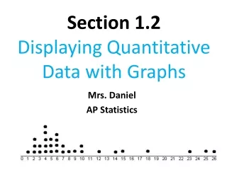
Dotplots How many classes are you taking?
Homework • Page 42 (37, 39, 41)