Download
1 / 32
320 likes | 328 Views
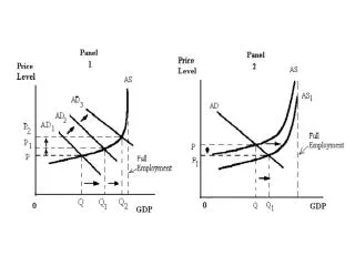
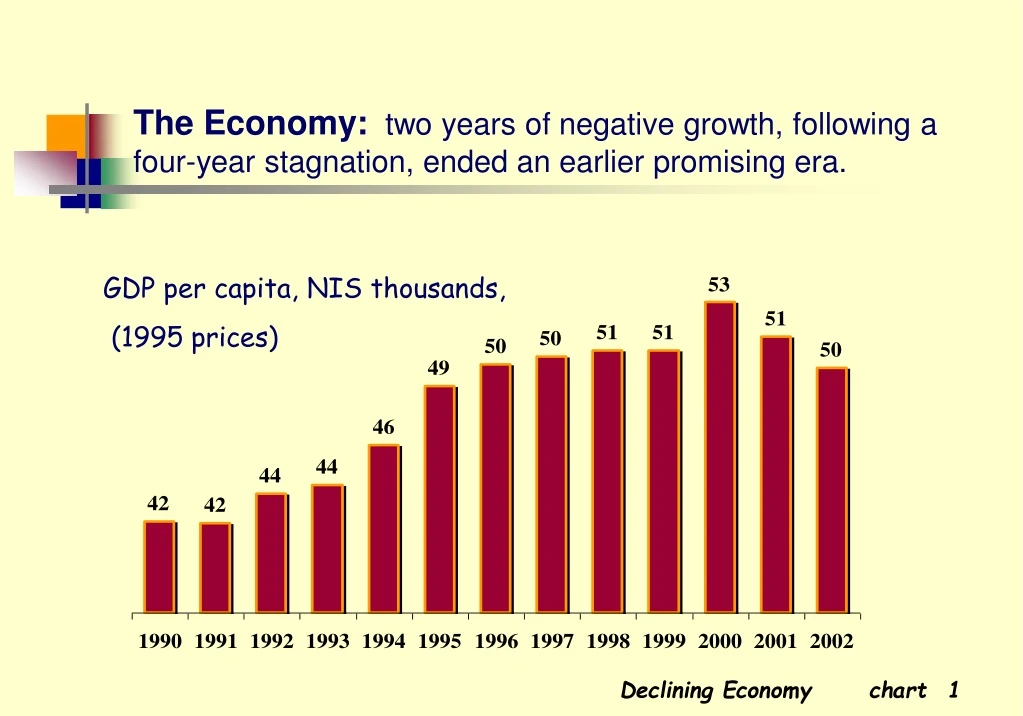
The Economy: two years of negative growth, following a four-year stagnation, ended an earlier promising era. GDP per capita, NIS thousands, (1995 prices). Unemployment: after declining, despite mass immigration, unemployment is once again rising. % unemployed.

E N D
The Economy: two years of negative growth, following a four-year stagnation, ended an earlier promising era. GDP per capita, NIS thousands, (1995prices) Declining Economy chart
Unemployment:after declining, despite mass immigration, unemployment is once again rising. %unemployed Declining Economy chart
Unemployment by Region: periphery towns suffer more unemployment than the center. %unemployed Declining Economy chart
Standard of Living - Public Opinion:Has your standard of living changed in the last 2-3 years? The majority feel a decline in their standard of living. Declining Economy chart
Income Needs - Public Opinion:Does your income meet your basic needs?One third feel barely able to meet their needs. Declining Economy chart
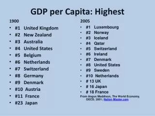
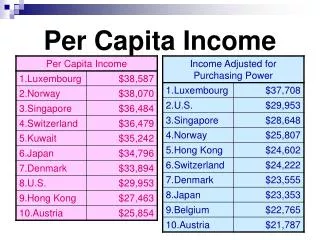
Gross Domestic Product: while lagging behind more developed countries as measured in per capita terms, Israeli ranking rises when examined per employee. Per capitaPer employed person US$, thousands The Positive Side chart
Exports: the past 20 years have seen a major shift from conventional industries to electronics. % of total exports The Positive Side chart
Information Technology: Israel has a high proportion of ICT in its business sector. Employment share is lower but still relatively high. % in Value-Added % in Employment The Positive Side chart
Occupational Structure: reflects reliance on academic and professional employment. The Positive Side chart
Income Distribution: those inthe lowest decile earn as little as 1/5 of those in the highest decile. Index, upper decile of income = 100 Deciles of income per standard person Income Distribution chart
Durable Goods Ownership: the lowest decile lags behind in access to computer technology and transportation. % of total in each decile Income Distribution chart
Families in Poverty: families living below the poverty line have leveled off at the high level of 16-17%. % of families below poverty line Income Distribution chart
Real Wages: a trend of rising real average wages has abruptly reversed. Index 1994=100 Income Distribution chart
Security - Public Opinion: Does the security situation influence your daily life?Over 50% feel a great impact. % of respondents Social Tensions chart
Violent Crime: the rate of violent crime doubled in the 90s; a major part, attributable to domestic violence. per 1000 population Social Tensions chart
Road Accidents: Israel has almost the highest number of road accident victims of all Western countries. per 100,000 population Social Tensions chart
Tolerance - Public Opinion: Is Israeli society tolerant of national, ethnic, or religious groups?The public perceives Israeli society as largely intolerant. Social Tensions chart
Foreign Workers: since the mid-90s, Palestinian laborers have been largely replaced by foreign workers. % of civilian labor force Social Tensions chart
Foreign Workers - Public Opinion: How should the government relate to foreign workers? Almost half think they should be prevented from entering and deported. Social Tensions chart
Government Outlays: social services are the largest component of the government budget. Total budget – US$ 60 billion Restrained Budget chart
Government Expenditure: stability following decline of government outlays from almost 60% of GDP to near 40%. Total budget, excl. debt servicing other defense social services Restrained Budget chart
In-Kind Social Services: after a short spurt in the early 90s, a moderate downward trend may be observed in education, health and welfare expenditures. % of GDP Restrained Budget chart
Unemployment Benefits: rising unemployment has led to a rapid increase in the number of people receiving unemployment and income support benefits. thousands Restrained Budget chart
Budget Cuts - Public Opinion: To what extent do budget cuts hurt social services? Most people say it has had a harmful effect. Restrained Budget chart
Social Gaps - Public Opinion: How does the budget affect socio-economic disparities? The public feels government policy has widened social gaps. Restrained Budget chart
University Enrollment: since reaching parity in 1985, more women now enroll in university than men. Enrolled as % of age group (20-29) Service development chart
Higher Education: over 40% of Israeli adults (age 25-64) have a post-secondary education. Service development chart
Education and Disparities - Public Opinion: Does the education system narrow social disparities? Only a minority see the education system as reducing disparities. Service development chart
National Health Expenditure: per capita expenditure is lower than in most Western countries. US$ Service development chart
Government Health Expenditure: expenditures failed to keep pace with population growth; per capita rates have declined to the level of the early 90s. Index: 1980=100 Service development chart
Health Care - Public Opinion: Do all enjoy the same level of health care? 80% feel that everyone does not receive equal treatment. Service development chart
Long-Term Care: The number receiving long-term care benefits increased dramatically. % of population aged 65+ Service development chart