Download
1 / 15
180 likes | 273 Views
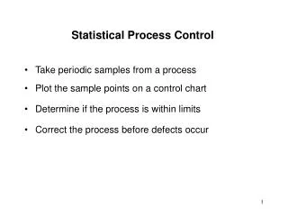
This course covers basics of creating control charts, advanced charting concepts, identifying out-of-control conditions, and calculating control limits. Real-life examples and decision trees are included for practical learning.

E N D
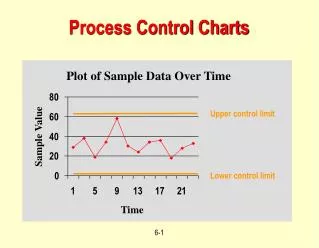
Control Charts An Introduction to Statistical Process Control
Course Content • Prerequisites • Course Objectives • What is SPC? • Control Chart Basics • Out of Control Conditions • SPC vs. SQC • Individuals and Moving Range Chart • Central Limit Theorem • X-bar and Range Charts • Advanced Control Charts • Attribute Charts • Final Points • Reference Section
Prerequisites • Learners should be familiar with the following concepts prior to taking this course • Variation • Mean and Standard Deviation • Histograms • Normal Distributions • Cp and Cpk • Capability Course is available on BPI website if you need to review these topics
Course Objectives • Upon completion of this course, participants should be able to: • Understand the basics of creating variable and attribute control charts • Understand the concepts of advanced control charting • Identify an out of control condition • Identify which control chart to use with each process • Calculate control limits for any control chart
Real Life Examples • Process: Driving to Work • Average Time: 12 minutes • Standard Deviation: 2.5 minutes • Common Causes • Wind speed, miss one green light, driving speed, number of cars on road, time when leaving house, rainy weather • Special Causes • Stop for school bus crossing, traffic accident, pulled over for speeding, poor weather conditions, car mechanical problems, construction detour, stoplights not working properly, train crossing
UCL A B C 2 S 6 S 4 S C B A LCL Nelson Tests for Control • Any point outside control limits • 9 consecutive points on same side of centerline • 6 consecutive points increasing or decreasing • 2 of 3 points in same zone A or beyond • 4 of 5 points in same zone B or beyond • 14 consecutive points alternating up and down • 15 consecutive points in either zone C • 8 points in a row outside zone C, same side of centerline ±2σ ±1σ ±3σ
Nelson Test #3 +3σ UCL A +2σ B +1σ C 0 CL C -1σ B -2σ A -3σ LCL Rule 3: 6 consecutive points increasing or decreasing
Individuals Chart UCL 6:55 PM0.204 CL 9:35 PM0.169 LCL
Central Limit Theorem Number of Samples = 100 Number of Samples = 66 Number of Samples = 50 Number of Samples = 40
X-bar and R example AVERAGE VARIATION Between Subgroup Variation Within Subgroup Variation
Range Chart 6:55 PM45 43 48 45 50 Range = 7 UCL CL 9:35 PM44 48 43 42 45 Range = 6 LCL Range = Max of Data Subgroup – Min of Data Subgroup
How to setup EWMA chart • Determine λ (between 0 and 1) • λ is the proportion of current value used for calculating newest value • Recommend λ = 0.10, 0.20 or 0.40 (use smaller λ values to detect smaller shifts) • Calculate new z values using λ = 0.10 zi = λ*xi + (1 – λ) * zi-1 (where i = sample number) 9.7495 = (0.9*9.945) + (0.1*7.99) 9.899 = (0.9*9.7035) + (0.1*11.6)
u chart • Plots the quantity of defects per part in a sample • Each part can have more than one defect • Use when sample size varies 11 total defects found on 6 documents u = 11/6 = 1.833 defects per document whereas p = 4/6 = 67% defect rate
Decision Tree for Control Charts What type of data: Attribute or Variable? Attribute Variable How are defects counted:Defectives (Y/N), or Count of Defects? How large are the subgroups? 1 2 to 5 5 or more Defectives Count Constant Sample Size? Constant Sample Size? X-bar and Range X-bar and Std Dev Individuals and Moving Range Yes Yes No No np chart(number defective) P chart(proportion defective) c chart(defects per sample) u chart(defects per unit)
Additional Resources Business Performance Improvementhttp://www.biz-pi.com