Download
1 / 15
160 likes | 496 Views
Tab Controls. ?Tab controls are used to organize related information through a convenient, folder/style U.I. structure that consumes little

E N D
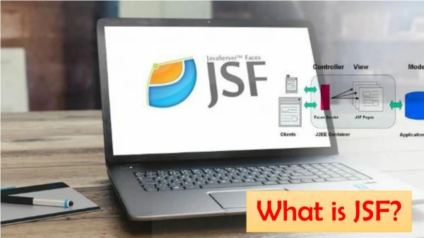
1. JSF Tab Controls This Learning Module shows how to develop server-side EGL applications with dynamic content organized in JSF Tab Components
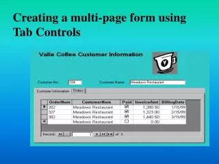
2. Tab Controls ?Tab controls are used to organize related information through a convenient, folder/style U.I. structure that consumes little �real estate�. See example below of a common master/detail page pattern. See Notes***
Let�s do a workshop that will show you how to create a page design pattern like this.
Tab Controls are a very popular form of data display. They allow users to click from one informational view to another rather easily, and are excellent display components � ESPECIALLY for one-to-many data models. For example, show a single customer�s details in a master section, then their purchases, returns, transactions, history, etc. all in different tabs. Tab controls are easy to create and use � and can be programmatically manipulated using the JSF Component Tree (see section later in this course). They also allow users to flip through them in the browser. Let�s check them out. Note that we�ll use a fairly detailed example � so this workshop will take a few minutes to complete�
Additional TechNotes:
Tab panels support two levels of Events:
Events that are across all of the panels in the tabs: onInitialPanelEnter and Exit, onInitialPanelShow
Events that are fired off ONLY when the user clicks a specific panel: onenter/onexit. You must be selecting a panel in the tooling, in order to see these events in the QuickEdit viewTab Controls are a very popular form of data display. They allow users to click from one informational view to another rather easily, and are excellent display components � ESPECIALLY for one-to-many data models. For example, show a single customer�s details in a master section, then their purchases, returns, transactions, history, etc. all in different tabs. Tab controls are easy to create and use � and can be programmatically manipulated using the JSF Component Tree (see section later in this course). They also allow users to flip through them in the browser. Let�s check them out. Note that we�ll use a fairly detailed example � so this workshop will take a few minutes to complete�
Additional TechNotes:
Tab panels support two levels of Events:
Events that are across all of the panels in the tabs: onInitialPanelEnter and Exit, onInitialPanelShow
Events that are fired off ONLY when the user clicks a specific panel: onenter/onexit. You must be selecting a panel in the tooling, in order to see these events in the QuickEdit view
3. ? Tab Controls � 1 of 2 � Create the Master Detail Record View Create a new .JSP page named: tabPage.jsp. Use a template. Add the page heading text, and drop an HTML table on the page: 3 Rows X 3 Columns. Width: 100% Add the literal text to the cells as shown below Add Output controls within the cells as shown below Optional � Using copy/paste (of existing) and/or Content Assist, add two new .CSS entries to stylesheet.css Add a new outputText class Add a new transparent row class For the Tab control