Download
1 / 9
90 likes | 143 Views
Discover how artists can utilize valid color schemes to evoke emotion, capture attention, and convey messages effectively in their work. Learn about various color schemes and their impact on creating elegance, vibrancy, harmony, and tranquility.

E N D
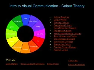
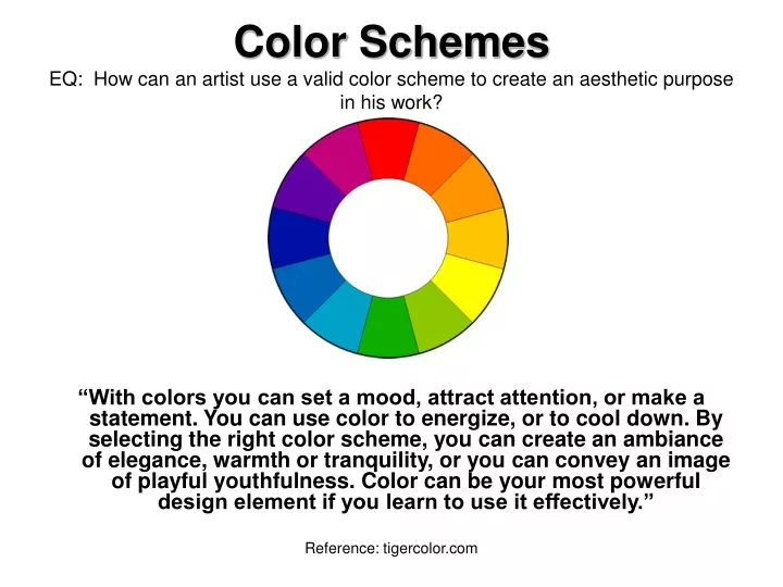
Color SchemesEQ: How can an artist use a valid color scheme to create an aesthetic purpose in his work? “With colors you can set a mood, attract attention, or make a statement. You can use color to energize, or to cool down. By selecting the right color scheme, you can create an ambiance of elegance, warmth or tranquility, or you can convey an image of playful youthfulness. Color can be your most powerful design element if you learn to use it effectively.” Reference: tigercolor.com
Monochromatic Color Scheme consists of different values (tints and shades) of one single color Reference: tigercolor.com
Complementary Color SchemeColors that are opposite each other on the color wheel are considered to be complementary colors (example: red and green). The high contrast of complementary colors creates a vibrant look especially when used at full saturation. Reference: tigercolor.com
Analogous Color SchemeAnalogous color schemes use colors that are next to each other on the color wheel. They usually match well and create serene and comfortable designs. Analogous color schemes are often found in nature and are harmonious and pleasing to the eye. Reference: tigercolor.com
Triadic Color Scheme A triadic color scheme uses colors that are evenly spaced around the color wheel. Triadic color schemes tend to be quite vibrant, even if you use pale or unsaturated versions of your hues. To use a triadic harmony successfully, the colors should be carefully balanced - let one color dominate and use the two others for accent. Reference: tigercolor.com
Split-Complementary Color Scheme The split-complementary color scheme is a variation of the complementary color scheme. In addition to the base color, it uses the two colors adjacent to its complement. Reference: tigercolor.com
Rectangle (Tetrad) Color Scheme (Double Complements). The rectangle or tetrad color scheme uses four colors arranged into two complementary pairs. This rich color scheme offers plenty of possibilities for variation. Tetrad color schemes works best if you let one color be dominant. Reference: tigercolor.com
Square Color Scheme: often Double Complementary. The square color scheme is similar to the rectangle, but with all four colors spaced evenly around the color circle. Square color schemes works best if you let one color be dominant. Reference: tigercolor.com
Neutral Color Scheme A color scheme that includes only colors not found on the color wheel, called neutrals, such as beige, brown, white, black, and gray.