Download
1 / 22
290 likes | 938 Views
Quality Control charts . Population vs Samples. Statistics can be gathered by collecting information from the entire collection of values or only a portion Population – a collection of all possible elements, values, etc associated with the situation Deductive or descriptive

E N D
Population vs Samples • Statistics can be gathered by collecting information from the entire collection of values or only a portion • Population – a collection of all possible elements, values, etc associated with the situation • Deductive or descriptive • Sample – a subset of elements or measurements taken from a populations • Inductive • Quality control relies on inductive statistics
Sampling • Store orders 1000 shirts • 200 blue, 800 white • Should the manager check all? • Easier way – collect samples of 10 at random and check how many are blue
Types of data • Variable data • Measured characteristics • Tend to be continuous • Attribute data • Observable characteristics • Tend to be discrete • Data can be grouped or ungrouped
Accuracy, Precision, Error • Accuracy – how far from actual value • Precision – ability to repeat the same measurement and get the same value • Error – how far a measured value is from the true value
Data representation • Histograms and frequency diagrams are similar • They show distribution • Data are grouped into cells • Find range and interval.
Data analysis • Central tendency • Mean • For population • Average • When data is from a sample
Data analysis • Range • R = Xmax – Xmin • Standard deviation • Shows dispersion of data within the distribution • Population • Sample
Variable control charts • Decision making tools • Determine “out-of-control” condition • Process capability • Problem solving tools • Locate/identify cause for poor quality • Monitor production
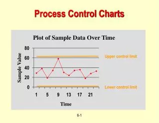
Control charts • Samples are taken • Averages of the subgroups plotted • Centerline of the chart is the central tendency (mean or average) • Chart has upper (UCL) and low (LCL) control limits • They represent +/-3
and R charts • Monitor subgroup averages from sampled data • R monitors deviation from average range • Choose sample size • Determine average of the subgroups • Compute UCL and LCL • Plot data • If falls within the limits, accept population else investigate or reject
For chart UCL = + 3 LCL = - 3 If the sample size of the subgroup is between 4 and 10, the distribution is nearly normal Shewart developed an approximation for 3 for small subgroup sizes (<20) and R charts
and R charts • UCL= +A2 • LCL= +A2 • A2 3 • Centerline is
and R charts • The R chart is to show the variation of the ranges within the subgroups • For R chart • UCL = + 3R • LCL = - 3R • Centerline is • For small subgroup sample sizes • UCL= D4 • LCL= D3
Control charts for attributes • Attributes are characteristics associated with a product or service and are not easily measurable • Used when measurements may not be possible
Control charts for attributes • Advantages • Relatively easy • Inexpensive • Easy to use for service type OS • Disadvantages • Does not provide reason for non-conformity • Do not provide detailed information
Control charts for attributes • p – charts • Binomial distribution • Fraction of non-conforming parts, p • Constant sample size, n • Collect data • Track number of non conforming parts, np
p – charts Compute the mean fraction of non-conforming parts for all the samples, which is the centerline for the chart, UCL and LCL = Control charts for attributes
c – charts number of non-conforming parts, c Used when non-conformities are scattered through a continuous flow of product inclusions or cracks on sheet metal surface Specify what is to be inspected eg. Number of cracks per 3 square feet. Control charts for attributes
c – charts Calculate centerline UCL and LCL = Control charts for attributes