Download
1 / 18
180 likes | 192 Views
Learn the key points and best practices for creating visually appealing and effective infographics that engage your audience and convey information effectively.

E N D
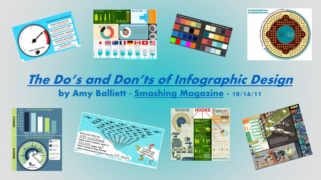
The Do’s and Don’ts of Infographic Design by Amy Balliett - Smashing Magazine - 10/14/11
KEY POINTS FROM The Do’s and Don’ts of Infographic Designby Amy Balliett - Smashing Magazine - 10/14/11 • The term “data viz” comes from “data visualization,” which implies that sets of data will be displayed in a unique way that can be seen, rather than read. • Today, infographics compile many different data visualizations into one cohesive piece of “eye candy.” • Show, don’t tell – display information visually and dress up conventional graphs and charts whenever possible • Think about interesting organization – will your information flow vertically? horizontally? be divided in sections? tell a story by having a beginning, middle, and end? • Use color – often using three colors that work together is easy for your audience’s eyes Notice how the info about government healthcare is depicted using an IV bag, which is a medical tool of healthcare. The idea of government is depicted by the national flags.
As you examine main types of infographics, click on the button to view the entire infographic.
TYPE 1: “How to” A pictorial guide to doing something
TYPE 2: Evaluation • The Best… • The Worst… • The Most Unforgettable… • The Scariest…
Type 3: Information— Topic or Person What does someone MOST need to know to understand in at least a basic way?
TYPE 4: Compare/ Contrast Look at the differences between two things
TYPE 5: Top 10 (or whatever number) List Identify key factors related to a topic
Type 6: The History of… What key events are crucial in understanding the development or evolution of a topic?
Next Steps: Select a topic that you find interesting and on which you’d like to conduct some brief, basic research. Fill in the research sheet provided to you in class. Create your own infographic according to one of the main types you just explored (see left). Review the GAPSTone considerations on the next slide as well.
As you create your infographic, • be sure to consider the categories of GAPSTone: • You will be filling in a graphic organizer to explain • how these elements are evident in/lend meaning to your infographic. • G = Graphics (font, images, colors, layout, etc.) • A = Audience • P = Purpose • S = Subject • Tone = Your feeling/attitude/opinion toward the content
As you start to design your infographic, give thought to the visual choices: • Background • Chart/pie graph/bar graph format • Images • Font • Color • Lay-out • Be creative and visually engaging! • See samples on the next few slides.
Note that the pie chart is placed within the “Uncle Sam” hat to reflect the focus on America’s budget issues. Clever! An infographic on people and their tablets is shaped like an iPad!
The bookshelf background is logical and creative in portraying info about writing mistakes; separating info within books is also a relevant way to organize information.
The background design resembles a subway/metro system to hint at the idea of a vast network of companies/ services associated with Amazon.
In this excerpt of an infographic, the Lego background grabs attention, AND it is connected to the topic.
The visual incorporates effective overlays to demonstrate how Godzilla has been sized for films over the years. What would be even more interesting might be notes about how the size reflects social issues/concerns during the year of the movie’s release. For instance, look how big Godzilla is in 2014. Is that because audiences want impressive special effects? Is it because in a post 9-11, terrorized, diseased, financially struggling world people need a mega-hero (remember that in the most recent film, Godzilla saves the day)?