Download
1 / 46
490 likes | 790 Views
Statistics. Graphic distributions. What is Statistics?. Statistics is a collection of methods for planning experiments, obtaining data, and then organizing, summarizing, presenting, analyzing, interpreting, and drawing conclusions based on the data. Uses of Statistics.

E N D
Statistics Graphic distributions
What is Statistics? Statistics is a collection of methods for planning experiments, obtaining data, and then organizing, summarizing, presenting, analyzing, interpreting, and drawing conclusions based on the data.
Uses of Statistics “Some students choose it because it is required, but increasing numbers do so voluntarily because they recognize its value and application to whatsoever field they plan to pursue. Because employers love to see a statistics course on the transcript of a job applicant, you will have an advantage….” Mario F. Triola
Abuses of Statistics Small samples Precise numbers Guesstimates Distorted percentages Partial pictures Deliberate distortion
More Abuses Loaded questions Pictographs Bad Samples Pollster Pressure Misleading graphs
Exploratory Data Analysis Just as an explorer crossing unknown lands tells what he sees, we will be describing the data that we find. • Examine each variable • Describe relationship • Begin with a graph
Nature of Data • Quantitative Data – (QUANTITY) Numbers representing counts or measurements • EX: • Qualitative or Categorical Data – (QUALITY) Separated into different categories that can be divided into non-numeric characteristics • EX:
M&M Experiment Method of collecting data: Weigh candies using a digitized scale, check color, and record.
What variables are recorded here? • What type of variables are they?
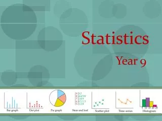
Frequency distribution Bar Graph Stacked Bar Graph Pie Charts Dot Plots Histograms Stem and Leaf Plot … Types of Graphic Representations
Box and Whisker Time Plot Scatter Plot Cumulative Plots Normality Plot Normal Distribution
Frequency Distribution • Pattern of variation • The distribution tells what values a variable takes and how often • Raw Data
Use of Categorical data Attractive Heights show counts More flexible than pie charts Vertical and Horizontal Can distort values Bar Graph
Methods of Travel BAR GRAPH EXAMPLE
Used to distinguish two or more categories of the same variable Great for comparing/ contrasting two variables Can be a little difficult to distinguish size Stacked Bar Graph
Visual Attractive Uses categorical data Easy to interpret Difficult to make precise Must use percents Close values difficult to differentiate Pie Charts
Flavors of Ice Cream PIE CHART EXAMPLE Guess what percentages these slices represent…
Flavors of Ice Cream PIE CHART EXAMPLE Were you close?
Good Visual Quantitative data Check for overall pattern Difficult with large amounts of data Dot Plots
Theme Park Attendance Per Day DOT PLOT EXAMPLE East Coast Resorts per thousand West Coast Resorts per thousand
Don’t Forget your socks –SOCS S – Shape O –Check for outliers C– Describe the center S – Describe the spread Tools for Interpretation
S – Shape • Symmetric? • Skewed to the left? • Skewed to the right ? • Bimodal?
O –Check for outliers • Stuff that is outside of the normal range • Details Later
C– Describe the center Values of central tendency: • Mean • Median • Mode • (Range)
S – Describe the spread • Wide spread? • Narrow Spread? • Uniform? • IQR • Range • Standard Deviation
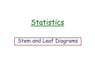
Sometimes data is too spread out to make a reasonable dot plot Five stems is a good minimum More flexible by rounding Easy to construct Hard with large data sets Stem and Leaf Plot
Home Run Hits comparison • Barry Hank • Bonds vs. Aaron • 9 613 • 5 5 42 0 4 6 7 9 • 7 7 4 4 3 330 2 4 4 8 9 9 • 9 6 2 040 0 4 4 4 4 5 7 • 5 • 6 • 37 17 = 17 hits
Quantitative variables Divides data into classes of equal size Visual may distort understanding Histogram
Easy to compare quartiles Outliers seen on modified boxplot Side by side = best comparison Difficult to determine size of data Can be misleading Show less detail Box and Whisker Plots
Time Plot • Variables observed over time • Horizontal axis has the time scale • Check for overall pattern • Does not show what happens WITHIN that time period!
Shows relationship of two variables Can determine overall tendencies Can determine strength of relationship Not all relationships are linear Scatter Plot
Cumulative Plots Commonly confused with bar graphs • Also known as an ogive (“oh-jive”) • Adds onto each progressive column Rabbits born in a month 1 2 3 4 5Week
Questions???? • The end!!!