Download
1 / 26
260 likes | 425 Views
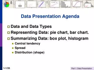
Presenting effective Tables and Figures. Data Presentation. Adapted by Joanna Wolfe from Marianne W. Zawitz , Bureau of Justice Statistics, October 11, 2000. This presentation covers the principles of creating good technical graphs and tables. 1. Provide descriptive captions.

E N D
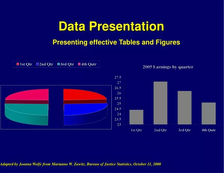
Presenting effective Tables and Figures Data Presentation Adapted by Joanna Wolfe from Marianne W. Zawitz, Bureau of Justice Statistics, October 11, 2000
This presentation covers the principles of creating good technical graphs and tables. 1. Provide descriptive captions. 2. Consider your “story” and audience when presenting data. 3. Avoid non-data ink. 4. Be ethical: Persuade but do not deceive.
Always label tables and figures. Percent with Ulcer Recurrence Weeks Figure 2: Recurrence of Gastric ulcers for the year after successful healing with ranitidine alone or triple therapy plus ranitidine. No maintenance was given.
Graphs excel at emphasizing trends and relationships while tables display exact values in a small amount of space. Table 1: Recurrence of Gastric Ulcers by Therapy Type Fig 2: Recurrence of Gastric Ulcers by Therapy Type
Bar graphs are good for communicating differences between values.
Pie charts are bad for complex data or when precision matters. Bureau of Justice Statistics Which slice is biggest? Which is smallest? By how much?
Bar charts allow readers to visualize differences between variables. Which bar is biggest? Which is smallest? By how much?
Tables allow readers to see EXACT differences between variables and exact values. A 21 B 19 C 18 D 14 E 12 F 9 G 7 Which value is biggest? Which is smallest? By how much?
The visualization expert Edward Tufte says "the only thing worse than a pie chart is two pie charts." Which military branch grew the most between 1990 and 1998?
Bar charts simplify comparisons. Which military branch grew the most between 1990 and 1998?
Which visualization is best for a technical audience? A 21 B 19 C 18 D 14 E 12 F 9 G 7
Summary so far: • Always supplement tables and figures with text: label axes and provide an informative caption. • Use bar charts or tables to compare values. • Use line graphs to show trends. • Use tables when exact values are important. • Only use pie charts for simple data and non-technical audiences.
Strive for simple designs that show the data. Avoid non-data ink. Avoid 3D.
3D charts add non-data ink and are more difficult to read than 2D charts. Is 1987 above or below 60 million? What about 1988? 1990?
Hidden data is a common problem with 3D presentations of 2D data Bureau of Justice Statistics
A simple line chart in 2 dimensions avoids hiding data South West Midwest Northeast Bureau of Justice Statistics
The purpose of a chart is to convey data so avoid non-data ink. • Grids • Ticks • Frames • Anything that does not convey data Bureau of Justice Statistics
Excess tick marks can make charts hard to read. Age of offender 18 years old 17 16 15 13-14 Bureau of Justice Statistics
Removing tick marks make trends easier to see. Age of offender 18 years old 17 16 15 13-14 Bureau of Justice Statistics
Avoid hatched fill patterns, which are hard to look at. Criminal history of detained vs. released felony defendants, 1990 Prior criminal history Arrest Any conviction Felony conviction Violent felony conviction
"Simplicity of design and complexity of data" Edward R. Tufte Bureau of Justice Statistics