Download
1 / 65
650 likes | 896 Views
Page design and layout for improved usability. CSCI 4800/6800 Spring 2005. The importance of page design. “Page design is the most immediately visible part of web design.” Jakob Nielsen, Designing Web Usability Has an effect on how people will judge your site Crucial to enhancing usability.

E N D
Page design and layoutfor improved usability CSCI 4800/6800 Spring 2005
The importance of page design “Page design is the most immediately visible part of web design.” Jakob Nielsen, Designing Web Usability • Has an effect on how people will judge your site • Crucial to enhancing usability
Page layout and design Eye flow and information processing Establishing a visual hierarchy Use of screen real estate Devote most space to content Design “above the fold” Common location of page elements Download (response times)
Eye flow “Good design is based on eye flow. The more eye movement required within a visual field, the less information can be received and processed.” Duff & Mohler, 1996 • Relationship between • Eye flow • Information processing
Natural eye flow • Movement is from the Primary Optical Area to the Terminal Anchor • Wavy lines indicate movement that the eye naturally resists • Crosses are fallow areas on the page/screen • Colin Wheildon, Type and Layout
Issues with reading online • Minimizing eye movement in web page design is even more important than in print • It is harder to read online • Around 80% of users scan pages • Users attention span is short • Paradox of the active user
How to reduce eye movement • Don’t put important, distracting or eye catching objects in the areas of the screen that causes movement the eye resists • Top right • Bottom left • Important items might be missed • Eye catching items might cause users to miss important content
How to reduce eye movement • Recognise that elements on pages create shapes • Text blocks • Headings • Images • Use the squint test tocheck your page layout
How to reduce eye movement • Draw imaginary grids
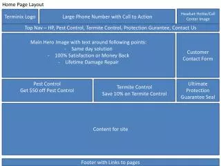
Reducing eye movement Making all the images a uniform size would improve the layout of this page
Reducing eye movement • Use left alignment for text and headings • It is no accident that this is the most used alignment • Not only reduces eye movement • Also places a fixed point on the page from where all headings and text can be scanned
Page layout and design Eye flow and information processing Establishing a visual hierarchy Use of screen real estate Devote most space to content Design “above the fold” Common location of page elements Download (response times)
Visual hierarchies “One of the best ways to make a page easy to grasp in a hurry is to make sure that the appearance of things on the page… clearly and accurately portrays… which things are related and which things are part of other things…” Steve Krug, Don’t Make Me Think • Relationship between • Placement of objects on a page • Information processing
Establishing a visual hierachy • Design and layout of information to • Show importance or priority • Show relationships between elements • Aid scanning and comprehension
Show importance or priority • Make important elements bigger, bolder • Position important elements nearer to the top of the page • Use a stronger colour for important elements • Use whitespace around elements to make them stand out
Show importance or priority Newspapers do this well Headline story, then secondary stories…
Show importance Government entry point – all departments shown on equal footing Some priority content is highlighted
Show relationships between elements • Use positioning • Grouping shows family relationship • Nesting shows child relationship • Proximity shows similarity • Use presentation styles • Size, colour, font style, orientation
Show relationships Family relationship Child relationship
Aid scanning and comprehension • Provide visual relief from dense chunks of text • Use meaningful headings and sub-headings • Turn lists and series into bullet points • Emphasize key words or phrases within paragraphs • Create contrasts between page elements • Present appropriate content as tables, graphs, charts, images
Aid scanning Headings and sub-headings Bulleted lists
Aid scanning Too much dense text Hyperlink colour doesn’t stand out enough
Aid scanning Too much dense text Hyperlink colour doesn’t stand out enough
Aid scanning Still too hard to scan links to main content
Page layout and design Eye flow and information processing Establishing a visual hierarchy Use of screen real estate Devote most space to content Design “above the fold” Common location of page elements Download (response times)
Use of screen real estate • Most users visit sites for their content • So, the first rule concerning the use of screen real estate is: • Devote most of the screen real estate to content
Devote screen real estate to content Content is displayed inside a small frame. No scrolling would be required if the frame was removed
Devote screen real estate to content Content is displayed inside a small frame, requiring more scrolling than would otherwise be necessary
Page layout and design Eye flow and information processing Establishing a visual hierarchy Use of screen real estate Devote most space to content Design “above the fold” Common location of page elements Download (response times)
Use of screen real estate • Users are in a hurry • Not sure if this page is the right page • So, the second rule concerning the use of screen real estate is: • Design ‘above the fold’
Scrolling behaviour • Early studies (1994/5) showed that users were reluctant to scroll • Not true any more, but • Users will not scroll unless they think the content they’re looking for is on that page • So, give good clues above the fold about what’s below the fold
The fold moves • Variations in screen displays means that the page fold is not static • Different display resolutions (640x480, 800x600, 1024x768, etc.) • Browser toolbars also take up space • Safe space is around 300 pixels
“Above the fold” Real content is hidden below the fold
Page length and scrolling • As a rule of thumb • Home page: 1 screen • Level 2 page: 2 screens • Level 3 page: 3 screens • Caution: pages can be accessed directly
Horizontal scrolling Users don’t expect horizontal scrolling
Page layout and design Eye flow and information processing Establishing a visual hierarchy Use of screen real estate Devote most space to content Design “above the fold” Common location of page elements Download (response times)
Common location of page elements • Some design conventions exist • Logo at top left or centre • Logo increasingly functions as a link to home page • Navigation at top and/or left • Right side navigation increasing • Practise of repeating links in text at bottom of the page is decreasing
User expectations study • Conducted at Wichita State University Usability Research Lab (SURL) 2000 • 304 participants (128 male, 183 female) • Age range 18-63 (average 20) • Internet experience > 1yr (mean 3 yrs) • Primary surfing goal - education
Example Logo placement Navigation placement Search placement
Example Logo placement Navigation placement Search placement
Example Logo placement Navigation placement Search placement
Example Logo placement Navigation placement Search placement