Download
1 / 28
280 likes | 418 Views
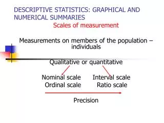
GRAPHICAL DESCRIPTIVE STATISTICS FOR QUANTITATIVE DATA. Graphical Techniques Quantitative Data. Histograms Consider Boundaries of measurement classes Choose values that are easy to read/understand Number of classes will “fall out” Where to place data occurring at “break points”

E N D
Graphical TechniquesQuantitative Data • Histograms • Consider • Boundaries of measurement classes • Choose values that are easy to read/understand • Number of classes will “fall out” • Where to place data occurring at “break points” • Excel – in the lower interval • Inclusion of Outliers? – unrepresentative data far above or far below most of the rest of the data • Seek reason for outliers • Relative Frequency (Percentage) Histograms • Cumulative Relative Frequency Ogives
Frequency Distributions • Take a Survey of Incomes of 200 High School Graduates 2 Years After Graduation • Results: $31,500, $26,900, …., $26,100 • Create Class Intervals So Data Can Convey Information • Not too many • Not too few • Include All Data (?) --- Outliers • Intervals of Equal Size
Results Income Frequency Rel. Freq. $15,000-$20,000 9 9/200 = .045 $20,000-$25,000 34 34/200 = .170 $25,000-$30,000 91 91/200 = .455 $30,000-$35,000 61 61/200 = .305 $35,000-$40,000 5 5/200 = .025
RELATIVE FREQUENCY HISTOGRAM Same shape as histogram – different scale on y-axis
Check Analysis Tool Pak Check Analysis Tool Pak-VBA Click OK EXCELDATA ANALYSIS • Go to Tools Menu • Select Data Analysis • What If Data Analysis Isn’t There? • Go to Tools Menu • Select Add-Ins
EXCELHistograms • Basic Approach: • Put Data in a Column • Create Bins (Measurement Classes) • Go To Tools Select Data Analysis Select Histogram Check Chart Output
2. First entry should be less than lowest value – actually the lower bound of the first measurement class – this allows us to begin the histogram at a value >0. 1. Enter label for X-Axis + 3. Enter the upper bound of the first measurement class 4. Highlight the first two entries and drag down to the upper bound of the last measurement class CREATE BINS
Go to ToolsSelect Data Analysis Select Histogram TOOLS/DATA ANALYSIS/HISTOGRAM
Enter • cells containing data including label • Enter • cells containing bins including label • Enter • where you want the output 3. Check Labels 4. Check Chart Output Histogram Dialogue Box
Grab Lower Corner and drag to resize Resizing
Change Numbers to Midpoint Values Delete first entry (15000) and last entry (More) Click in Grey Area and Delete Click and Rename Click and Delete To close gap width: Right mouse click on a bar Select Format Data Series Select Options Set Gap Width = 0 Result of Resizing
Relative Frequency • Proportion of Data in a Particular Class • Divide Frequencies by 200 gives these results:
Relative Frequency Histogram • Change the numbers on the y-axis to percentages • Can manipulate Excel Histogram • Numbers on Y-axis appear in column B • Somewhere create a cell with the formula =B2/200 (Say in cell B12) • Drag down until all relative frequencies are shown • Highlight this new set of numbers and press COPY • Then PASTE SPECIAL (Values) these numbers back into cell B2 • Erase numbers in cells B12 and below • Change Name in cell B1 and on Y-Axis to Relative Frequency
2. Select Copy 3. Put cursor in cell B2 • Go to Edit • Select Paste Special 5. Select Values 1. Enter =B2/200 Drag to B18 Then highlight B12:B18 Creating Relative Frequencies
6. Change to Relative Frequency 7. Highlight and delete Creating Relative Frequencies
Cumulative Relative Frequencies • Give the proportion of values that are less than the upper boundary point of the class • Cumulative frequency for first class is the relative frequency • For subsequent classes cumulative frequency = relative frequency + cumulative frequency of previous class
The same as the relative frequency .670 = .455 + .215 Cumulative Relative Frequencies
Ogives • Line graph of cumulative relative frequencies • Begin with y-value = 0 at $15,000 and draw line to .045 at $20,000 • Draw line from .045 at $20,000 to .215 at $25,000 • Draw line from .215 at $25,000 to .670 at $30,000 • Draw line from .670 at $30,000 to .975 at $35,000 • Draw line from .975 at $35,000 to 1 at $40,000 • Draw line flat at 1 (to infinity)
0.44 27500 Using Ogives to Approximate Prob (Income < $27,500)
Check both EXCEL Ogives
4. Change Names 5. Right Mouse Click On any bar --Delete 1. Resize 3. Delete Background 2. Delete Legend 6. Delete More
Review • Frequency Distributions • Frequency Histograms • Relative Frequency Distributions • Relative Frequency Histograms • Cumulative Relative Frequencies • Cumulative Relative Frequency Ogives