Download
1 / 39
400 likes | 420 Views
Explore the transition from cartography to geospatial data visualization, covering Tufte’s principles, digital techniques, and the importance of ethics and visual noise. Gain insights into creative visualization processes and principles by examining real-world mapping examples and data visualization resources.

E N D
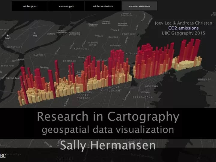
Joey Lee & Andreas Christen CO2 emissions UBC Geography 2015 Research in Cartographygeospatial data visualization Sally Hermansen
What are we going to do today • Get us thinking about geospatial data vis – some cool web sites • Review cartographic communication as you have been exposed to in 270/372 • From Cartography to Geospatial data Visualization: • Process • Tufte’s principles of visualization • Digital Transition • Politics • Review the course: web site; weekly schedule; assessment • Assignment 1
1. Get us thinking about geospatial data vis – some cool web sites • New York Times: Irma maps Monday Sept 11/17 • https://www.nytimes.com/interactive/2017/09/05/us/hurricane-irma-map.html?_r=1&emc=edit_nn_20170911&nl=morning-briefing&nlid=80589880&te=1
What are we going to do today • Get us thinking about geospatial data vis – some cool web sites • Review cartographic communication as you have been exposed to in 270/372 • From Cartography to Geospatial data Visualization: • Process • Tufte’s principles of visualization • Digital Transition • Politics • Review the course: web site; weekly schedule; assessment • Assignment 1
2. Cartographic Communication System 360.here.com real world map user GIS analyst/ cartographer’s conception of the real world map map DECODING 472 ENCODING 270/372 visual noise
Map Design (270/372) • Acquire data: check, review, edit, filter, parse • Classify, analyze, mine data: best method • Represent data: • map elements - symbology • figure/ground - balance • Ethics, audience, visual noise
What are we going to do today • Get us thinking about geospatial data vis – some cool web sites • Review cartographic communication as you have been exposed to in 270/372 • From Cartography to Geospatial data Visualization: • Process • Tufte’s principles of visualization • Digital Transition • Politics • Review the course: web site; weekly schedule; assessment • Assignment 1
3. From Cartography to Geospatial Data VisualizationLets get more creative… and this does not necessarily mean more complex • http://www.informationisbeautiful.net/visualizations/the-hollywood-insider/ • http://www.nytimes.com/interactive/2016/09/12/science/earth/ocean-warming-climate-change.html • MIT sensible cities lab http://senseable.mit.edu/
Geospatial Data Visualization Introduction to Dodge, McDerby and Turner Geographic Visualization • Looking: Explanation • Presentation graphics, maps, charts • Static, dynamic, animation, 3D • Querying Exploration • Visual interfaces for info access • Data mining • Questioning Exploration • Probe and drill down from presentation graphics • Interaction: change projections, filtering, classification, linked displays, real-time response • BBC Gapminder (4 minutes) http://www.gapminder.org/videos/200-years-that-changed-the-world-bbc/
a) Visualization ProcessIntroduction to Dodge, McDerby and Turner Geographic Visualization GOAL: helping people see the unseen • see complex relationships, • clear understanding of phenomenon, • reduce search time • reveal relationships • classics: London Tube and Minard’s Napoleon March map Theoretical Process: • Cognitive process of learning through the active engagement with graphical signs. • A cognitive shorthand for places and processes Technical Process…
b) Tufte’s Principles of Visualization • Visual Explanations • Envisioning Information • Beautiful Evidence
Goals of the Course = Goals of Tufte’s books: • Creativity in Envisioning Information • Representing knowledge with integrity through Visual Explanations • Leaving behind Beautiful Evidence
Envisioning InformationEscaping flatland image number word art
Visual Explanations Develop methods to: Describe Illustrate Construct Knowledge Clarity and Excellence in Thinking Clarity and Excellence in Data Display
The importance of Visual Explanations: cause and effect Decision to Launch Space Challenger • Jan. 28, 1986 • Perhaps Tufte’s greatest story • Page 38 VE
Tufte, BE, p 122-139Minard’s Map: analysis Tufte’s Principles: • Comparisons • Compared to what? 422 to 10 only 1 in 42 survived; 22,000 died in 2 days river • Causality, Mechanism, Structure, Explanation • Termperature (reaumur scale, like C) starts at 0 or freezing, and • Time: retreat Oct to Dec. 7th • Multivariate Analysis • 6 variables: size, location (x and y), direction, temp, date • Integration of Evidence: words, numbers, images, diagrams: mixed methods • Documentation : titles, authors, data source info, scales • Content counts: quality, relevance, integrity of content These principles are rooted in cognitive tasks – are relevant for Producing presentation and consuming presentations Analytical thinking: 1. causality 2. comparison 3. multivariate complexity
c) Digital TransitionIntroduction to Dodge, McDerby and Turner Geographic Visualization • Since 90s: rapid development and diffusion of information and communication • Mapquest, google maps, openstreetmap • Cheap, powerful computer graphics • Web mapping; on-line GIS tools, interactive mapping • Visualizations seen increasingly as transitory info resources, created at the moment and discarded after use
Huge change in geospatial data: • from UBC geography Getdata to • open data captured by governments and industry to • citizen science data or Volunteer Geographic Information • Big Data: sensors can now capture massive amounts of data in real time
Carlo RattiDirector MIT Sensible Cities lab Big data on cities + technology + design = Making cities smartergreenerhealthier
Carlo RattiDirector MIT Sensible Cities lab • http://senseable.mit.edu/livesingapore/visualizations.html • Underground project • MIT team: “economists, engineers, data scientists, biologists, mathematicians and data visualizers”
Carlo RattiDirector MIT Sensible Cities lab “he has figured out how to line up art and science, to merge a visual repertoire with one based on technology” AZUREMAGAZINE, Sept 2017
d) Politics of VisualizationIntroduction to Dodge, McDerby and Turner Geographic Visualization • Methodology of data selection design process • Subjective process: decision to include, exclude, represent, message • Data integrity – with all this open data, software, hackathons, github, forking…. We are losing meta data – data lineage and data integrity.
Data integrity? • https://zhang341.carto.com/viz/62f69b08-536d-11e6-b8f1-0e3ebc282e83/public_map • Versus • http://www.tampabay.com/projects/2015/investigations/pinellas-failure-factories/
What are we going to do today • Get us thinking about geospatial data vis – some cool web sites • Review cartographic communication as you have been exposed to in 270/372 • From Cartography to Geospatial data Visualization: • Process • Tufte’s principles of visualization • Digital Transition • Politics • Review the course: web site; weekly schedule; assessment • Assignment 1
4. The Course http://blogs.ubc.ca/advancedcartography/ http://vancitytrees.tumblr.com/ https://ubcwellbeing.wordpress.com/
Goals of Course • Understand geospatial data visualization process from raw data to interactive web maps (encoding information) • Understanding of decoding geospatial information displays: visual system, perception, cognition • Exposure to geospatial data visualization created with open source tools which may involve some coding. • Create a portfolio blog site as a repository of your work • Work with a community partner on a visualization project
5. Map Critique Assignment • Due at the beginning of next class • Presenters?