Download
1 / 24
240 likes | 364 Views
Populations and Samples. Chosing Appropriate Graphs to Represent Data. Frequency Table. A way to organize data into categories or groups according to intervals. Cumulative Frequency. Column in a frequency table that keeps a running total or the frequencies in each category. .

E N D
Populations and Samples Chosing Appropriate Graphs to Represent Data
Frequency Table • A way to organize data into categories or groups according to intervals
Cumulative Frequency • Column in a frequency table that keeps a running total or the frequencies in each category.
Stem-and-leaf Plot • Plot shows how ften data values occur and hot they are distributed • Leaf- on the plot represents the right hand digit • Stem- represents the left hand digits
Line Plot • Shows data on a number line with an x or other marks to show the frequency of the data. • Also known as Dot Plot
Bar Graph • Compares the occurrences of data
Histogram • Displays the frequency of data in intervals
Pie Chart • Displays data in a circle to reveal the relationships of the parts to the whole
Line Graph • Shows the relationship between two variables
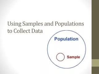
Population • The entire group of objects or individuals considered for the survey
Sample • Part of the population
Convenience Sample • Sampling the most available subjects in the population to obtain a quick result
Biased • A sample that does not fairly represent the population
Random Sample • A sample in which each member of the population has an equal chance of being selected
Practice Determine which sampling method will better represent the entire population. Justify your answer.
Practice Determine which sampling method will better represent the entire population. Justify your answer.
Essential Questions • How do I chose and create appropriate graphs to represent data? • What conclusions can be drawn from data?
TODAY… • Graphs, tables, and plots can be used in about any situation depending on what the researcher wants; however, we will look at the most common uses. • Use the graphic organizer given to you to categorize graphs, tables, and plots according to common usage. Keep this with you as we continue the presentation on populations so you may determine the best display to use for each scenario.
Scenario One Damon wants to start a tutoring business somewhere in Nashville. He wants to find out family incomes in relation to the number of children. He sends a survey out to every 10th person in the phone book. • What is the population? • The sample is made up of ____? • Convenience sample or Random sample? • Is this sample biased? • Will the findings tell the true story? • Which type of display would best represent the data? Relationship between variables Line Graph Histogram
Scenario Two Roy wants to save money but doesn’t know what he spends it on each month. He collects all his bills and lists all his typical spending habits to find the percentage of each category. • What is the population? • The sample is made up of ____? • Convenience sample or Random sample? • Is this sample biased? • Will the findings tell the true story? • Which type of display would best represent the data? Comparing differences within a population or between populations Pie Chart Histogram
Scenario Three The mayor of New York would like to know if the people of the city would like to save money by eliminating holiday lighting on the streets. He categorizes them according to 15 districts as he knows 7 of the districts will determine he re-election. He sends a survey out to every 20th household listed on the tax registry. • What is the population? • The sample is made up of ____? • Convenience sample or Random sample? • Is this sample biased? • Will the findings tell the true story? • Which type of display would best represent the data? Comparing difference between populations Line graph Bar graph
Scenario Four The park manager of Macon wants to know how many people of different ages use the park. He takes a survey of all the people at the park for seven days. • What is the population? • The sample is made up of ____? • Convenience sample or Random sample? • Is this sample biased? • Will the findings tell the true story? • Which type of display would best represent the data? Looking for occurrences Line graph Stem-and-leaf plot
Scenario Five Coach Finch wants to see how many goals each soccer team in the district makes during the first game of the season. Out of ten teams in the league, she calls three of her friend coaches and asks. She then displays her findings. • What is the population? • The sample is made up of ____? • Convenience sample or Random sample? • Is this sample biased? • Will the findings tell the true story? • Which type of display would best represent the data? Looking for occurrences Line/dot plot Stem-and-leaf plot
Complete the diagram and be prepared to share with the class. http://nces.ed.gov/nceskids/createagraph/default.aspx?ID=70a1a23b6bde4023944373932de4f698 Discovery Education Misleading Statistics