Download
1 / 24
240 likes | 526 Views
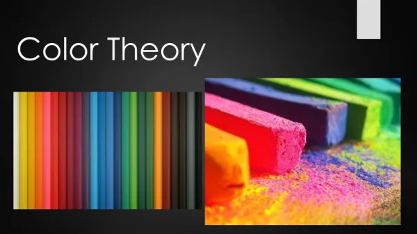
Color Theory. Data dan Teknologi Multimedia Sesi 04 Nofriyadi Nurdam. Course Outlines. Introduction Color Wheel Color Harmony Color Context Type of Color. Introduction. Color theory encompasses a multitude of definitions, concepts and design applications

E N D
Color Theory Data dan Teknologi Multimedia Sesi 04 Nofriyadi Nurdam
Course Outlines • Introduction • Color Wheel • Color Harmony • Color Context • Type of Color
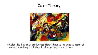
Introduction • Color theory encompasses a multitude of definitions, concepts and design applications • There are three basic categories of color theory that are logical and useful : The color wheel, color harmony, and the context of how colors are used. • Color theories create a logical structure for color
Introduction • For example, an assortment of fruits and vegetables can organized by color and placed them on a circle that shows the colors in relation to each other.
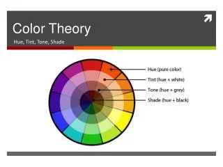
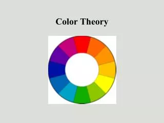
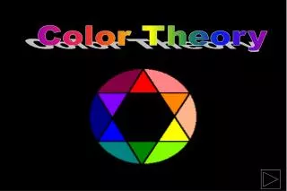
The Color Wheel • A color circle, based on red, yellow and blue, is traditional in the field of art. • Sir Isaac Newton developed the first circular diagram of colors in 1666. • Scientists and artists have studied and designed numerous variations of this concept. • In reality, any color circle or color wheel which presents a logically arranged sequence of pure hues has merit.
The Color Wheel • There are also definitions (or categories) of colors based on the color wheel. We begin with a 3-part color wheel.
The Color Wheel • Primary Colors: Red, yellow and blueprimary colors are the 3 pigment colors that can not be mixed or formed by any combination of other colors. All other are derived from these 3 colors • Secondary Colors: Green, orange and purpleThese are the colors formed by mixing the primary colors.
The Color Wheel • Tertiary Colors: Yellow-orange, red-orange, red-purple, blue-purple, blue-green & yellow-greenThese are the colors formed by mixing a primary and a secondary color. That's why the hue is a two word name, such as blue-green, red-violet, and yellow-orange.
Color Harmony • Harmony can be defined as a pleasing arrangement of parts, whether it be music, poetry, color, or even an ice cream sundae. • In visual experiences, harmony is something that is pleasing to the eye. • It engages the viewer and it creates an inner sense of order, a balance in the visual experience. • When something is not harmonious, it's either boring or chaotic.
Color Harmony • At one extreme is a visual experience that is so bland that the viewer is not engaged. The human brain will reject under-stimulating information. • At the other extreme is a visual experience that is so overdone, so chaotic that the viewer can't stand to look at it. The human brain rejects what it can not organize, what it can not understand.
Color Harmony • The visual task requires that we present a logical structure. Color harmony delivers visual interest and a sense of order. • Extreme unity leads to under-stimulation, extreme complexity leads to over-stimulation. Harmony is a dynamic equilibrium.
Some Formulas for Color Harmony • A color scheme based on analogous colors
Some Formulas for Color Harmony • A color scheme based on complementary colors
Some Formulas for Color Harmony • A color scheme based on nature
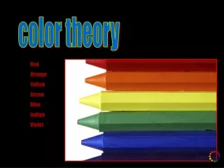
Meaning of Colors • Warm Colors: red, yellow, and orange. These colors evoke warmth because they remind us of things like the sun or fire. • Cool Colors: blue, green, and purple (violet). These colors evoke a cool feeling because they remind us of things like water or grass.
Meaning of Colors • Neutral Colors: Gray, Brown. These aren't on most color wheels, but they're considered neutral because they don't contrast with much of anything. They're dull and uneventful. • Value: Usually refers to the amount of black in a color. The more black a color has, the darker its value.
Meaning of Colors • Brightness: Refers to the amount of white in a color. The more white a color has, the brighter it is. • Saturation: Refers to the amount of a color used. When a color is at full saturation, it is extremely vibrant. When a color is "desaturated," a large amount of color has been removed. Desaturated colors tend to be close to being neutral because there is so much gray in them.
Color Context • Color context is a complex area of color theory. (Red in different background color)
Color Context • Different readings of the same color
Color Context • Different readings of the same color (cont...)
Type of Colors • RGB Color: This is color based upon light. Your computer monitor and television use RGB. The name "RGB" stands for Red, Green, Blue, which are the 3 primaries (with green replacing yellow). By combining these 3 colors, any other color can be produced. Remember, this color method is only used with light sources; it does not apply to printing.
Type of Colors • CMYK Color: This is the color method based upon pigments. "CMYK" stands for Cyan, Magenta, Yellow, and Black (its what the K stands for). Using these 4 colors, most other colors can be achieved. Unfortunately, CMYK cannot reproduce the same amount of colors as RGB can, which is why yellow-greens sometimes look a bit muddy when printed.This is the method used by printers the world over, and is also a clever way of mixing paints.
Type of Colors • Pantone (PMS) Color: This is yet another printing color method. PMS stands for "Pantone Matching System," and is a large list of specially mixed colors made by the Pantone Corporation. Instead of using CMYK to create colors, the pigments are created individually for purity.For example, if I wanted to use a Red-Violet color, I'd pick PMS 233M. The color would be made exclusively for my project and would always print exactly how I want.The only drawback to using PMS colors is that they're only useful for projects with few colors. They're also expensive.