Download

1 / 14
140 likes | 302 Views
Using Excel to Create Charts and Graphs. Computer Applications (N. Anthony, Johnson High School) . CHARTS AND GRAPHS. A picture representation of numerical data Cannot create a chart if you do not have numerical data Source of numerical data—Excel Spreadsheet

E N D
Using Excel to Create Charts and Graphs Computer Applications (N. Anthony, Johnson High School)
CHARTS AND GRAPHS • A picture representation of numerical data • Cannot create a chart if you do not have numerical data • Source of numerical data—Excel Spreadsheet • An excel spreadsheet must be developed before you can create any charts.
ADVANTAGES OF CHARTS • People had rather view charts than numbers • A Picture is Worth a Thousand Words • A Chart makes it easy to see the “BIG” picture • Can analyze a chart much faster than a table of data
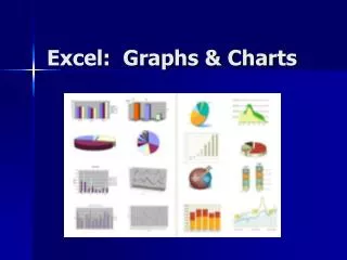
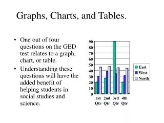
TYPES OF CHARTS • Bar or Column • Line • Pie
BAR CHARTS (column) • A chart that shows how many times something happens or occurs • Either vertical or horizontal bars representing the number of times something happens • Example: How many males and females are in a particular class or How many people have an A, a B, a C, or an F average in a class.
LINE CHARTS • A chart that shows how something has changed over time. • Shows trends • Uses lines with points to represent data • Example: Show how the price of gas has changed over the last 12 months.
PIE CHARTS • Shows how the individual parts of something relate to the “whole” • Shows the percentages that each part is of the whole. • Similar to bar, but doesn’t show how many, but what percentage
SPREADSHEET DATA USED TO CREATE A CHART • X-series of Data • Y-series of Data Before you can ever create a chart, you MUST be able to identify 2 ranges in a spreadsheet!!
X-SERIES OF DATA • Data in spreadsheet that identifies each individual bar, point, or slice in a chart. • Usually with be labelsortext in the spreadsheet. • Can only have one X-series of data • X-series of data appears at the bottom of line and bar charts and identifies each slice in a pie chart.
Y-SERIES OF DATA • Data in a spreadsheet that actually builds the lines, bars, or slices in a chart. • The Y-series of data MUST be actual numbers or values in the spreadsheet. • You can have multiple Y-series of data in a chart.
Y-SERIES X-SERIES Example: I want to chart how Mary Benton’s grades changed from Test 1 to Test 3.
Y-SERIES X-SERIES Example: I want to chart how everyone did on the 2nd test of the semester.
RULE OF THUMB!! • If your Y-series of data runs left to right, your X-series of data will also run left to right. • If your Y-series of data runs up and down, your X-series of data will also run up and down.
Develop the Excel Spreadsheet fully. Highlight the Y-series of Data Click on INSERT menu Click on CHART option Choose type of chart you want to develop Click NEXT Click onSERIES Identify the X-series of data Click NEXT Specify all Chart titles Move through all the tabs choosing appropriate options (discuss later) Click FINISH Specify where the chart will be located (either As a New Sheet or An Object In STEPS TO CREATING A CHART