Download
1 / 33
330 likes | 511 Views
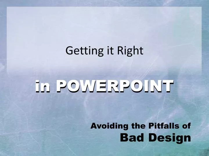
Getting it Right. in POWERPOINT. in POWERPOINT. Avoiding the Pitfalls of Bad Design. Outline. The Outline Slide Slide Structure Fonts Color Background Spelling and Grammar Conclusions. The Outline Slide. 1st or 2nd slide should provide the outline for your presentation

E N D
Getting it Right in POWERPOINT in POWERPOINT Avoiding the Pitfalls of Bad Design
Outline • The Outline Slide • Slide Structure • Fonts • Color • Background • Spelling and Grammar • Conclusions
The Outline Slide • 1st or 2nd slide should provide the outline for your presentation • Outline slides: • Only contain main points • Set up the order of the rest of your presentation * Main points from your Outline Slide will be Titles of the slides that follow
Slide Structure • Slide purpose: To provide basic structure & visuals for your verbal presentation • Similar to notecards • DO NOT READ directly from your slides!
Slide Structure 5/5/5 Rule Limit your slides • Five words per line of text • Five lines of text per slide • Five text-heavy slides in a row
Slide Structure This page contains too many words for a presentation slide. It is not written in point form, making it difficult both for your audience to read and for you to present each point. This makes it appear much too complicated. In short, your audience will spend too much time trying to read this paragraph instead of listening to you.
Poor Structure • Bullet points are great if well structured • Too close together = hard to read • Lack of white space = hard to read • Too crowded = Hard on the eyes!
Better Structure • Bullets are much more readable when there is white space between them. • To Add white space between bullets Menu > Paragraph > Spacing > (before/after)
Animation • Too much can be distracting • Annoying • Nauseating • Counter-productive
Animation • Use subtle animation carefully. • Animate bullet points to appear as you address them • Use "exotic" animation very sparingly • Use simple transitions between slides
Font Style • Limit # of font styles • Standard fonts are best • 1 font for headlines • 1 font for “copy” • Focus on readability
Funky Fonts • Stick to standard fonts. • If presenting on any machine other than your own, your “creative” fonts will not appear correctly! Funky Fonts
Font Size • Minimum size 18 – 24 pt • Larger for headlines (36 – 44+ pt) • Smaller size for sub-points
Font Color • Font color should CONTRAST w/the background • Dark on light • Light on dark • Focus on readability
Font Color • Use color to EMPHASIZE a point • But do so sparingly
Font Color • Using a font color that does not contrast with the background color is hard to read • Overuse of color for decoration is distracting and annoying. • Using a different color for each point is unnecessary • Using a different color for secondary points is also unnecessary • Trying tobe creativecan alsobe bad
Capitalization • Avoid all-caps • (UNLESS YOU ARE SHOUTING!) • ALL CAPS ARE MORE DIFFICULT TO READ
Capitalization • The text introducing the list of bullet points should end with a colon: • Bullet point • Bullet point • Bullet point
Bullet Sample #1 • Tonight's agenda includes: • annual review of capital gains issues • outstanding inheritance tax issues • When bullets are NOT proper sentences: • Do not capitalize • No period at end
Bullet Sample #2 • Tonight's agenda includes: • We will conduct an annual review of capital gains issues. • The senior tax manager will talk about outstanding inheritance tax issues. • When bullets ARE proper sentences: • Start proper sentences with a capital. • End proper sentences with a period.
Backgrounds • “Form follows Function.” • All visuals should have a purpose • Every visual should enhance the message (text)
Background • Avoid backgrounds & visuals that are distracting or difficult to read • Keep your backgrounds consistent– use theme families
Imagery • JPG have backgrounds • GIF files allow fortransparency
Imagery • Can be manipulatedin PowerPoint • Flipped horizontal • Lowered opacity
Graphs • Graphed data is easier to comprehend • Graphed data is easier to retain (than raw data) • Trends are easier to visualize when graphed
Bad Graphs • Title is missing • Minor gridlines too busy • Fonts too small • Color illogical • Shading disracts
Spelling & Grammar • SPELL CHECK! • SPELL CHECK! • PROOF READ! • PROOF READ!
Last slide • Invite audience to ask questions • Provide a visual aid • Avoid abrupt endings
Questions? Thank You!