Download
1 / 48
490 likes | 689 Views
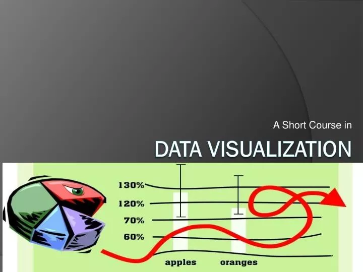
A Short Course in. Data Visualization. THE GOAL... Give the viewer the greatest number of ideas in the shortest time with the least ink in the smallest space.” - attributed to Tufte.

E N D
A Short Course in Data Visualization
THE GOAL...Give the viewer the greatest number of ideas in the shortest time with the least ink in the smallest space.”- attributed to Tufte
THE GOAL...Give the viewer the greatest number of ideas in the shortest time with the least ink in the smallest space.”- attributed to Tufte
Challenger January 28, 1986 73 seconds after launch
ChallengerDamage vs. Temperature Shuttle Destroyed Shuttle OK Challenger Launch
Information: overall patterns & detailed behavior Overall – 11 year sunspot cycle visible Detail – rise is faster than fall (seen when banked to 45)
Flaws:Display 0.0 on X-axis should be 0.6 X & Y should be on the same scale, this makes the equal emission line (Y = X) easier to understand Deviations from line are to be measured vertically, not orthogonally
Flaws:Reasoning Flights without O-ring damage omitted Severity of O-ring damage omitted
Flaws:Display, reasoning & message Apparent message – body mass & brain mass are correlated Claimed message – “the beast with the largest brain mass for body weight is called Homo Sapiens” Desired message – humans have a larger brain mass for body surface than other organisms
Data Visualization • Pattern Perception • Focuses on the relationships between values • Decoding (detection & assembly) • Estimation (discrimination, ranking, ratioing) • Table look-up • Focuses on the individual values themselves • Scanning • Interpolation • Matching
Decoding:Color Brain does not naturally order hues Perceptual merging occurs at 7 to 15 hues
Decoding:Color Two distinct hues can clearly demark boundaries Use distinct hues (cyan, magenta, green, orange, blue) for categorical variables
Decoding:Color Use differing lightness (or saturation) for quantitative variables
Decoding:texture Texture symbols are used when color is not available Some symbols pairs are easier to distinguish than others
Decoding:texture Choice of symbol set greatly affects perception
Decoding:overlap If few overlap problems exist… try , , , , If moderate overlap problems exist… try o, +, <, S, W If extreme overlaps exist… try o, /, , , (or jittering)
Decoding:reference grids Weber’s Law: the greater the percentage increase in line length, the greater the probability of a difference being detected
Decoding:reference grids The grid allows for the perception of the differences in the dips in the left column of each set of graphs The grid is not as dark as the actual line as it is for reference only
Decoding:reference grids Without grids, distances between curves are detected orthogonal to the lines However, distances between the lines are correctly measured vertically If distances between the lines is the information of interest, graph the subtraction instead
Decoding:reference grids Lack of inherent reference grids in pie charts hinders pattern assembly In the pie chart at left two sizes are perceived… odd wedges are small and even wedges are large In the dot plot at left, variation is seen within the group of odd wedges and within the group of even wedges
Decoding:reference grids Lack of inherent reference grids in divided bar charts hinders pattern assembly… the Hart age effect is lost in the graph on the left
Decoding:reference grids Lack of inherent reference grids in area charts hinders pattern assembly… the bend is lost in the graph on the left
Decoding:slopes Patterns in slopes are perceived best when the graph is banked to 45 The horizontal and vertical scales are adjusted so the average of the absolute angles of the individual segments is 45 degrees
Decoding:ordering Ordering of categories impacts which pattern is perceived from the data... On the left, it is easy to see that sheep do not follow the general livestock pattern. On the right, it is easy to see that Greece differs from the general country pattern.
Estimation • Discrimination • Same or different • Ranking • Larger or smaller • Ratioing • Magnitude change
Table look-up “Identify the largest yield” • Scanning • Move eyes to locate symbol furthest to right • Interpolation • Estimate value encoded by the symbol relative to scale • Matching • Compare the symbol to the keys “It’s Waseca No. 462 in 1931 with 65 bushels/acre”
Table look-up • Certain graph techniques force pattern perception to be a table look-up operation… • Pie charts • Divided bar charts • Area charts • Alphabetically ordered categories
Perception failures (and possible corrections) Excessive clutter
Perception failures (and possible corrections) Data on the scale
Perception failures (and possible corrections) Unnecessary information inside the data rectangle
Perception failures (and possible corrections) Symbols lost in the overlap
Perception failures (and possible corrections) Pattern lost in the overlap
Perception failures (and possible corrections) Pattern changed by scale breaks
Use area or volume to represent univariate data (LF = 2.8)(LF =1317)
Poor visualizationis not always accidental... ...this is the easiest way to to “lie” with statistics.