Download
1 / 6
60 likes | 120 Views
Explore various graphing techniques to showcase patterns and trends in data, from slug food preferences to chicken eating habits and endangered bird populations. Analyze the effects of smoking on death rates from lung cancer. Perfect your graphing skills with this practical lab session!

E N D
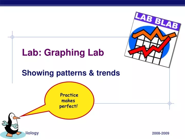
Lab: Graphing Lab Showing patterns & trends Practicemakes perfect!
12 10 0 4 8 2 6 M O A D S P L What foods do slugs like to eat? Bar graph! amount food eaten (g) Conclusion? Slugs like apples best & dog food the least. food source
12 15 18 0 3 6 9 5 7 6 2 3 1 4 0 How much food do chickens eat? Line graph! 13.5 amount food eaten (g) 6.0 Chickens eat more food each day as they grow. Conclusion? days
10 20 30 50 40 70 60 1970 1950 1960 Populations of endangered birds Line graph! number of birds Crane population is increasing. Condor population is decreasing. Swan population is holding steady. Conclusion? years
30 60 90 15 45 75 0 65-74 75-84 45-54 35-44 55-64 Effect of smoking on death rate from lung cancer Bar graph! The longer & heavier you smoke the more likely you are to die of lung cancer. annual death rate Conclusion? age group