Download
1 / 42
440 likes | 554 Views
Descriptive Statistics. Tabular and Graphical Displays Frequency Distribution - List of intervals of values for a variable, and the number of occurrences per interval Relative Frequency - Proportion (often reported as a percentage) of observations falling in the interval

E N D
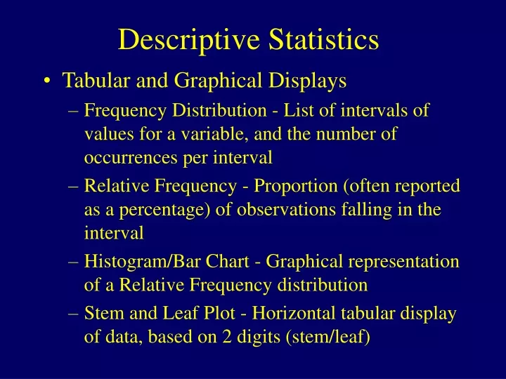
Descriptive Statistics • Tabular and Graphical Displays • Frequency Distribution - List of intervals of values for a variable, and the number of occurrences per interval • Relative Frequency - Proportion (often reported as a percentage) of observations falling in the interval • Histogram/Bar Chart - Graphical representation of a Relative Frequency distribution • Stem and Leaf Plot - Horizontal tabular display of data, based on 2 digits (stem/leaf)
Constructing Pie Charts • Select a small number of categories (say 5 or 6 at most) to avoid many narrow “slivers” • If possible, arrange categories in ascending or descending order for categorical variables
Constructing Bar Charts • Put frequencies on one axis (typically vertical, unless many categories) and categories on other • Draw rectangles over categories with height=frequency • Leave spaces between categories
Constructing Histograms • Used for numeric variables, so need Class Intervals • Let Range = Largest - Smallest Measurement • Break range into (say) 5-20 intervals depending on sample size • Make the width of the subintervals a convenient unit, and make “break points” so that no observations fall on them • Obtain Class Frequencies, the number in each subinterval • Obtain Relative Frequencies, proportion in each subinterval • Construct Histogram • Draw bars over each subinterval with height representing class frequency or relative frequency (shape will be the same) • Leave no space between bars to imply adjacency of class intervals
Interpreting Histograms • Probability: Heights of bars over the class intervals are proportional to the “chances” an individual chosen at random would fall in the interval • Unimodal: A histogram with a single major peak • Bimodal: Histogram with two distinct peaks (often evidence of two distinct groups of units) • Uniform: Interval heights are approximately equal • Symmetric: Right and Left portions are same shape • Right-Skewed: Right-hand side extends further • Left-Skewed: Left-hand side extends further
Stem-and-Leaf Plots • Simple, crude approach to obtaining shape of distribution without losing individual measurements to class intervals. Procedure: • Split each measurement into 2 sets of digits (stem and leaf) • List stems from smallest to largest • Line corresponding leaves aside stems from smallest to largest • If too cramped/narrow, break stems into two groups: low with leaves 0-4 and high with leaves 5-9 • When numbers have many digits, trim off right-most (less significant) digits. Leaves should always be a single digit.
Comparing Groups • Side-by-side bar charts • 3 dimensional histograms • Back-to-back stem and leaf plots • Goal: Compare 2 (or more) groups wrt variable(s) being measured • Do measurements tend to differ among groups?
Summarizing Data of More than One Variable • Contingency Table: Cross-tabulation of units based on measurements of two qualitative variables simultaneously • Stacked Bar Graph: Bar chart with one variable represented on the horizontal axis, second variable as subcategories within bars • Cluster Bar Graph: Bar chart with one variable forming “major groupings” on horizontal axis, second variable used to make side-by-side comparisons within major groupings (displays all combinations in factorial expt) • Scatterplot: Plot with quantitaive variables y and x plotted against each other for each unit • Side-by-Side Boxplot: Compares distributions by groups
Example - Ginkgo and Acetazolamide for Acute Mountain Syndrome Among Himalayan Trekkers Contingency Table (Counts) Percent Outcome by Treatment
Sample & Population Distributions • Distributions of Samples and Populations- As samples get larger, the sample distribution gets smoother and looks more like the population distribution • U-shaped - Measurements tend to be large or small, fewer in middle range of values • Bell-shaped - Measurements tend to cluster around the middle with few extremes (symmetric) • Skewed Right - Few extreme large values • Skewed Left - Few extreme small values
Measures of Central Tendency • Mean - Sum of all measurements divided by the number of observations (even distribution of outcomes among cases). Can be highly influenced by extreme values. • Notation: Sample Measurements labeled Y1,...,Yn
Median, Percentiles, Mode • Median - Middle measurement after data have been ordered from smallest to largest. Appropriate for interval and ordinal scales • Pth percentile - Value where P% of measurements fall below and (100-P)% lie above. Lower quartile(25th), Median(50th), Upper quartile(75th) often reported • Mode - Most frequently occurring outcome. Typically reported for ordinal and nominal data.
Measures of Variation • Measures of how similar or different individual’s measurements are • Range -- Largest-Smallest observation • Deviation -- Difference between ith individual’s outcome and the sample mean: • Variance of n observations Y1,...,Yn is the “average” squared deviation:
Measures of Variation • Standard Deviation - Positive square root of the variance (measure in original units): • Properties of the standard deviation: • s 0, and only equals 0 if all observations are equal • s increases with the amount of variation around the mean • Division by n-1 (not n) is due to technical reasons (later) • s depends on the units of the data (e.g. $1000s vs $)
Empirical Rule • If the histogram of the data is approximately bell-shaped, then: • Approximately 68% of measurements lie within 1 standard deviation of the mean. • Approximately 95% of measurements lie within 2 standard deviations of the mean. • Virtually all of the measurements lie within 3 standard deviations of the mean.
Other Measures and Plots • Interquartile Range (IQR)-- 75th%ile - 25th%ile (measures the spread in the middle 50% of data) • Box Plots - Display a box containing middle 50% of measurements with line at median and lines extending from box. Breaks data into four quartiles • Outliers - Observations falling more than 1.5IQR above (below) upper (lower) quartile
Dependent and Independent Variables • Dependent variables are outcomes of interest to investigators. Also referred to as Responses or Endpoints • Independent variables are Factors that are often hypothesized to effect the outcomes (levels of dependent variables). Also referred to as Predictor or Explanatory Variables • Research ??? Does I.V. D.V.
Example - Clinical Trials of Cialis • Clinical trials conducted worldwide to study efficacy and safety of Cialis (Tadalafil) for ED • Patients randomized to Placebo, 10mg, and 20mg • Co-Primary outcomes: • Change from baseline in erectile dysfunction domain if the International Index of Erectile Dysfunction (Numeric) • Response to: “Were you able to insert your P… into your partner’s V…?” (Nominal: Yes/No) • Response to: “Did your erection last long enough for you to have succesful intercourse?” (Nominal: Yes/No) Source: Carson, et al. (2004).
Example - Clinical Trials of Cialis • Population: All adult males suffering from erectile dysfunction • Sample: 2102 men with mild-to-severe ED in 11 randomized clinical trials • Dependent Variable(s): Co-primary outcomes listed on previous slide • Independent Variable: Cialis Dose: (0, 10, 20 mg) • Research Questions: Does use of Cialis improve erectile function?
Contingency Tables • Tables representing all combinations of levels of explanatory and response variables • Numbers in table represent Counts of the number of cases in each cell • Row and column totals are called Marginal counts
Outcome Present Outcome Absent Group Total Group 1 X1 n1-X1 n1 Group 2 X2 n2-X2 n2 Outcome Total X1+X2 (n1+n2)-(X1+X2) n1+n2 2x2 Tables - Notation
High Quality Low Quality Group Total Not Integrated 33 55 88 Vertically Integrated 5 79 84 Outcome Total 38 134 172 Example - Firm Type/Product Quality • Groups: Not Integrated (Weave only) vs Vertically integrated (Spin and Weave) Cotton Textile Producers • Outcomes: High Quality (High Count) vs Low Quality (Count) Source: Temin (1988)
Scatterplots • Identify the explanatory and response variables of interest, and label them as x and y • Obtain a set of individuals and observe the pairs (xi , yi) for each pair. There will be n pairs. • Statistical convention has the response variable (y) placed on the vertical (up/down) axis and the explanatory variable (x) placed on the horizontal (left/right) axis. (Note: economists reverse axes in price/quantity demand plots) • Plot the n pairs of points (x,y) on the graph
France August,2003 Heat Wave Deaths • Individuals: 13 cities in France • Response: Excess Deaths(%) Aug1/19,2003 vs 1999-2002 • Explanatory Variable: Change in Mean Temp in period (C) • Data:
Sample Statistics/Population Parameters • Sample Mean and Standard Deviations are most commonly reported summaries of sample data. They are random variables since they will change from one sample to another. • Population Mean (m) and Standard Deviation (s) computed from a population of measurements are fixed (unknown in practice) values called parameters.
Example 1.3 - Grapefruit Juice Study To import an EXCEL file, click on: FILE OPEN DATA then change FILES OF TYPE to EXCEL (.xls) To import a TEXT or DATA file, click on: FILE OPEN DATA then change FILES OF TYPE to TEXT (.txt) or DATA (.dat) You will be prompted through a series of dialog boxes to import dataset
Descriptive Statistics-Numeric Data • After Importing your dataset, and providing names to variables, click on: • ANALYZE DESCRIPTIVE STATISTICS DESCRIPTIVES • Choose any variables to be analyzed and place them in box on right • Options include:
Descriptive Statistics-General Data • After Importing your dataset, and providing names to variables, click on: • ANALYZE DESCRIPTIVE STATISTICS FREQUENCIES • Choose any variables to be analyzed and place them in box on right • Options include (For Categorical Variables): • Frequency Tables • Pie Charts, Bar Charts • Options include (For Numeric Variables) • Frequency Tables (Useful for discrete data) • Measures of Central Tendency, Dispersion, Percentiles • Pie Charts, Histograms
Vertical Bar Charts and Pie Charts • After Importing your dataset, and providing names to variables, click on: • GRAPHS BAR… SIMPLE (Summaries for Groups of Cases) DEFINE • Bars Represent N of Cases (or % of Cases) • Put the variable of interest as the CATEGORY AXIS • GRAPHS PIE… (Summaries for Groups of Cases) DEFINE • Slices Represent N of Cases (or % of Cases) • Put the variable of interest as the DEFINE SLICES BY
Histograms • After Importing your dataset, and providing names to variables, click on: • GRAPHS HISTOGRAM • Select Variable to be plotted • Click on DISPLAY NORMAL CURVE if you want a normal curve superimposed (see Chapter 4).
Side-by-Side Bar Charts • After Importing your dataset, and providing names to variables, click on: • GRAPHS BAR… Clustered (Summaries for Groups of Cases) DEFINE • Bars Represent N of Cases (or % of Cases) • CATEGORY AXIS: Variable that represents groups to be compared (independent variable) • DEFINE CLUSTERS BY: Variable that represents outcomes of interest (dependent variable)