Download
1 / 29
290 likes | 320 Views
Explore interaction design in computer science, psychology, and more. Learn to create user-friendly interfaces for optimal user experience. Find valuable resources at defriska.wordpress.com/lecture/imk.

E N D
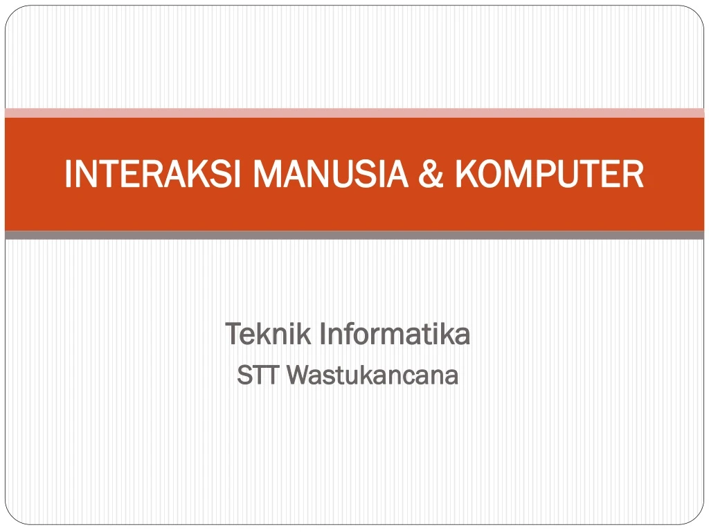
INTERAKSI MANUSIA & KOMPUTER Teknik Informatika STT Wastukancana
Who am I? • Meriska Defriani, S.Komp • M.defriska@gmail.com • 085215956400 (sms only ) • Defriska.wordpress.com/lecture/imk
Class Rule • Be ON TIME • NO SANDAL • Silent or Turn Off HP • Candy OK, Drink Water OK, NO Heavy Food • Update the Task
Persentase • Kehadiran 10% • Tugas 20% • UTS 30% • UAS 40%
Range Huruf Mutu • >= 75 : A • >= 65 - < 75 : B • >= 55 - < 65 : C • >=45 - < 55 : D • <45 : E
Things that don’t work the way you expect How do you open the refrigerator?
Beberapa bidang studi yang berkaitan dengan Desain Interaksi • Ilmu komputer • Psikologi • Perancangan grafis dan tipografi • Ergonomik • Liguistik
Bahan bacaan • Don’t make me think • Guidelines book ^ ^ ^ bisa di-download di defriska.wordpress.com/imk
Facts of life • We don’t read pages.We scan them • We’re usually in hurry • We know we don’t need to read everythings • We’re good at it
We don’t make optimal choices. We satisfice • We don’t figure out how things work. We muddle through • It’s not important to us • If we find something that works, we stick to it
So, what must we do? • Create a clear visual hierarchy • The more important something is, the more prominent it is • Things are related logically are also related visually • Things are nested visually to show what’s part of what • Break up pages into clearly defined areas
Make it obvious what’s clickable • Keep the noise down to a dull roar • Bussy-ness • Background noise • Happy talk must die • Instruction must die
Navigation and breadcrumb • Navigation • It gives us something to hold onto • It tells us what’s here • It tell us how to use the site • It give us confidence in the people who built it • 5 basic elements of navigation • Site ID • A way home • A way to search • Section • Utilities
Page name • Every page has a name • The name needs to be in right place • The name needs to be prominent • The name needs to match what i clicked
Breadcrumbs • Show you the path from home page to where you are • About.com has best breadcrumbs • Put them at the top • Use “>” between levels • Use tiny type • Use the words “you are here” • Boldface the last item • Don’t use them instead of a page name
Tabs • They’re self-evident • They hard to miss • They’re slick • They suggest a physical space • Good tabs • They drawn correctly
They were color coded • Ther was a tab selected when you enter the site