Download
1 / 15
150 likes | 286 Views
Lesson 5.4 – Choosing an Appropriate Graph. Arizona State Standard: … Compare & contrast the effectiveness of different representations of data S2C1PO4. Guidelines for selecting the correct graph to display data.

E N D
Lesson 5.4 – Choosing an Appropriate Graph Arizona State Standard: … Compare & contrast the effectiveness of different representations of data S2C1PO4
Guidelines for selecting the correct graph to display data. • Use a bar graph when the data fall into distinct categories and you want to compare totals. • Use a line graph when the categories have a numerical order, such as a sequence of years. • Use a pictograph instead of a bar graph when you want a high visual appeal REFER TO HANDOUT
Try it! • You take a survey to find out how much walking people do while at work. The results are shown below. • What is the best graph to display this data?
Example #2 – What is the best graph to represent the following data?
Let’s Practice! • Page 222 • # 1 - 4
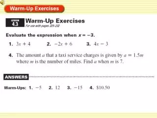
1. How many more mi. per day do police officers walk than mail carriers? ANS: 2.4
2. In which occupation do people walk half the distance per day that police officers do? ANS: retail salesperson
4. Which is the least popular suit color for women? ANS: Brown-women Red - men
HOMEWORK • Page 222 • # 5 – 13 ALL