Download
1 / 44
570 likes | 2.58k Views
Seven QC Tools. Problem Solving. Seven Quality Control Tools. Pareto Chart Process flow diagram Cause and Effect Diagram Check sheet Histogram Control chart Scatter diagram. Pareto Principle. Vilfredo Pareto (1848-1923) Italian economist 20% of the population has 80% of the wealth

E N D
Seven QC Tools Problem Solving Quality Improvement: Problem Solving
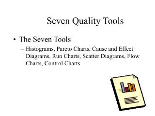
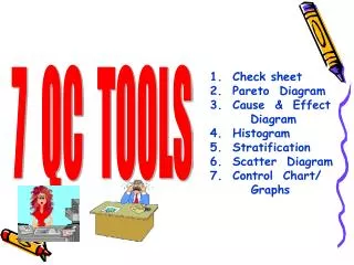
Seven Quality Control Tools • Pareto Chart • Process flow diagram • Cause and Effect Diagram • Check sheet • Histogram • Control chart • Scatter diagram Quality Improvement: Problem Solving
Pareto Principle • Vilfredo Pareto (1848-1923) Italian economist • 20% of the population has 80% of the wealth • Juran used the term “vital few, trivial many”. He noted that 20% of the quality problems caused 80% of the dollar loss. 7 Quality Tools Quality Improvement: Problem Solving
Pareto chart 7 Quality Tools Quality Improvement: Problem Solving
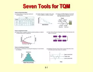
Grand total % 100 % How to Construct a Pareto Diagram 80 % Contributors 1. Total the data on effect of each contributor & sum these to determine grand total. 2. Re order the contributors from largest to the smallest 3. Determine the cumulative percent of total 4. Draw & label the left vertical axis. 5. Draw & label the horizontal axis. 6. Draw & label the right vertical axis. 7. Draw bars to represent the magnitude of each contributor’s effect. 8. Draw a line graph to represent the cumulative percent of total 9. Analyze the diagram 10. Title the chart, label the ‘ vital few’ and ‘useful many’ & show the cumulative percent contribution of the vital few. Quality Improvement: Problem Solving
Seven Quality Control Tools • Pareto Chart • Process flow diagram • Cause and Effect Diagram • Check sheet • Histogram • Control chart • Scatter diagram Quality Improvement: Problem Solving
Flowcharts • Flowcharts • Graphical description of how work is done. • Used to describe processes that are to be improved. 7 Quality Tools Quality Improvement: Problem Solving
Flow Diagrams " Draw a flowchart for whatever you do. Until you do, you do not know what you are doing, you just have a job.” -- Dr. W. Edwards Deming. Quality Improvement: Problem Solving
Flowchart Activity Decision Yes No 7 Quality Tools Quality Improvement: Problem Solving
Flowchart Quality Improvement: Problem Solving
Flow Diagrams Quality Improvement: Problem Solving
Process Chart Symbols Operations Inspection Transportation Delay Storage
Date: 9-30-00 Location: Graves Mountain Analyst: TLR Process: Apple Sauce Step Operation Transport Inspect Delay Storage Description of process Distance (feet) Time (min) 1 Unload apples from truck 20 2 Move to inspection station 100 ft 3 Weigh, inspect, sort 30 4 Move to storage 50 ft 5 360 Wait until needed Move to peeler 6 20 ft 7 Apples peeled and cored 15 8 Soak in water until needed 20 9 5 Place in conveyor 10 Move to mixing area 20 ft 11 30 Weigh, inspect, sort Page 1 0f 3 Total 480 190 ft Process Chart Quality Improvement: Problem Solving
Seven Quality Control Tools • Pareto Chart • Process flow diagram • Cause and Effect Diagram • Check sheet • Histogram • Control chart • Scatter diagram Quality Improvement: Problem Solving
Cause-and-Effect Diagrams • Show the relationships between a problem and its possible causes. • Developed by Kaoru Ishikawa (1953) • Also known as … • Fishbone diagrams • Ishikawa diagrams 7 Quality Tools Quality Improvement: Problem Solving
Cause and Effect “Skeleton” Materials Procedures Quality Problem People Equipment 7 Quality Tools Quality Improvement: Problem Solving
Measurement Human Machines Out of adjustment Poor supervision Faulty testing equipment Lack of concentration Tooling problems Incorrect specifications Improper methods Old / worn Inadequate training Quality Problem Inaccurate temperature control Poor process design Defective from vendor Ineffective quality management Not to specifications Dust and Dirt Material- handling problems Deficiencies in product design Environment Materials Process Fishbone Diagram Quality Improvement: Problem Solving
Cause and effect diagrams To construct the skeleton, remember: • For manufacturing - the 4 M’s & E • man, method, machine, material, environment. • For service applications • equipment, policies, procedures, people Quality Improvement: Problem Solving
Cause and effect diagrams • Advantages • Making the diagram is educational in itself • Diagram demonstrates knowledge of problem solving team • Diagram results in active searches for causes • Diagram is a guide for data collection Quality Improvement: Problem Solving
Seven Quality Control Tools • Pareto Chart • Process flow diagram • Cause and Effect Diagram • Check sheet • Histogram • Control chart • Scatter diagram Quality Improvement: Problem Solving
Planning for Data collection • What question do we need to answer • How we will recognize & communicate the answers to the questions -Tells about required data • What Data Analysis tools we need to use • What type of data do we need in order to construct the tool • Where in the process can we get this data • Who in the process can give this data • How we can collect data from those people with minimum efforts & chance of error. • What additional information do we need to capture for future analysis, reference & traceability Quality Improvement: Problem Solving
Check Sheet Shifts Defect Type 7 Quality Tools Quality Improvement: Problem Solving
COMPONENTS REPLACED BY LAB TIME PERIOD: 22 Feb to 27 Feb 1998 REPAIR TECHNICIAN: Bob TV SET MODEL 1013 Integrated Circuits|||| Capacitors |||| |||| |||| |||| |||| || Resistors || Transformers|||| Commands CRT | Check Sheet Quality Improvement: Problem Solving
Seven Quality Control Tools • Pareto Chart • Process flow diagram • Check sheet • Histogram • Cause and Effect Diagram • Control chart • Scatter diagram Quality Improvement: Problem Solving
Histograms A Histogram is a Graphic summary of variation in a set of data. The pictorial nature of the Histogram enables us to see patterns that are difficult to see in a simple table of numbers. This is a good tool to analyze data that contain variation. It tells us about pattern of variation of the process. The tool is most useful to work out Process Capability Index. Hence this tool is used to compare before project & after project process variation spread, pattern, improvement in Cp. Quality Improvement: Problem Solving
Steps for Constructing a Histogram 1. Collect the measurements / data. 2. Arrange / Group the data column wise in Table form 3. Find & mark the largest and smallest number / value in each group. 4. Find the largest(Max) and smallest value(Min.) in whole set. 5. Calculate the range of measurements, i.e. Range = Max. - Min. 6. Determine the number of class intervals for the Frequency diagram Guidelines :- No of Readings No of Class intervals < 50 5 to 7 50 to 100 6 to 10 > 100 7 to 12 7. Determine Intervals and Boundaries Interval = Range / Class Interval 8. Determine the frequencies of each class interval with tallies. 9. Prepare the frequency Histogram - mark & label the vertical scale (Frequency) - Mark & label the horizontal scale ( Measurement value) - Draw the columns according to the frequency tallies. - Label the Histogram. Quality Improvement: Problem Solving
“Stem and leaf” displays Data Integrated Circuit Response Time (ps) Quality Improvement: Problem Solving
“Stem and leaf” displays Integrated Circuit Response Time (ps) 3 7 4 4 7 7 4 3 7 9 4 6 0 1 5 6 2 6 7 1 1 5 6 4 8 3 4 5 6 1 6 0 0 Quality Improvement: Problem Solving
Dot diagrams Integrated Circuit Response Time (ps) 3 4 5 6 Plant A Plant B Quality Improvement: Problem Solving
What is Graph ? • Graph is a diagram which explains connections or • inter relations amongst 2 or more things. These connections • are represented by a number of distinctive dots, lines, bars, • columns. • Common type of graphs - • Line Graph • Column / Bar Graph • Pie Graph Quality Improvement: Problem Solving
Seven Quality Control Tools • Pareto Chart • Process flow diagram • Cause and Effect Diagram • Check sheet • Histogram • Control chart • Scatter diagram Quality Improvement: Problem Solving
Definition of Control Chart A Control Chart is a special type of trend chart used to detect the special causes of variation in the process. • Types of Control Charts - • For Variables , i.e. For the characteristics that can be • measured - X - R Chart • For Attributes - For characteristics that can be judges as • pass or fail, go or no-go, defective or non-defective etc. • - np chart, p chart, c chart, u chart Quality Improvement: Problem Solving
Advantages of using control charts - • It is a effective tool to control the process statistically (SPC) • It helps to detect changes in the process over a period of time • and take corrective action. • It differentiates chance cause variation & assignable cause • variation in the process. • It is an effective tool which helps to reduce variations in the • process • It provides information about process capability. Quality Improvement: Problem Solving
Control Charts Quality Improvement: Problem Solving 7 Quality Tools
Control Chart 27 24 UCL = 23.35 21 c = 12.67 18 15 Number of defects 12 9 6 LCL = 1.99 3 2 4 6 8 10 12 14 16 Sample number Quality Improvement: Problem Solving
Seven Quality Control Tools • Pareto Chart • Process flow diagram • Cause and Effect Diagram • Check sheet • Histogram • Control chart • Scatter diagram Quality Improvement: Problem Solving
Scatter Diagram A Scatter diagram is a graphic presentation of the relationship between two variables. In quality improvement, scatter diagrams are usually used to explore cause - effect relationships in the diagnostic journey. It establishes correlation A example - A Hydraulic system was tripping for indication of overload. The tripping mechanism is provided as safety. The electronic control circuitry was executing safety shut down of the hydraulic system, with Voltage as a signal. The complaint was more in Summer months from areas that were close to large bodies of Water.
One of the Probable cause was “ The higher Relative Humidity causes stickiness in the system, leading to increased load and subsequent tripping.” The diagram clearly shows that as Relative Humidity increases the sensor reads higher voltage. This causes circuitry to believe that the hydraulic system had exceeded it limits & trips. Effect Voltage Cause Relative Humidity Quality Improvement: Problem Solving
The graphic nature of the scatter diagram helps a team to see the relationship between the variables. The patterns of Correlation - It can be statistically described as Pearson’s Correlation Coefficient A) Linear ( It can be strong or Weak correlation) Negative correlation Positive Correlation B) Non Linear C) No Correlation Quality Improvement: Problem Solving
Thank You Quality Improvement: Problem Solving


![Seven Quality Tools [Statistical Process Control]](https://cdn3.slideserve.com/6416179/seven-quality-tools-statistical-process-control-dt.jpg)