Download

1 / 30
320 likes | 789 Views
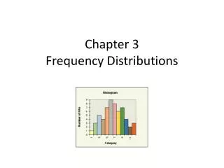
Chapter 3: Frequency Distributions. In Chapter 3:. 3.1 Stemplot 3.2 Frequency Tables 3.3 Additional Frequency Charts. Stem-and-leaf plots (stemplots). Always start by looking at the data with graphs and plots Our favorite technique for looking at a single variable is the stemplot

E N D
In Chapter 3: 3.1 Stemplot 3.2 Frequency Tables 3.3 Additional Frequency Charts
Stem-and-leaf plots (stemplots) • Always start by looking at the data with graphs and plots • Our favorite technique for looking at a single variable is the stemplot • A stemplot is a graphical technique that organizes data into a histogram-like display You can observe a lot by looking – Yogi Berra
Stemplot Illustrative Example • Select an SRS of 10 ages • List data as an ordered array 05 11 21 24 27 28 30 42 50 52 • Divide each data point into a stem-value and leaf-value • In this example the “tens place” will be the stem-value and the “ones place” will be the leaf value, e.g., 21 has a stem value of 2 and leaf value of 1
Stemplot illustration (cont.) • Draw an axis for the stem-values: 0| 1| 2| 3| 4| 5| ×10 axis multiplier (important!) • Place leaves next to their stem value • 21 plotted (animation) 1
Stemplot illustration continued … • Plot all data points and rearrange in rank order: 0|5 1|1 2|1478 3|0 4|2 5|02 ×10 • Here is the plot horizontally: (for demonstration purposes) 8 7 4 25 1 1 0 2 0------------0 1 2 3 4 5------------Rotated stemplot
Interpreting Stemplots • Shape • Symmetry • Modality (number of peaks) • Kurtosis (width of tails) • Departures (outliers) • Location • Gravitational center mean • Middle value median • Spread • Range and inter-quartile range • Standard deviation and variance (Chapter 4)
Shape • “Shape” refers to the pattern when plotted • Here’s the silhouette of our data X X X X X X X X X X ----------- 0 1 2 3 4 5 ----------- • Consider: symmetry, modality, kurtosis
Shape: Idealized Density Curve A large dataset is introduced An density curve is superimposed to better discuss shape
Kurtosis (steepness) fat tails Mesokurtic (medium) Platykurtic (flat) skinny tails Leptokurtic (steep) Kurtosis is not be easily judged by eye
Location: Mean “Eye-ball method” visualize where plot would balance Arithmetic method = sum values and divide by n Eye-ball method around 25 to 30 (takes practice) Arithmetic method mean = 290 / 10 = 29 8 7 4 25 1 1 0 2 0------------0 1 2 3 4 5 ------------ ^ Grav.Center
Location: Median • Ordered array: 05 11 21 24 27 28 30 42 50 52 • The median has a depth of(n + 1) ÷ 2 on the ordered array • When n is even, average the points adjacent to this depth • For illustrative data: n = 10, median’s depth = (10+1) ÷ 2 = 5.5 → the median falls between 27 and 28 • See Ch 4 for details regarding the median
Spread: Range • Range = minimum to maximum • The easiest but not the best way to describe spread (better methods of describing spread are presented in the next chapter) • For the illustrative data the range is “from 5 to 52”
Stemplot – Second Example • Data: 1.47, 2.06, 2.36, 3.43, 3.74, 3.78, 3.94, 4.42 • Stem = ones-place • Leaves = tenths-place • Truncate extra digit (e.g., 1.47 1.4) Do not plot decimal |1|4|2|03|3|4779|4|4(×1) • Center: between 3.4 & 3.7 (underlined) • Spread: 1.4 to 4.4 • Shape: mound, no outliers
Third Illustrative Example (n = 25) • Data: {14, 17, 18, 19, 22, 22, 23, 24, 24, 26, 26, 27, 28, 29, 30, 30, 30, 31, 32, 33, 34, 34, 35, 36, 37, 38} • Regular stemplot: |1|4789|2|223466789|3|000123445678(×1) • Too squished to see shape
Third Illustration (n = 25), cont. • Split stem: • First “1” on stem holds leaves between 0 to 4 • Second “1” holds leaves between 5 to 9 • And so on. • Split-stem stemplot |1|4|1|789|2|2234|2|66789|3|00012344|3|5678(×1) • Negative skew - now evident
How many stem-values? • Start with between 4 and 12 stem-values • Trial and error: • Try different stem multiplier • Try splitting stem • Look for most informative plot
Fourth Example: Body weights (n = 53) Data range from 100 to 260 lbs:
Data range from 100 to 260 lbs: • ×100 axis multiplier only two stem-values (1×100 and 2×100) too broad • ×100 axis-multiplier w/ split stem only 4 stem values might be OK(?) • ×10 axis-multiplier see next slide
Fourth Stemplot Example (n = 53) 10|0166 11|009 12|0034578 13|00359 14|08 15|00257 16|555 17|000255 18|000055567 19|245 20|3 21|025 22|0 23| 24| 25| 26|0 (×10) Looks good! Shape: Positive skew, high outlier (260) Location: median underlined (about 165) Spread: from 100 to 260
Quintuple-Split Stem Values 1*|0000111 1t|222222233333 1f|4455555 1s|666777777 1.|888888888999 2*|0111 2t|2 2f| 2s|6 (×100) Codes for stem values: * for leaves 0 and 1 t for leaves two and threef for leaves four and fives for leaves six and seven. for leaves eight and nine For example, this is 120: 1t|2(x100)
SPSS Stemplot SPSS provides frequency counts w/ its stemplots: Frequency Stem & Leaf 2.00 3 . 0 9.00 4 . 0000 28.00 5 . 00000000000000 37.00 6 . 000000000000000000 54.00 7 . 000000000000000000000000000 85.00 8 . 000000000000000000000000000000000000000000 94.00 9 . 00000000000000000000000000000000000000000000000 81.00 10 . 0000000000000000000000000000000000000000 90.00 11 . 000000000000000000000000000000000000000000000 57.00 12 . 0000000000000000000000000000 43.00 13 . 000000000000000000000 25.00 14 . 000000000000 19.00 15 . 000000000 13.00 16 . 000000 8.00 17 . 0000 9.00 Extremes (>=18) Stem width: 1 Each leaf: 2 case(s) 3 . 0 means 3.0 years Because of large n, each leaf represents 2 observations
Frequency Table AGE | Freq Rel.Freq Cum.Freq. ------+----------------------- 3 | 2 0.3% 0.3% 4 | 9 1.4% 1.7% 5 | 28 4.3% 6.0% 6 | 37 5.7% 11.6% 7 | 54 8.3% 19.9% 8 | 85 13.0% 32.9% 9 | 94 14.4% 47.2%10 | 81 12.4% 59.6%11 | 90 13.8% 73.4%12 | 57 8.7% 82.1%13 | 43 6.6% 88.7%14 | 25 3.8% 92.5%15 | 19 2.9% 95.4%16 | 13 2.0% 97.4%17 | 8 1.2% 98.6%18 | 6 0.9% 99.5%19 | 3 0.5% 100.0%------+-----------------------Total | 654 100.0% • Frequency = count • Relative frequency = proportion or % • Cumulative frequency % less than or equal to level
Frequency Table with Class Intervals • When data are sparse, group data into class intervals • Create 4 to 12 class intervals • Classes can be uniform or non-uniform • End-point convention: e.g., first class interval of 0 to 10 will include 0 but exclude 10 (0 to 9.99) • Talley frequencies • Calculate relative frequency • Calculate cumulative frequency
Class Intervals Uniform class intervals table (width 10) for data:05 11 21 24 27 28 30 42 50 52
Histogram A histogram is a frequency chart for a quantitative measurement. Notice how the bars touch.
Bar Chart A bar chart with non-touching bars is reserved for categorical measurements and non-uniform class intervals