Download
1 / 28
280 likes | 565 Views
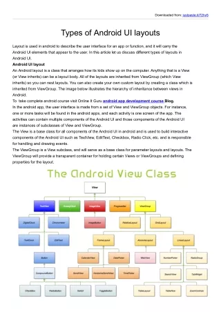
Android UI Design Patterns. Computer Engineering 0892014 Park Soyoung. 목차. Icons Design Launcher Icons Menu Icons Status Bar Icons Tab Icons Dialog Icons List View Icons App Widget Design Menu Design. Style. Launcher Icons. Clean and contemporary Simple and iconic

E N D
Android UI Design Patterns Computer Engineering0892014 Park Soyoung
목차 • Icons Design • Launcher Icons • Menu Icons • Status Bar Icons • Tab Icons • Dialog Icons • List View Icons • App Widget Design • Menu Design
Style Launcher Icons • Clean and contemporary • Simple and iconic • Tactile and textured • Forward-facing and top-lit
Size and positioning Launcher Icons • High-density • Full Asset: 72 x 72 px • Icon: 60 x 60 px • Square Icon: 56 x 56 px • Medium-density • Full Asset: 48 x 48 px • Icon: 40 x 40 px • Square Icon: 38 x 38 px • Low-density • Full Asset: 36 x 36 px • Icon: 30 x 30 px • Square Icon: 28 x 28 px
Materials and colors Launcher Icons • 안드로이드에서 권장하는 기본 색상 • 안드로이드에서 제공하는 Materials
Do’s and Don’ts Launcher Icons • 모던, 최소화, 매트, 질감, 앞을 보고 있는 단추, 위에서 비추는 조명, 제공된 색상 사용 • 앤티크, 과하게 복잡한 것, 광택, 회전, 잘림
Size and positioning Menu Icons • High-density • Full Asset: 72 x 72 px • Icon: 48x 48 px • Square Icon: 44 x 44 px • Medium-density • Full Asset: 48 x 48 px • Icon: 32x 32 px • Square Icon: 30 x 30 px • Low-density • Full Asset: 36 x 36 px • Icon: 24x 24 px • Square Icon: 22 x 22 px
Color Palette Menu Icons • 검정 • 회색 그라데이션 • 흰색
Do’s and Don’ts MenuIcons • 메뉴 아이콘 역시 런쳐 아이콘과 마찬가지로 복잡하고 흐린 것은 안되며, 제공된 색상 이외의 것을 사용하면 안 된다.
Size and positioning Status Bar Icons • High-density • Full Asset: 24wx 38h px • Icon: 24w x 24h px • Medium-density • Full Asset: 16wx 25 px • Icon: 16w x 16w px • Low-density • Full Asset: 12wx 19h px • Icon: 12w x 12h px
Color Palette Status Bar Icons • 검정 • 검정 그라데이션 • 회색 그라데이션 • 흰색
Do’s and Don’ts Status Bar Icons • 상태 바 아이콘 역시, 사이즈를 마음대로 바꿔서는 안되고 색상도 정해진 색상을 써야 합니다.
Size and positioning Tab Icons • High-density • Full Asset: 48x 48 px • Icon: 42x 42 px • Medium-density • Full Asset: 32x 32 px • Icon: 28x 28 px • Low-density • Full Asset: 24x 24 px • Icon:22 x 22 px
Color Palette Tab Icons • 회색 그라데이션
Do’s and Don’ts Tab Icons • 위에서 빛이 나거나, 다른 색상을 쓰거나, 크기를 임의로 줄일 경우는 안 되요.
Dialog & List View Icons Size and positioning
App Widget Design • Standard Widget Sizesin Portrait Orientation
App Widget Design • Standard Widget Sizes in Landscape Orientation
App Widget Design • Select a bounding box size for your widget. • 위젯에 대한 경계 상자 크기를 선택한다. • Select a matching frame. • 일치하는 프레임을 선택한다. • Apply standard shadow effect to your graphics. • 그래픽에 표준 그림자 효과를 적용합니다.(홈페이지 참고) • If your widget includes buttons, draw them in three states (default, pressed, and selected). • 만약에 버튼이 포함되어 있다면, 세 가지 경우를 만드세요.
App Widget Design • Finish drawing your artwork and then scale and align it to fit. • 그림을 크기와 색 등을 맞게 맞추고 끝냅니다. • Save your widget with the correct graphics file settings. • 올바른 그래픽 파일을 설정하여 위젯을 저장합니다.
Standard Widget Sizes App Widget Design in Portrait Orientation
Standard Widget Sizes App Widget Design in Landscape Orientation
Standard Widget Frames App Widget Design in Portrait Orientation 2 X 2 → ← 3 X 3 ↓ 4 X 1
Standard Widget Frames App Widget Design 2 X 2 → ← 3 X 3 ↓ 4 X1
Menu Design • Place the most frequently used operations first. • 가장 자주 사용하는 맨 처음 둡니다. • Don't put commands only in a Context menu. • 콘텍스트 메뉴에 명령만을 넣지 마세요. • The first command in a Context menu should be the selection's most intuitive command. • 콘텍스트 메뉴에서 첫 명령은 선택할 때 가장 직관적인 명령이어야 합니다. • Selecting an item in the content should perform the most intuitive operation. • 콘텐츠 항목을 선택하면 가장 직관적인 작업을 수행합니다.
Menu Design • A Context menu should identify the selected item. • 콘텍스트 메뉴는 선택한 항목이 식별 가능해야만 한다. • Put only the most important commands fixed on the screen. • 화면에는 가장 중요한 명령 만을 고정시켜 넣어야 한다. • Use short names in the Options icon menu. • 옵션 아이콘 메뉴에는 짧은 이름을 써야 합니다. • If an activity has no Options menu, do not display a message. • 만약 액티비티가 옵션메뉴가 없다면, 메시지가 보이지 않아도 된다. • Dim or hide menu items that are not available in the current context. • 현재 콘텍스트에서 사용하지 않는 메뉴는 희미하게 하거나 숨깁니다.
Etc. • 홈페이지를 살펴보면 아이콘을 만드는 방법 등, 알면 좋은 정보가 더 있다.(그림자 효과 넣는 등, 포토을 이용해서 하는 방법 등이 올라와 있다.) • 가서 한 번씩 살펴보세요.