Download
1 / 72
740 likes | 1.27k Views
The Bar Graph or Bar Chart. What is it? How to Draw it. What is a Bar Graph?. A bar graph is a graph that displays the frequency or numerical distribution of a categorical variable, showing values for each bar next to each other for easy comparison. Alternate Name: Bar Chart .

E N D
The Bar Graph or Bar Chart What is it? How to Draw it
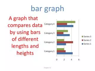
What is a Bar Graph? A bar graph is a graph that displays the frequency or numerical distribution of a categorical variable, showing values for each bar next to each other for easy comparison. Alternate Name: Bar Chart
Bar Graph Example In June 2005, the US Dept of Transportation reported the following data by observing 1700 motorcyclists nationwide at randomly selected roadway location: • Proper Helmet 731 • Insufficient Helmet 153 • No Helmet 816 Total 1,700
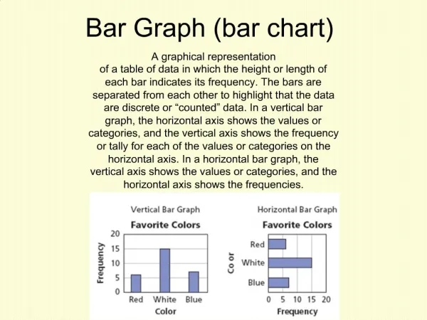
x-axis & y-axis Variables • On a vertical bar graph, the y-axis variable is normally a quantitative variable. Is it discrete or continuous? ® • On a vertical bar graph, the x-axis variable is normally a categorical variable Categorical Variable
Type of Variables on the Previous Motorcycle Bar Graph • x-axis? Categorical Variable. Name the categories Proper, Insufficient, None • y-axis Discrete Quantitative Variable What are the units? Helmets
Making a Bar Graph Look Better • What would make this bar graph look better? If we ranked the numbers by either increasing or decreasing value, the appearance would be less jagged, making a Pareto Chart. • What is a Pareto Chart? A bar graph in which the bars are ordered according to value, in either increasing or decreasing order. • Why Pareto Charts? Graph is named for Vilfredo Pareto, an Italian mathematician & economist. 1848-1923.
Non Pareto Version of Sales
Bar Graphs: VERY FLEXIBLE FORMAT Advantage over Pie Charts Bar Graphs are easier to make & to read than pie charts. How are they similar to Pie Charts? Both pie charts & bar graphs can display the distribution of a categorical variable How are they different from Pie Charts? A bar graph can also compare any set of quantities measured in the same units.
In Class Survey Results from 2009:Do you believe in Supernatural Phenomena?
In Class Survey Results from 20093-Level Comparative Bar Graph
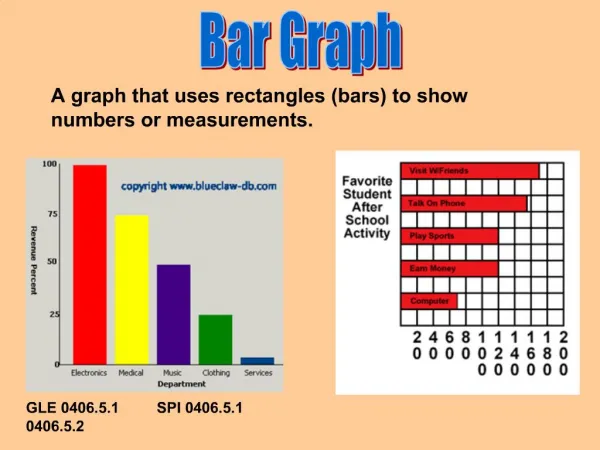
Bar Graph Characteristics • Data can be quantitative or categorical • Bars can be vertical or horizontal • The x-axis represents the category displayed • The y-axis represents the quantitative values of the variable being displayed • Bars are of uniform width and uniformly spaced
Bar Graph Characteristics • A consistent measurement scale is used for each vertical bar • Height of bars represent the values of the variable displayed, the frequency of occurrence or percentage of occurrence • The graph is well-annotated with title, labels for each bar, vertical scale, horizontal categories, source
Changing Scale – The Squiggle What is a squiggle? At least a 2-angle line on a bar graph axis that abbreviates a scale. When do you use a squiggle? Use a squiggle on the changed axis whenever you change scale in a bar graph. Horizontal Squiggle Vertical Squiggle
“Would The Bar Graph Make a Good Pie Chart?” • Only when Bar Graphs represent parts of a whole, can it be made into a Pie Chart. • If the answer is NO, you could write: • No, because these values are comparative data only. • No, because these values DO NOT represent parts of the whole. • If the answer is YES, you could write: • Yes, because these values represent parts of the whole.
Bar Graph & Pie Chart Relationship Summary • Every Pie Chart COULD be made into a Bar Graph BUT • NOT all Bar Graphs CAN be made into Pie Charts Pie Chart Þ Bar Graph Bar Graph Þ Pie Chart
The Chicago Tribune polled 380 randomly selected Chicago residents from August 27 to 31, 2009 on the subject of the potential Chicago Olympics of 2016. The question asked was, “Do you favor or oppose Chicago hosting the 2016 Olympic games?” The results of the poll were: Deciding Which Graph is Better Supply the remainder of the data labels
The answer is obviously yes, But the question remains, Which Graph looks better? Which Graph is better for display purposes? This is a matter of opinion Could the Pie Chart Become a Bar Graph? Supply the remainder of the data labels
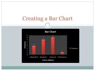
What’s the question? What’s the title? What’s the population? What’s the sample? How many variables? What are they? What’s the conclusion? Good pie chart? Is this a Pareto chart? Examining a Bar Chart for Meaning