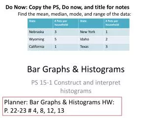
Download

1 / 21
240 likes | 419 Views
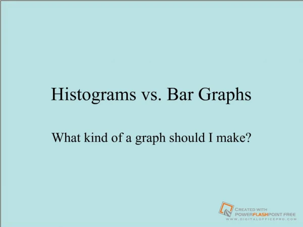
Bar Graphs and Histograms. Powerpoint hosted on www.worldofteaching.com Please visit for 100’s more free powerpoints. What do you know about. bar graph? double bar graph? Histogram?. Bar Graph. Native Language of 7 th Graders in Anywhere, China.

E N D
Bar Graphs and Histograms Powerpoint hosted on www.worldofteaching.com Please visit for 100’s more free powerpoints
What do you know about • bar graph? • double bar graph? • Histogram?
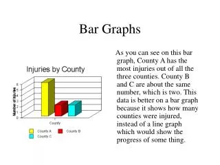
Bar Graph Native Language of 7th Graders in Anywhere, China • A bar graph can be used to display and compare data • The scale should include all the data values and be easily divided into equal intervals.
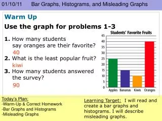
How to interpret a Bar Graph? The bar graph shows Mr. Snowden’s students by gender and band membership. • How many of Mr. Snowden’s students are band members? • How many of Mr. Snowden’s students are not band members? Snowden’s Students by Gender & Band Membership
Double Bar Graph • Can be used to compare two related sets of data
How to make a Double-Bar Graph? • Choose a scale and interval for the vertical axis. • Draw a pair of bars for each country’s data. Use different colors to show males and females. • Label the axes and give the graph a title. • Make a key to show what each bar represents.
The table shows the highway speed limits on interstate roads .within three states
Step 1 • Choose a scale and interval for the vertical axis.
Step 2 • Draw a pair of bars for each state’s data. Use different colors to show urban and rural.
Step 3 and 4 Speed Limit on Interstate Roads • Label the axes and give the graph a title. • Make a key to show what each bar represents Urban Rural Speed Limit (mi/h)
Histogram • Histogram is a bar graph that shows the frequency of data within equal intervals. • There is no space in between the bars.
Step 1 • Make a frequency table of the data. Be sure to use equal intervals
Step 2 • Choose an appropriate scale and interval for the vertical axis. The greatest value on the scale should be at least as great as the greatest frequency.
Step 3 • Draw a bar for each interval. The height of the bar is the frequency for that interval. Bars must touch but not overlap. • Label the axes and give the graph title
Can you now make a bar graph, double bar Graph and a histogram?
The list below shows the results of a typing test in words per minute. Make a histogram of the data. 62, 55, 68, 47, 50, 41, 62, 39, 54, 70, 56, 70, 56, 47, 71, 55, 60, 42