Download
1 / 14
140 likes | 389 Views
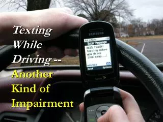
Don’t Let Texting Blind You!. S Whitaker APLC ; P.3 Mrs.Stein. What is your first impression?. My first impression:. The first thing I noticed was that the text, “DON’T LET TEXTING BLIND YOU” was directly in front of the drivers face, causing him to not be able to see the road. .

E N D
Don’t Let Texting Blind You! S Whitaker APLC ; P.3 Mrs.Stein
My first impression: The first thing I noticed was that the text, “DON’T LET TEXTING BLIND YOU” was directly in front of the drivers face, causing him to not be able to see the road.
Audience: I believe that the audience for this ad is mainly those drivers that text while they are driving. The audience could also be those who are passengers to texting drivers because they see how texting “blinds” the driver.
Does it change your feelings towards the ad if the words weren’t “blinding” the driver?
My thoughts: I believe that the ad would lose some of its affect if the words weren’t over the drivers eyes. The whole point of the words being on the driver is to show that when you text and drive, you’re basically blind.
Pathos: The quote, “STOP THE TEXTS. STOP THE WRECKS.” is the emotional appeal of this ad. I believe this because when you read that, you start thinking about how many wrecks texting and driving causes.
Logos: I believe that the logical appeal of this ad is that the quote, “DON’T LET TEXTING BLIND YOU,” is directly in front of the driver. I think this because it actually proves that texting is blinding the driver. It shows that texting and driving can cause you to become blind to what’s going on around you.
Ethos: I believe the ethical appeal of this ad, is the logo in the bottom right corner. NHTSA, National Highway Traffic Safety Administration, which works daily to help prevent crashes and their costs, both human and financial.
Citations: • http://www.google.com/imghp?hl=en&tab=wi • textually.org • http://textinganddrivingstatistics.com/ • http://www.nhtsa.gov/About