Download
1 / 10
110 likes | 144 Views
Learn about regression analysis and correlation to make estimates between variables. Use scatterplots to identify relationships and choose the best curve. Discover how to interpret correlation coefficients for model fitting.

E N D
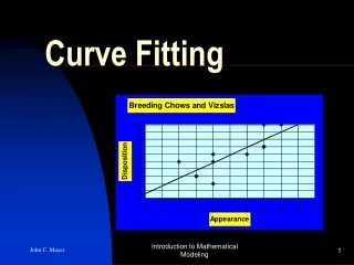
With statistical applications, exact relationships may not exist Often an averagerelationship is used RegressionAnalysis: a collection of methods by which estimates are made between 2 variables CorrelationAnalysis: tells the degree to which the variables are related Scatterplot: good tool for recognizing & analyzing relationships dependent variable (prediction to be made) independent variable (the basis for the prediction)
Ex 1) A college admissions committee wishes to predict students’ first-year math averages from their math SAT scores. The data was plotted: The points are NOT on a clear straight line. But what can this plot tell us? - In general, higher SAT scores correspond to higher grades - Looks like a positive linear (or direct) relationship * Our graphing calculator can plot scatter plots Remember to identify which variable is independent & which is dependent. * Once we have a scatter plot, we identify the line or curve that “best fits” the points
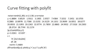
Statisticians use the methodofleastsquares to obtain a linearregression equation y = a + bx *the sum of all the values y is zero *the sum of the squares of the values y is as small as possible *On Calculator 2nd 0 (CATALOG) Scroll down to Diagnostic On Enter, Enter
Ex 2) A runner’s stride rate is related to his or her speed. Plot using a scatter plot STAT 1: Edit… L1 = enter data for speed (independent) L2 = enter data for stride rate (dependent) 2nd Y= (STAT PLOT) 1: Enter WINDOW GRAPH looks like a line!
Do a “linear regression” • STAT CALC 8: Lin Reg (a+bx) Xlist: L1 • Ylist: L2 • Calculate enter y = 1.766 + .080x What is r? correlation coefficient It tells us “how good” our regression model fits. The closer it is to 1 (for direct linear) or –1 (for inverse linear), the better our model fits the data.
Ex 3) Match the scatter diagrams with the correlation coefficients r = 0.3, r = 0.9, r = –0.4, r = –0.75 c) a) b) r = 0.9 rising line fits points well r = –0.4 falling line fits points but not closely r = 0.3 rising line fits points but not closely A straight line is not always the best way to describe a relationship. The relationship may be described as curvilinear. Exponential ExpReg y = abx Logarithmic LnReg y = a + b lnx Power PwrReg y = axb All of these can be found in the STAT CALC menu
Ex 4) An accountant presents the data in the table about a company’s profits in thousands of dollars for 7 years after a management reorganization. Scatter plot STAT 1:EDIT Enter data in L1 & L2 WINDOW GRAPH Typo Looks exponential Let’s try an exponential regression STAT CALC 0: ExpReg y = 107.208 (1.439)x Now use this model to predict the profit for year 8. y = 107.208 (1.439)8 = 1971.1 $1,971,000
Homework #1507 Pg 842 #4 – 7, 9 – 12, 14, 17 – 26, 31, 38 (use your graphing calculator for all scatter plots then make a sketch of what your calculator gives)