Download
1 / 9
90 likes | 165 Views
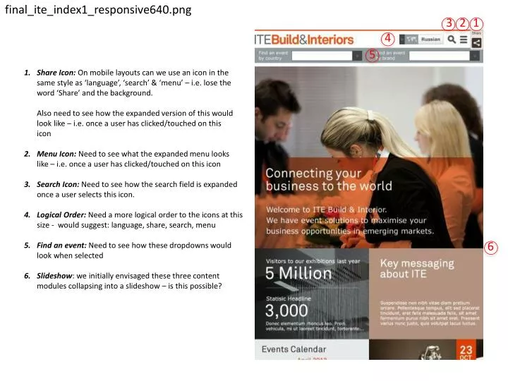
final_ite_index1_responsive640.png. 3. 2. 1. 4. 5.

E N D
final_ite_index1_responsive640.png 3 2 1 4 5 Share Icon: On mobile layouts can we use an icon in the same style as ‘language’, ‘search’ & ‘menu’ – i.e. lose the word ‘Share’ and the background.Also need to see how the expanded version of this would look like – i.e. once a user has clicked/touched on thisicon Menu Icon: Need to see what the expanded menu looks like – i.e. once a user has clicked/touched on this icon Search Icon: Need to see how the search field is expanded once a user selects this icon. Logical Order: Need a more logical order to the icons at this size - would suggest: language, share, search, menu Find an event: Need to see how these dropdowns would look when selected Slideshow: we initially envisaged these three content modules collapsing into a slideshow – is this possible? 6
final_ite_index1_responsive320.png 3 2 1 4 5 Share Icon: On mobile layouts can we use an icon in the same style as ‘language’, ‘search’ & ‘menu’ – i.e. lose the word ‘Share’ and the background.Also need to see how the expanded version of this would look like – i.e. once a user has clicked/touched on thisicon Menu Icon: Need to see what the expanded menu looks like – i.e. once a user has clicked/touched on this icon Search Icon: Need to see how the search field is expanded once a user selects this icon. Logical Order: Need a more logical order to the icons at this size - would suggest: language, share, search, menu Find an event: Need to see how these dropdowns would look when selected Slideshow: we initially envisaged these three content modules collapsing into a slideshow – is this possible? 6
final_ite_contact640.png Module Layout & Text Size: Concerned about the small size of this text on the mobile layouts – can we look at alternative layouts for these four modules that enable us to increase the font size – perhaps 2 columns x 2 rows? Text Size: Text size is getting quite small here too – perhaps we should consider dropping the additional text altogether on mobile devices and just have buttons that link through to the sister sites. Padding: When arranged in this way should these modules sit flush with each other as per the homepage? i.e. remove the padding between the modules here 3 1 2
final_ite_contact320.png 3 Module Layout & Text Size: Concerned about the small size of this text on the mobile layouts – can we look at alternative layouts for these four modules that enable us to increase the font size – perhaps 1 columns x 4 rows? Text Size: Text size is getting quite small here too – perhaps we should consider dropping the additional text altogether on mobile devices and just have buttons that link through to the sister sites. Margins: The text is very tight against the left margin on this screen – can we increase the margin a little? Padding: When arranged in this way should these modules sit flush with each other as per the homepage? i.e. remove the padding between the modules here 1 4 2
final_ite_event_overview320.png 1 Duplicate functionality: We only require the text link to ‘Find an event’ here – it should be a ‘back’ link to the user’s ‘search results’ Margins: The text is very tight against the left margin on this screen – can we increase the margin a little? 2
final_ite_contact640.png Call Us: This is important information so should be more prominent – perhaps aligning this and the contact form information across the full page. Secondary calls to action: With the contact information full width above them, these could then be arranged more neatly in a 2 column x 2 row layout? 2 1
final_ite_contact320.png 1 Find an event: We don’t need this functionality on this page Margins: The text is very tight against the left margin on this screen – can we increase the margin a little? 2
final_ite_contact_form640.png Call Us: This is important information so should be more prominent – perhaps aligning this and the contact form information across the full page. Secondary calls to action: With the contact information full width above them, these could then be arranged more neatly in a 2 column x 2 row layout? 2 1
final_ite_contact_form320.png 1 Find an event: We don’t need this functionality on this page Margins: The text is very tight against the left margin on this screen – can we increase the margin a little? Checkbox Alignment: Seems to have gone awry 2 3