Download
1 / 21
220 likes | 369 Views
Филтри и преходи. CSS атрибут filter. E фекти:. Alpha прозрачност Blur движение в посока Chroma опред. цвят става прозрачен; DropShadow копие с отместване FlipH , FlipV огледално копие Glow сияние Gray Scale степени на сиво Invert фото негатив Light осветяване от посока

E N D
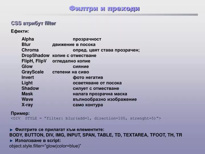
Филтри и преходи CSS атрибут filter Eфекти: Alpha прозрачност Blur движение в посока Chroma опред.цвят става прозрачен; DropShadow копие с отместване FlipH, FlipV огледално копие Glow сияние GrayScale степени на сиво Invert фото негатив Light осветяване от посока Shadow силует с отместване Mask налага прозрачна маска Wave вълнообразно изображение X-ray само контура Пример: <DIV STYLE = “filter: blur(add=1, direction=100, strenght=5)”> • Филтрите се прилагат към елементите: • BODY, BUTTON, DIV, IMG, INPUT, SPAN, TABLE, TD, TEXTAREA,TFOOT, TH, TR • Използване в script: • object.style.filter=”glow(color=blue)”
Филтри и преходи Преходи 24 на брой blend transition – получават аргумент за времетраене на скриването/показването reveal transition – получават числова стойност за ефекта при показване:
Филтри и преходи <!DOCTYPE html PUBLIC "-//W3C//DTD HTML 4.0 Transitional//EN"> <HTML><!-- Cycling through 24 transitions --> <HEAD><TITLE>24 DHTML Transitions</TITLE> <SCRIPT> var transitionName = ["Box In", "Box Out", "Circle In", "Circle Out", "Wipe Up", "Wipe Down", "Wipe Right", "Wipe Left", "Vertical Blinds", "Horizontal Blinds", "Checkerboard Across", "Checkerboard Down", "Random Dissolve", "Split Vertical In", "Split Vertical Out", "Split Horizontal In", "Split Horizontal Out", "Strips Left Down", "Strips Left Up", "Strips Right Down", "Strips Right Up", "Random Bars Horizontal", "Random Bars Vertical", "Random"]; var counter = 0; var whichImage=true; function blend() { if ( whichImage ) { image1.filters( "revealTrans" ).apply(); image1.style.visibility = "hidden"; image1.filters( "revealTrans" ).play(); } else { image2.filters( "revealTrans" ).apply(); image2.style.visibility = "hidden"; image2.filters( "revealTrans" ).play(); } }
Филтри и преходи function reBlend ( fromImage ) { counter++; if ( fromImage ) { image1.style.zIndex -= 2; image1.style.visibility = "visible"; image2.filters("revealTrans").transition = counter % 24; } else { image1.style.zIndex += 2; image2.style.visibility = "visible"; image1.filters("revealTrans").transition = counter % 24; } whichImage = !whichImage; blend(); transitionDisplay.innerHTML = "Transition " + counter % 24 + ":<BR> " + transitionName[ counter % 24 ]; } </SCRIPT> </HEAD> <BODY STYLE="color: white; background-color: lightcoral" ONLOAD = "blend()"> <IMG ID = "image2" SRC = "icontext.gif" STYLE = "position: absolute; left: 10; top: 10; width:300; z-index:1; visibility: visible; filter: revealTrans( duration = 2, transition = 0 )" ONFILTERCHANGE = "reBlend( false )">
Филтри и преходи <IMG ID = "image1" SRC = "icons2.gif" STYLE = "position: absolute; left: 10; top: 10; width:300; z-index:1; visibility: visible; filter: revealTrans( duration = 2, transition = 0 )" ONFILTERCHANGE = "reBlend( true )"> <DIV ID = "transitionDisplay" STYLE = "position: absolute; top: 10; left: 325">Transition 0:<BR> Box In</DIV> </BODY> </HTML> Преходи при преминаване между страници: <МЕТА> <HTML> <HEAD> <TITLE>начална страница</TITLE> </HEAD> <BODY BGCOLOR="yellow"> <A HREF="second.htm">ако кликнете тук ще се изпълни прехода</A> <P> <IMG SRC="magic.gif"> </BODY> </HTML>
Филтри и преходи <HTML> <HEAD> <TITLE>втора страница с 2 прехода</TITLE> <META HTTP-EQUIV="Page-Enter"CONTENT="revealtrans(duration=3.0, transition=23)"> <META HTTP-EQUIV="Page-Exit"CONTENT="revealtrans(duration=3.0, transition=23)"> </HEAD> <BODY> <A HREF="first.htm">ако кликнете тук - към първата страница</A> <P> <IMG SRC="flower.gif"> </BODY> </HTML> Примери
Филтри и преходи <!DOCTYPE html PUBLIC "-//W3C//DTD HTML 4.0 Transitional//EN"> <HTML> <!-- Image filters to invert, grayscale, or xray an image --> <HEAD> <TITLE>Misc. Image filters</TITLE> <STYLE TYPE = "text/css"> .cap { font-weight: bold; background-color: #DDDDAA; text-align: center } </STYLE> </HEAD> <BODY> <TABLE> <TR CLASS = "cap"> <TD>Normal</TD> <TD>Grayscale</TD> <TD>Xray</TD> <TD>Invert</TD> </TR> <TR> <TD><IMG SRC = "myimage.jpg"></TD> <TD><IMG SRC = "myimage.jpg" STYLE = "filter: gray"></TD> <TD><IMG SRC = "myimage.jpg" STYLE = "filter: xray"></TD> <TD><IMG SRC = "myimage.jpg" STYLE = "filter: invert"></TD> </TR> </TABLE> </BODY> </HTML>
Филтри и преходи <HTML><HEAD> <TITLE>Blend Transition II</TITLE> <SCRIPT LANGUAGE = "JavaScript"> var whichImage = true; function blend() { if ( whichImage ) { image1.filters( "blendTrans" ).apply(); image1.style.visibility = "hidden"; image1.filters( "blendTrans" ).play(); } else { image2.filters( "blendTrans" ).apply(); image2.style.visibility = "hidden"; image2.filters( "blendTrans" ).play(); } }
Филтри и преходи function reBlend ( fromImage ) { if ( fromImage ) { image1.style.zIndex -= 2; image1.style.visibility = "visible"; } else { image1.style.zIndex += 2; image2.style.visibility = "visible"; } whichImage = !whichImage; blend(); } </SCRIPT> </HEAD> <BODY STYLE = "color: darkblue; background-color: lightblue" ONLOAD = "blend()"> <H1>Blend Transition Demo</H1> <IMG ID = "image2" SRC = "cool12.jpg" ONFILTERCHANGE = "reBlend( false )" STYLE = "position: absolute; left: 50; top: 50; width: 300; filter: blendTrans( duration = 4 ); z-index: 1"> <IMG ID = "image1" SRC = "cool8.jpg" ONFILTERCHANGE = "reBlend( true )" STYLE = "position: absolute; left: 50; top: 50; width: 300; filter: blendTrans( duration = 4 ); z-index: 2"> </BODY> </HTML>
Филтри и преходи Добавяне сенки към текст
Филтри и преходи <HTML> <!-- Applying the shadow filter --> <HEAD> <TITLE>Shadow Filter</TITLE> <SCRIPT LANGUAGE = "JavaScript"> var shadowDirection = 0; function start() { window.setInterval( "runDemo()", 500 ); } function runDemo() { shadowText.innerText = "Shadow Direction: " + shadowDirection % 360; shadowText.filters( "shadow" ).direction = ( shadowDirection % 360 ); shadowDirection += 45; } </SCRIPT> </HEAD> <BODY ONLOAD = "start()"> <H1 ID = "shadowText" STYLE = "position: absolute; top: 50; left: 50;padding: 10; filter: shadow( direction = 0, color = red )">Shadow Direction: 0</H1> </BODY> </HTML>
Филтри и преходи Градиенти с alpha филтър
Филтри и преходи <BODY> <DIV ALIGN = "center" ID = "pic" STYLE = "position: absolute; left:0; top: 0; filter: alpha( style = 2, opacity = 100, finishopacity = 0 )"> <IMG SRC = "flag.gif"> </DIV> Текст, който блести
Филтри и преходи <HEAD> <TITLE>Glow Filter</TITLE> <SCRIPT LANGUAGE = "JavaScript"> var strengthIndex = 1; var counter = 1; var upDown = true; var colorArray=[ "FF0000","FFFF00","00FF00", "00FFFF","0000FF","FF00FF"]; function apply() { glowSpan.filters( "glow" ).color = parseInt( glowColor.value, 16); glowSpan.filters( "glow" ).strength = glowStrength.value; } function startdemo() { window.setInterval( "rundemo()", 150 ); } function rundemo() { if ( upDown ) glowSpan.filters( "glow" ).strength = strengthIndex++; else glowSpan.filters( "glow" ).strength = strengthIndex--; if ( strengthIndex == 1 ) { upDown = !upDown; counter++; glowSpan.filters( "glow" ).color = parseInt( colorArray[ counter % 6 ], 16 ); } if ( strengthIndex == 10 ) { upDown = !upDown; } } </SCRIPT> </HEAD>
Филтри и преходи <BODY STYLE = "background-color: #00AAAA"> <H1>Glow Filter:</H1> <SPAN ID = "glowSpan" STYLE = "position: absolute; left: 200; top: 100; padding: 5; filter: glow( color = red, strength = 5 )"> <H2>Glowing Text</H2> </SPAN> <TABLE BORDER = 1 STYLE = "background-color: #CCFFCC"> <TR> <TD>Color (Hex)</TD> <TD> <INPUT ID="glowColor" TYPE="text" SIZE=3 MAXLENGTH=3 VALUE=FF0000> </TD> </TR> <TR> <TD>Strength (1-255)</TD> <TD> <INPUT ID="glowStrength" TYPE="text" SIZE=3 MAXLENGTH=3 VALUE= 5> </TD> </TR> <TR> <TD COLSPAN = 2> <INPUT TYPE = "button" VALUE = "Apply" ONCLICK = "apply()"> <INPUT TYPE = "button" VALUE = "Run Demo" ONCLICK = "startdemo()"></TD> </TR> </TABLE> </BODY> </HTML>
Филтри и преходи Илюзия за движение blurImage.filters( "blur" ).direction = ( ( blurDirection += 45 ) % 360 );
Филтри и преходи Вълнообразно представен текст function start() { window.setInterval( "wave()", 5 ); } function wave() { wavePhase++; flag.filters( "wave" ).phase = wavePhase; } </SCRIPT></HEAD> <BODY ONLOAD = "start();"> <SPAN ID = "flag" STYLE = "align: center; position: absolute; left: 30; padding: 15; filter: wave(add = 0, freq = 1, phase = 0, strength = 10)"> <H1>Here's some waaaavy text</H1>
Филтри и преходи Усъвършенствани филтри – dropshadow, light
Филтри и преходи ... function setlight( ) { dsImg.filters( "light" ).addPoint( 150, 150, 125, 255, 255, 255, 100); } function run() { eX = event.offsetX; eY = event.offsetY; xCoordinate = Math.round( eX-event.srcElement.width/2, 0 ); yCoordinate = Math.round( eY-event.srcElement.height/2, 0 ); dsImg.filters( "dropShadow" ).offx = xCoordinate / -3; dsImg.filters( "dropShadow" ).offy = yCoordinate / -3; dsImg.filters( "light" ).moveLight(0, eX, eY, 125, 1); } </SCRIPT> </HEAD> <BODY ONLOAD = "setlight()" STYLE = "background-color: green"> <IMG ID = "dsImg" SRC = "circle.gif" STYLE = "top: 100; left: 100; filter:dropShadow( offx = 0, offy = 0, color = black ) light()" ONMOUSEMOVE = "run()"> </BODY>
Филтри и преходи Завъртян текст
Филтри и преходи <HTML> <HEAD> <TITLE>The flip filter</TITLE> <STYLE TYPE = "text/css"> BODY { background-color: #CCFFCC } TABLE { font-size: 3em; font-family: Arial, sans-serif; background-color: #FFCCCC; border-style: ridge ; border-collapse: collapse } TD { border-style: groove; padding: 1ex } </STYLE> </HEAD> <BODY> <TABLE> <TR> <TD STYLE = "filter: fliph">Text</TD> <TD>Text</TD> </TR> <TR> <TD STYLE = "filter:. flipv fliph">Text</TD> <TD STYLE = "filter: flipv">Text</TD> </TR> </TABLE> </BODY> </HTML>