Download
1 / 50
500 likes | 618 Views
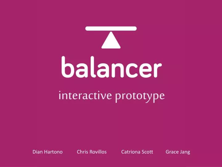
interactive prototype. Dian Hartono Chris Rovillos Catriona Scott Grace Jang. presenting today. b rian yin. problem & solution r ecap of lab usability test results revised ui designs demonstration of prototype tools used summary of talk. problem & solution

E N D
interactive prototype Dian Hartono Chris RovillosCatriona Scott Grace Jang
presenting today brian yin
problem & solution recap of lab usability test results revised ui designs demonstration of prototype tools used summary of talk
problem & solution recap of lab usability test results revised ui designs demonstration of prototype tools used summary of talk
people work hard high expectations competitive environment
long hours fatigue lack of social time
overworked employees = bad for employers
balancer is a mobile app that helps workers achieve a healthy work-life balance
problem & solution recap of lab usability test results revised ui designs demonstration of prototype tools used summary of talk
problem & solution recap of lab usability test results revised ui designs demonstration of prototype tools used summary of talk
usability test results: problems solutions
problem 1: participants didn't know if they are adding a goal or an activity.
solution: increase differentiation of goals and activities
problem 2: participants weren't able to locate the invitations bar, thus couldn’t complete the moderate task
solution: make the invitations bar more apparent
problem 3: participants didn't understand what each "+" sign meant throughout the interface.
solution: have different wording, symbol and color to help users differentiate between adding a goal and activities.
problem & solution recap of lab usability test results revised ui designs demonstration of prototype tools used summary of talk
problem & solution recap of lab usability test results revised ui designs demonstration of prototype tools used summary of talk
rationale: previously called activities People have preconceptions for “goals” and “activities” activities <-> goals? Focus on goals, and view activities as steps to achieve a goal
rationale: we believe having it the same color as the top bar made it significantly less distinguishable many participants missed the invitations bar.
rationale: participants weren’t able to differentiate between “goals” and “activities”
rationale: in previous UIs the “+” sign was used as buttons for multiple actions participants were confused on what each “+” sign meant
rationale: to help users understand that “steps” are part of “goals” this concept is reinforced by the and text presentation
problem & solution recap of lab usability test results revised ui designs demonstration of prototype tools used summary of talk
problem & solution recap of lab usability test results revised ui designs demonstration of prototype tools used summary of talk
problem & solution recap of lab usability test results revised ui designs demonstration of prototype tools used summary of talk
problem & solution recap of lab usability test results revised ui designs demonstration of prototype tools used summary of talk
we divided our team into two groups: ui design and coding implementation
ui design: used photoshop to improve the app’s overall user experience and graphic designs
coding implementation: watched the stanfordIOS app dev. lectures used xcode and the integrated cocoa frameworks to code storyboarding feature for ui
problem & solution recap of lab usability test results revised ui designs demonstration of prototype tools used summary of talk
problem & solution recap of lab usability test results revised ui designs demonstration of prototype tools used summary of talk
summary: • activities -> steps • Several new ui design to improve user experience -more descriptive button • color coding and text presentation • minor changes (invitations bar goals) 3. photoshop to improve user experience 4. used xcode to make our prototype