Download
1 / 50
600 likes | 875 Views
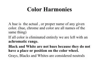
Colour Harmonies. AWS 4M0 Mr. Griscti. The Process of Choosing Colour. DEFINE the mood and the goal of your project CHOOSE the colour you feel best expresses this mood PLAY with the possibilities presented, using swatches to match fabrics, paints, papers, inks, etc.;

E N D
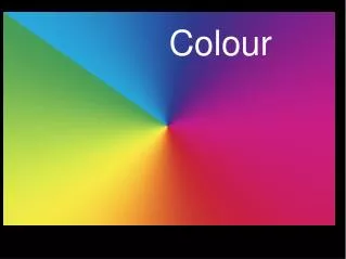
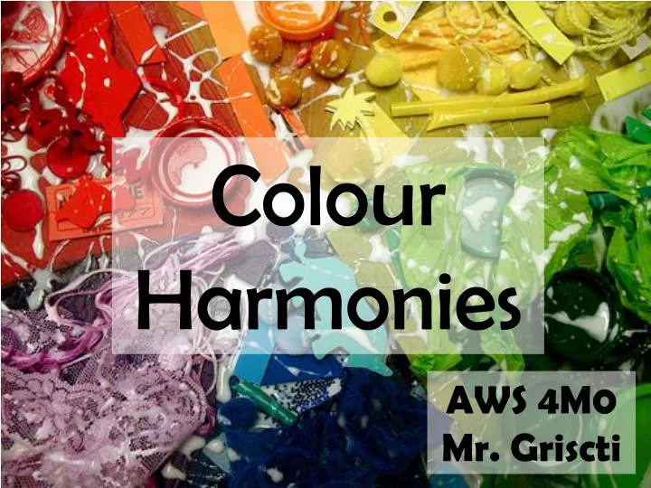
Colour Harmonies AWS4M0 Mr. Griscti
The Process of Choosing Colour • DEFINE the mood and the goal of your project • CHOOSE the colour you feel best expresses this mood • PLAY with the possibilities presented, using swatches to match fabrics, paints, papers, inks, etc.; • REFINE these colour options down to the best possible colour scheme.
Basic Colour Schemes • Cold The effect can be frigid, austere, clean and fresh. • Hot Hot colours are aggressive and attention grabbing. • Light Barely there colours that make a space feel larger and airier. • Dark Strong colours, sober, and seem to diminish rather than expand • Warm Unlike hot colours, warm colours are softened with yellow. • Cool Blended with yellow and red. Perceived as soothing, calming, meditative, and peaceful. • Pale Pastels evoke youth, innocence, gentleness and femininity. • Bright Intense colours that seem to vibrate, they are a keynote of the Pop Art movement of the 1960's.
Basic Colour Schemes • Achromatic Meaning "without colour." • Analogous Any three hues that are adjacent to each other. • Clash Have a brash, surprising effect. Combine a hue with a colour on either side of its complement. • Complementary Direct opposites on the colour wheel. • Monochromatic a single hue combined with any of its tints and shades • Neutral Hues that have been neutralized by adding their complements • Primary Most basic scheme which can look very childish.
Basic Colour Schemes • Secondary Each made by combining two primaries together. • Split Complementary The hues on either side of its complement create the split complementary scheme. i.e. orange with blue-green. • Tertiary Triad consist of three tertiary hues that are equidistant from each other on the colour wheel. i.e. Red-violet, yellow-orange, and blue-green; or red-orange, yellow-green, and blue-violet.
Creative Colour Combinations • Powerful A powerful colour scheme is one that captures the viewers attention and emotion. The surest means to an end? Use a potent red hue as part of a colour scheme. This aggressive, dominant quality has long made red the colour of choice for advertising, particularly packaging. It's interesting to note how many nations flags include red, the colour of strength.
Creative Colour Combinations • Powerful "Red Poppy"Georgia O'Keefe
Creative Colour Combinations • Rich The hues of gemstones, precious carpets, dark wood, and aged wine are the basis of a rich colour scheme. The dominant feeling conveyed by a rich colour scheme is of affluence, harmony, and old-aged comfort. Colours are dominant without being overbearing as they have been enriched with black. i.e. maroon, forest green, and olive.
Creative Colour Combinations • Romantic A colour scheme that is gentile, its delicate pastels evocative of early spring flowers. Surprisingly, red is the hue that is the basis for a romantic colour scheme—red that’s been gentled with to make white to make a pale pink.
Creative Colour Combinations • Vital Lively, expressive, youthful, and exuberant—that's the feeling conveyed by a vital colour scheme, which is based around a red-orange hue. Red-orange is a cheerful colour that has the effect of making one feel warm and energetic.
Creative Colour Combinations • Earthy The earthy colour scheme transforms the high energy of red-orange with a hint of black, a great combination for stimulating energy while remaining "grounded."
Creative Colour Combinations • Friendly A true orange hue is warm, comforting and undemanding, and is the central hue of a friendly colour scheme. Orange is uncomplicated and direct; when paired with its complement, blue, both hues take on an added crispness and definition (akin to looking at fall leaves against a clear, brilliant October sky).
Creative Colour Combinations • Soft The combination of gentile pastel tints verging on the neutral creates a soft colour scheme. Most often, a soft colour scheme contains peach, a tint that combines the purity of white with the openness and sociability of orange.
Creative Colour Combinations • Welcoming A welcoming colour scheme is one that includes the warm glow of yellow-orange, also called amber. This honeyed colour combines the sociable, outgoing qualities of orange and the sincere, expressive qualities of yellow. Open, honest, and congenial, a welcoming colour scheme has a classic appeal; particularly in its complementary and monochromatic combinations, which convey an age-old conviviality.
Creative Colour Combinations • Moving A moving colour scheme centers around the lightest primary colour, yellow. Yellow creates motion; it is expansive, often dominating other colours, and is a hue that advances toward the viewer. In maximum saturation, yellow can be the most aggressive of hues, more so even than red.
Creative Colour Combinations • Elegant The ultimate in restraint, the elegant colour scheme is a graceful melding of the faintest tints, suffused with warmth of palest yellow. In this tint, the active nature of yellow is mollified with white, which creates a creamy colour that is hands-down classic for interior walls; it has a reflective, expansive quality that seems to cast a room in a golden light.
Creative Colour Combinations • Fresh A fresh colour scheme revolves around the universally appealing secondary colour, green. Green is a colour associated with healing, prosperity, rebirth, harmony, tranquility, and generosity. This hue strikes a balance between warm and cool.
Creative Colour Combinations • Traditional Evoke a sense of history—it's as if these colours, darkened with age, or have come straight out of a medieval tapestry. The shaded greens that anchor this colour scheme combine the stability of black with the prosperous, regenerate aspect of green, evoking ancient evergreen forests. These shaded greens are "the colour of money."
Creative Colour Combinations • Refreshing A refreshing colour scheme always includes the clear, energetic colour blue-green, known as teal or aqua. Refreshing colours imply physical fitness, health, and mental clarity.
Creative Colour Combinations • Tropical The tropical colour scheme differs from the refreshing colour scheme in the addition of white; the resultant pastels imply brilliant sunshine reflecting off water, flowers, and sandy beaches with a feeling of light transparency.
Creative Colour Combinations • Classic Classic colour schemes imply power. They usually include the depth and intensity of a royal blue hue. This beautiful colour is sober, strong, and spiritual.
Creative Colour Combinations • Dependable Navy blue is a sort of "adopted neutral" the world over—a colour that conveys reliability, responsibility, and durability. Uniforms and work clothes are often seen in this colour.
Creative Colour Combinations • Calm Pale blue is a cooling, soothing tint and the basis of the calm colour scheme. Blue actually reduces blood pressure and pulse, and respiration rates.
Creative Colour Combinations • Regal A deep blue-violet, known as "the royal purple," has been a colour associated with ruling power for millennia. Authoritative, strong, and courageous.
Creative Colour Combinations • Magical Rare, unpredictable, and fascinating are the colours of the magical scheme. A powerful violet hue, which combines the passion of red with the spiritual openness of blue, is a central hue to the magical palette. In China, deep violet—known as purple—is considered the most fortunate of colours.
Creative Colour Combinations • Energetic No colour is as energetic as red-violet, which combines the penetrating nature of red with the inspiration of violet. Also called magenta or fuchsia.
Creative Colour Combinations • Subdued Subdued colours are those that are muted with the addition of neutral gray and/or white. These colours are beloved by the impressionist painters. Mauve is the colour most often seen in a subdued colour scheme.
Creative Colour Combinations • Professional The classic professional attire? It is of course, the gray flannel suit—and gray is therefore central to the professional colour scheme. Gray is serious, sober, no-nonsense neutral that communicates that the wearer is to give up an ego-driven sense of self to be part of a greater "team." In design it usually involves black, white, and gray with a single colour.