Download
1 / 19
210 likes | 445 Views
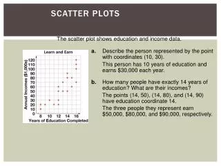
Scatter Plots. Scatter plots are used when you want to represent data from a table. Match the data values in the table to the coordinates of the points on the scatter plot. Scatter Plots.

E N D
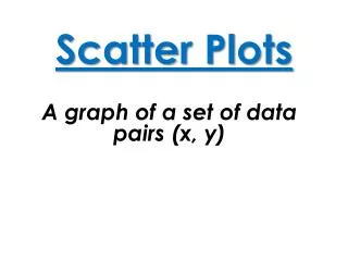
Scatter Plots Scatter plots are used when you want to represent data from a table. Match the data values in the table to the coordinates of the points on the scatter plot.
Scatter Plots Scatter plots are used when you want to represent data from a table. Match the data values in the table to the coordinates of the points on the scatter plot. Example : Create a scatter plot for the following table :
Scatter Plots Scatter plots are used when you want to represent data from a table. Match the data values in the table to the coordinates of the points on the scatter plot. Example : Create a scatter plot for the following table : 1. Create a coordinate grid
Scatter Plots Scatter plots are used when you want to represent data from a table. Match the data values in the table to the coordinates of the points on the scatter plot. Example : Create a scatter plot for the following table : • Create a coordinate grid • Number and label each axis 200 160 120 Cost of Party ( $ ) 80 40 24 22 4 16 20 12 8 Number of Guests
Scatter Plots Scatter plots are used when you want to represent data from a table. Match the data values in the table to the coordinates of the points on the scatter plot. Example : Create a scatter plot for the following table : • Create a coordinate grid • Number and label each axis • Plot each data value 200 160 120 Cost of Party ( $ ) ( you might have to estimate the location of the point ) 80 40 24 22 4 16 20 12 8 Number of Guests
Scatter Plots Scatter plots are used when you want to represent data from a table. Match the data values in the table to the coordinates of the points on the scatter plot. Example : Create a scatter plot for the following table : • Create a coordinate grid • Number and label each axis • Plot each data value 200 160 120 Cost of Party ( $ ) ( you might have to estimate the location of the point ) 80 40 24 22 4 16 20 12 8 Number of Guests
Scatter Plots Scatter plots are used when you want to represent data from a table. Match the data values in the table to the coordinates of the points on the scatter plot. Example : Create a scatter plot for the following table : • Create a coordinate grid • Number and label each axis • Plot each data value 200 160 120 Cost of Party ( $ ) ( you might have to estimate the location of the point ) 80 40 24 22 4 16 20 12 8 Number of Guests
Scatter Plots Scatter plots are used when you want to represent data from a table. Match the data values in the table to the coordinates of the points on the scatter plot. Example : Create a scatter plot for the following table : • Create a coordinate grid • Number and label each axis • Plot each data value 200 160 120 Cost of Party ( $ ) ( you might have to estimate the location of the point ) 80 40 24 22 4 16 20 12 8 Number of Guests
Scatter Plots Scatter plots are used when you want to represent data from a table. Match the data values in the table to the coordinates of the points on the scatter plot. Example : Create a scatter plot for the following table : • Create a coordinate grid • Number and label each axis • Plot each data value 200 160 120 Cost of Party ( $ ) ( you might have to estimate the location of the point ) 80 40 24 22 4 16 20 12 8 Number of Guests
Scatter Plots Scatter plots are used when you want to represent data from a table. Match the data values in the table to the coordinates of the points on the scatter plot. Example : Create a scatter plot for the following table : • Create a coordinate grid • Number and label each axis • Plot each data value 200 160 120 Cost of Party ( $ ) ( you might have to estimate the location of the point ) 80 40 24 22 4 16 20 12 8 Number of Guests
Scatter Plots Scatter plots are used when you want to represent data from a table. Match the data values in the table to the coordinates of the points on the scatter plot. Example : Create a scatter plot for the following table : • Create a coordinate grid • Number and label each axis • Plot each data value 200 160 120 Cost of Party ( $ ) ( you might have to estimate the location of the point ) 80 40 24 22 4 16 20 12 8 Number of Guests
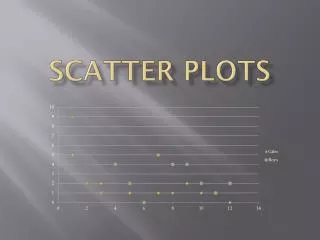
Scatter Plots Scatter plots are used when you want to represent data from a table. Match the data values in the table to the coordinates of the points on the scatter plot. Example # 2 : During the month of June, Sarah created a scatter plot that showed the hours worked and how much she earned in tips. If Sarah is working an 8 hour shift tonight, how much can she expect to earn in tips according to her scatter plot ? 120 100 80 60 Tips earned ( $ ) 40 20 4 14 12 2 6 8 10 Hours Worked
Scatter Plots Scatter plots are used when you want to represent data from a table. Match the data values in the table to the coordinates of the points on the scatter plot. Example # 2 : During the month of June, Sarah created a scatter plot that showed the hours worked and how much she earned in tips. If Sarah is working an 8 hour shift tonight, how much can she expect to earn in tips according to her scatter plot ? 120 From the scatter plot, we can see that the last 8 hour shift she worked she earned $70 in tips… 100 80 60 Tips earned ( $ ) 40 20 4 14 12 2 6 8 10 Hours Worked
Scatter Plots Scatter plots are used when you want to represent data from a table. Match the data values in the table to the coordinates of the points on the scatter plot. Example # 2 : During the month of June, Sarah created a scatter plot that showed the hours worked and how much she earned in tips. Sometimes we will need to extrapolate the graph. That is, estimate the data past the known information. 120 100 80 60 Tips earned ( $ ) 40 20 4 14 12 2 6 8 10 Hours Worked
Scatter Plots Scatter plots are used when you want to represent data from a table. Match the data values in the table to the coordinates of the points on the scatter plot. Example # 2 : During the month of June, Sarah created a scatter plot that showed the hours worked and how much she earned in tips. Sometimes we will need to extrapolate the graph. That is, estimate the data past the known information. This is called a “line of best fit”. 120 100 80 60 Tips earned ( $ ) 40 20 4 14 12 2 6 8 10 Hours Worked
Scatter Plots Scatter plots are used when you want to represent data from a table. Match the data values in the table to the coordinates of the points on the scatter plot. Example # 2 : During the month of June, Sarah created a scatter plot that showed the hours worked and how much she earned in tips. Sometimes we will need to extrapolate the graph. That is, estimate the data past the known information. This is called a “line of best fit”. This line “fits” in between the data points and extends beyond our last data item… 120 100 80 60 Tips earned ( $ ) 40 20 4 14 12 2 6 8 10 Hours Worked
Scatter Plots Scatter plots are used when you want to represent data from a table. Match the data values in the table to the coordinates of the points on the scatter plot. Example # 2 : During the month of June, Sarah created a scatter plot that showed the hours worked and how much she earned in tips. Using this “line of best fit”, we could estimate what Sarah would earn if she worked a shift that hasn’t been plotted… 120 100 80 60 Tips earned ( $ ) 40 20 4 14 12 2 6 8 10 Hours Worked
Scatter Plots Scatter plots are used when you want to represent data from a table. Match the data values in the table to the coordinates of the points on the scatter plot. Example # 2 : During the month of June, Sarah created a scatter plot that showed the hours worked and how much she earned in tips. Using this “line of best fit”, we could estimate what Sarah would earn if she worked a shift that hasn’t been plotted… For example, how much could Sarah expect earn if she works a 12 hour shift ? 120 100 80 60 Tips earned ( $ ) 40 20 4 14 12 2 6 8 10 Hours Worked
Scatter Plots Scatter plots are used when you want to represent data from a table. Match the data values in the table to the coordinates of the points on the scatter plot. Example # 2 : During the month of June, Sarah created a scatter plot that showed the hours worked and how much she earned in tips. Using this “line of best fit”, we could estimate what Sarah would earn if she worked a shift that hasn’t been plotted… For example, how much could Sarah expect earn if she works a 12 hour shift ? About $95.00 120 100 80 60 Tips earned ( $ ) 40 20 4 14 12 2 6 8 10 Hours Worked