Download
1 / 36
360 likes | 474 Views
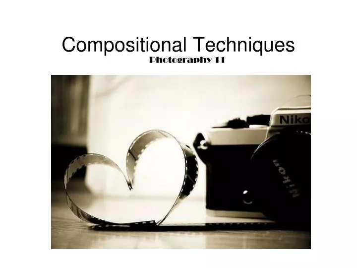
Photography 11. Compositional Techniques. Centre of Interest. There is a centre of interest in every photograph. It will be the most important part of the photo. It is where the photographer wants you to focus your attention.

E N D
Photography 11 Compositional Techniques
Centre of Interest There is a centre of interest in every photograph. It will be the most important part of the photo. It is where the photographer wants you to focus your attention. • The photographer uses compositional techniques to get the viewer to focus on the centre of interest
Contrast • The amount of darks and lights in the photo A photo with mostly grey tones has low contrast. A photo with lots of darks and highlights has high contrast.
Shutterspeed • Used to create effects such as blurring, frozen images, or panning. Slow Shutterspeed (to show blurring) Fast Shutterspeed (frozen in motion)
Panning(Subject and camera moving, background becomes blurry)
Selective Focus • Choice of aperture affects this (depth of field) and can be used to emphasize a certain part or aspect of the photo • Foreground, midground, background, or all in focus. Foreground in focus Midground in focus
Selective Focus cont. Focusing on different or unusual areas in a photograph creates unique images Background in focus All in focus
Viewpoint • How the photographer was aiming the camera when he/she took the photo. Bugs eye view, birds eye view, eye-level, close-up, long shot.
Rule of Thirds • Key elements lie on dividing lines, either horizontal, vertical, both, or where the lines meet (intersections.)
Leading Lines • Already existing lines can be used to draw your attention towards certain parts of a photo.
Framing • Elements or objects in a photo are used to act as a frame for the subject.
Pattern / Repetition • Used to accentuate a certain area or to create an overall balanced effect. • Also used to create an abstraction of a common subject, so the viewer sees it differently
Symmetry / Asymmetry A symmetrical photograph will be exactly or close to exactly the same on either side, if divided in half vertically. This creates an even balance. Asymmetrical photographs are uneven on either side, but will be balanced in other ways.
Diagonal Lines • Can be used as leading lines, to create interest, or to create a sense of movement, action, or unease. Simply tilting your camera can create this effect, or enhance it.
Colour Terms: • Hue: The common name given to the visual perception of a colour (ex – blue) • Saturation: The intensity or purity of a colour. A fully desaturated image will appear greyscale (black and white.) • Tone: Whether a colour is dark, light, or in between • Key: Brightness in an image. High Key = Bright with lots of whites. Low Key = Dark, with lots of blacks and shadows
Muliticultures and Colour • Western cultures – white is associated with purity/spirituality. • Many Eastern cultures – white is worn at funerals, a colour of mourning • In the West, Yellow = happy • In some Asian cultures, Yellow = death • West – black = death • Ancient Egypt – black = life (colour of the mud of the life-giving Nile river.
Colour and Advertising • Butter is coloured with yellow because it sells better that way • Candy sells better if it is all different colours, even if the pieces are all the same flavour • People think that coffee tastes richer in a brown cup than in a white cup • Fast food restaurants often use red and yellow in their colour schemes • All businesses choose certain colours for their logo and use these colours everywhere – on letterheads, advertisements, handouts, websites etc.
Andre Derain • “Fauve artists sought to reenergize the expressive capabilities of painting through the use of intense pigments, raw brushwork, and a reconsidered notion of light and shadow.” Three Trees, L’Estaque, 1906, oil on canvas, 100 x 80 cm approx.
First Nations Art • First Nations artists of the North West often often use a limited colour palette involving red and black and sometimes yellow and light blue. Killerwhale, drum by Philip Gray (Tsimshian/Cree)
Artists Who use Colour Extensively • Mark Rothko, an Abstract Expressionist painter created large canvases of colour with the intention of invoking certain emotional responses in the viewer No. 13, (White, Red, on Yellow), 1958, oil and acrylic with powdered pigments on canvas, 242 x 207 cm approx.
Colour and Emotion • Feeling blue? Many people associate colours with certain emotions. There can be many reasons for this. You might dislike certain colours because they remind you of a negative experience in a certain place. • Extensive studies have been done to figure out what emotions most people associate with colour.
Plutchik’s Wheel of Emotions • Plutchik came up with 8 basic human emotions, from which other emotions stem or are related. They are: • Anticipation - Surprise • Joy - Sadness • Trust - Disgust • Fear - Anger What colours represent these emotions to you?
Colour Theory • Primary Colours are colours that cannot be made by mixing any other colours. They are red, blue, and yellow. • Secondary Colours are made by combining any two primary colours in approximately equal proportions. They are orange, green, and violet (purple.)
Tertiary (or intermediate) colours are made from mixing one primarywith its neighboring secondary colour. • Ex. – red + orange = red orange • Yellow + orange = yellow orange
Analogous colours are colours that are next to each other on the colour wheel
Warm colours are all the hues from red violet to yellow. • Cool colours are all the hues from yellow green to violet.
Complementary colours are colours that are opposite each other on the colour wheel Lee Frost, Buddhist Monk, Shwedagon Pagoda, Yangon
Neutral colours are the result of mixing any two complementary colours. These often create a warm or cool grey, or a warm or cool brown if mixing all colours (primary colours.) Lee Frost, View from Shwesandaw Paya, Bagan,
Colour in Photography • Strong colours jump out at the viewer, especially reds • Colours appear stronger or higher in saturation when they are placed against or near their complementary colour • Colours often need to be corrected in image manipulation software because our cameras concentrate on getting the best exposure for light, which sometimes alters how colours appear
If there is little colour contrast in an image, shadows and highlights may need to be deepened/lightened in order to create greater tonal contrast to bring out your image • Black and White photographs are often still a favourite among photographers and are published widely today